
在開發雙平台 App 時,相信大家都有察覺到 Android iOS兩者在預設樣式上有所不同。例如 Header 標題, Android 靠左顯示, iOS 則在中間。
同樣的,我們也可能需要判斷不同裝置,藉此設定不同樣式。對此 React Native 提供了 Platform ,不只能協助判斷裝置平台,也能藉由它抓到裝置版本、是否為 iPad 等資訊。
<Text>OS: {Platform.OS}</Text>
<Text>OS Version: {Platform.Version}</Text>
{Platform.OS === 'ios' && (
<Text>isPad: {Platform.isPad.toString()}</Text>
)}
能使用的屬性、吐出資料的格式可能因平台不同,詳細表格請參考官網。
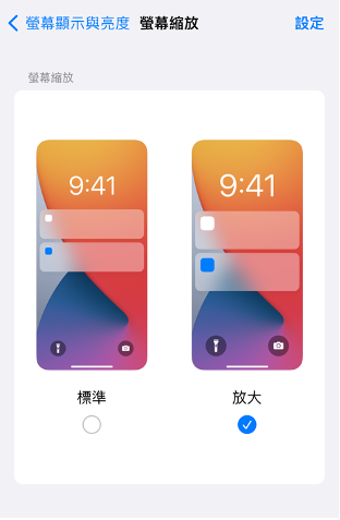
過去在印製東西時會以 dpi 作點數密度單位,代表一英吋能印多少點。能印越多點,印出來的內容就會越清晰。現今手機同樣會運用到相關概念,有的手機大小雖一樣,但看起來的畫質卻不同,因為螢幕一英吋顯示的像素不同。能顯示越多像素,就越清晰,而計算的單位則被稱為 ppi 。
這會為 App 開發者帶來什麼問題呢?當我們在 App 放入一張圖片或一段文字,以寫死的字體大小或寬高設定,可能因為用不同裝置開啟,甚至是使用者設了較大的顯示模式導致跑版。
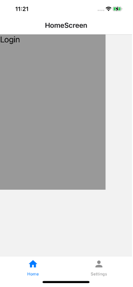
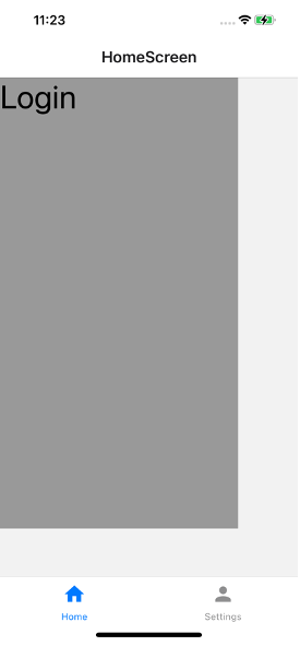
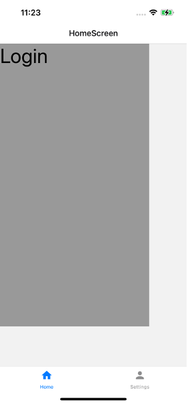
下圖是實際用同樣的 iPhone 內建截圖功能截出的圖片,一張是標準模式,另一張則是放大模式。可以發現比例並不一致,字體大小也不同。
function HomeScreen() {
  return (
    <View style={styles.container}>
      <View style={styles.textWrapper}>
        <Text style={styles.myText}>Login</Text>
      </View>
    </View>
  );
}

const styles = StyleSheet.create({
  container: {flex: 1},
  textWrapper: {
    height: '70%',
    width: '80%',
    backgroundColor: '#999'
  },
  myText: {
    fontSize: 20,
  },
});
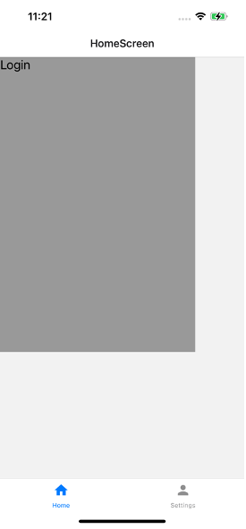
當然上面的範例只是個簡單的示意,也許會覺得只差一點點還好。但如果頁面比較複雜,有可能會導致同一行的內容調到下一行導致斷字或跑版。而 react-native-responsive-screen 是一個小型函式庫,提供開發者簡單的方法達成響應式設計。透過下列指令下載套件:
npm install react-native-responsive-screen --save
這個套件會偵測螢幕的長寬,當開發者運用它提供的 widthPercentageToDP 或 heightPercentageToDP 時,他會將本來的單位轉換成 DP ,藉此讓不同大小的螢幕瀏覽時,都能顯示正確比例。且不只長寬,它也可以用來設定字體大小。官方建議從大裝置開發起(如平板),這樣比較不會忘記處理響應式。此外,這個套件也可以搭配 styled-components 使用。
讓我們來改寫上面的程式碼。由於 widthPercentageToDP 和 heightPercentageToDP 非常冗長,因此,我們可以透過 as 重新將他們命名為 wp 與 hp 來使用。
import {
  widthPercentageToDP as wp,
  heightPercentageToDP as hp,
} from 'react-native-responsive-screen';

const styles = StyleSheet.create({
  container: {flex: 1},
  textWrapper: {
    backgroundColor: '#999',
    height: hp('70%'),
    width: wp('80%'),
  },
  myText: {
    fontSize: hp('5%'),
  },
});

 看影片追技術