在開始實作前,我們先來介紹一些在前端界面開發中常用的套件,這些套件可以用來輔助介面的開發,並且提高開發效率,也可以為我們製作的專案增添更多視覺上的吸引力及功能性。
在本篇文章將介紹一套基於 Vue 框架的 UI 套件:Element Plus。
Vue Element Plus 是 Vue.js 框架的一個基於 Element UI 的擴展組件庫,用於構建用戶界面。它提供了一套現代化的、可定制的 UI 組件,可以幫助開發者快速構建各種 Web 應用程序和界面。 Vue Element Plus 是 Element UI 的升級版本,它在 Element UI 的基礎上進行了一些改進和增強,以滿足現代 Web 應用開發的需求。
Element Plus內含有豐富的UI元件,可以滿足使用者的不同需求,也可以做到響應式網頁,適應各種網頁大小,除此之外,Element Plus也支援多國語言,可以因應不同需求做語言的切換。
使用npm進行安裝的方法:
npm install element-plus --save
在main.js的檔案中引入Element Plus做為全域引用
import { createApp } from 'vue'
import App from './App.vue'
import ElementPlus from 'element-plus'
import "element-plus/dist/index.css";

createApp(App).use(ElementPlus).mount('#app')
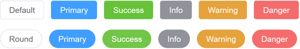
可以將type設置為primary、success、info、warning、danger來改變按鈕的顏色,也可以透過plain、round、 circle 來設定按鈕的樣式。
<template>
  <el-row>
    <el-button>Default</el-button>
    <el-button type="primary">Primary</el-button>
    <el-button type="success">Success</el-button>
    <el-button type="info">Info</el-button>
    <el-button type="warning">Warning</el-button>
    <el-button type="danger">Danger</el-button>
  </el-row>
  <br>
  <el-row>
    <el-button round>Round</el-button>
    <el-button type="primary" round>Primary</el-button>
    <el-button type="success" round>Success</el-button>
    <el-button type="info" round>Info</el-button>
    <el-button type="warning" round>Warning</el-button>
    <el-button type="danger" round>Danger</el-button>
  </el-row>
</template>
需要先安裝使用icon需要的套件@element-plus/icons-vue
npm install @element-plus/icons-vue
可以在官網上找到各式各樣的符號標誌
https://element-plus.org/en-US/component/icon.html#icon-collection
點擊想要使用的icon即可將程式碼複製下來
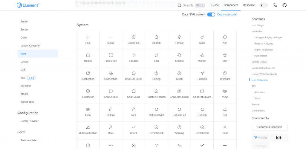
使用時需要在裡面將該icon進行引用
<template>
	<el-icon><Mouse /></el-icon>
</template>

<script>
import { Mouse } from "@element-plus/icons-vue";
export default {
  components: {
    Mouse,
  },
};
</script>

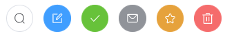
也可以將icon與button進行結合
<template>
	<el-button circle><el-icon><Search /></el-icon></el-button>
  <el-button type="primary" circle><el-icon><Edit /></el-icon></el-button>
  <el-button type="success" circle><el-icon><Check /></el-icon></el-button>
  <el-button type="info" circle><el-icon><Message /></el-icon></el-button>
  <el-button type="warning" circle><el-icon><Star /></el-icon></el-button>
  <el-button type="danger" circle><el-icon><Delete /></el-icon></el-button>
</template>

<script>
import { Search, Edit, Check, Message, Star, Delete } from "@element-plus/icons-vue";
export default {
  components: {
    Search,
    Edit,
    Check,
    Message,
    Star,
    Delete,
  },
};
</script>
好的前端的UI設計通常會讓人在第一眼留下一個深刻的印象,因此我們可以運用套件來協助我們進行版面上的設計,Element Plus就是一個常在Vue框架下中被使用的UI套件。
除了以上介紹到的元件,Element Plus還提供了很多很便利的元件,像是card、table等等,開發者皆可在Element Plus的官網看到更多更詳細的介紹。

 看影片追技術