除了靜態的顯示元件,動態的互動元件也很重要。從這個章節開始會介紹可以跟用戶互動的元件,按鈕、選單、輸入框。
Button 是 SwiftUI 提供的按鈕,有以下兩種寫法:
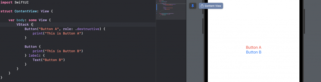
Button("Button A", role: .destructive) {
    print("This is Button A")
}

Button {
    print("This is Button B")
} label: {
    Text("Button B")
}
action 內是你按下按鈕要執行的動作
label 裡面可以放各式各樣的
View
寫完之後,可以直接在右邊的 Canvas 直接點按鈕試試
如果你想用一般的 Button 就好,可以使用 .buttonStyle 修飾器來修改按鈕的樣式:
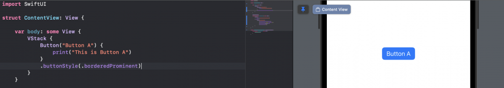
Button("Button A") {
    print("This is Button A")
}
.buttonStyle(.borderedProminent)
.buttonStyle還有其他參數可以玩玩看
第二種是有 label 的 Button,可以在 label 內塞各式各樣的 View,比較有變化性:
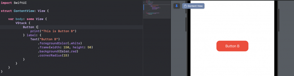
Button {
    print("This is Button B")
} label: {
    Text("Button B")
        .foregroundColor(.white)
        .frame(width: 150, height: 50)
        .background(Color.red)
        .cornerRadius(15)
}
使用 label 的 Button 有一點需要注意,就是 label 內的 View 才是能點選的。
按按看下面兩個看起來一模一樣 Button 有什麼差異?
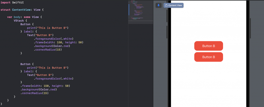
VStack {
    Button {
        print("This is Button B")
    } label: {
        Text("Button B")
            .foregroundColor(.white)
            .frame(width: 150, height: 50)
            .background(Color.red)
            .cornerRadius(15)
    }


    Button {
        print("This is Button B")
    } label: {
        Text("Button B")
            .foregroundColor(.white)
    }
    .frame(width: 150, height: 50)
    .background(Color.red)
    .cornerRadius(15)
}
上面的 Button 點選紅色部分會有反應。
下面的 Button 點選紅色部分沒反應,一定要點字才有反應。
因為上方的 .background 是寫在 label 內的,點擊才會執行 action 內的行為。
.onTapGesture 這個修飾器也可以達成 點選執行動作 的效果。
但跟 Button 不同的是,.onTapGesture 點選時不會有按鈕變白的動畫。
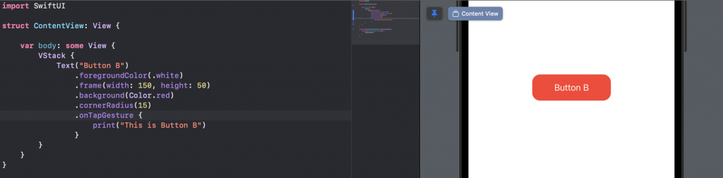
Text("Button B")
    .foregroundColor(.white)
    .frame(width: 150, height: 50)
    .background(Color.red)
    .cornerRadius(15)
    .onTapGesture {
        print("This is Button B")
    }
Button 可以做到點擊互動的行為,想要被點擊的 View 都要寫在 label 內!
.onTapGesture 也可以做到類似效果,只是不會有動畫。


 iThome鐵人賽
 看影片追技術