今天講Form-Control,使用bootstrap的 form-control 類別可以自訂<input>、<textarea>的樣式,尺寸,與focus 狀態。
寫法只要在<input>、<textarea>上加上.form-control就可以了,你會發現樣式改變,而且點擊它還會出現一圈藍色的focus效果。
程式碼:
<div class="mb-3">
  <label for="exampleFormControlInput1" class="form-label">Email address</label>
  <input type="email" class="form-control" id="exampleFormControlInput1" placeholder="name@example.com">
</div>
<div class="mb-3">
  <label for="exampleFormControlTextarea1" class="form-label">Example textarea</label>
  <textarea class="form-control" id="exampleFormControlTextarea1" rows="3"></textarea>
</div>
效果(textarea那一圈藍色的是因為有點中它):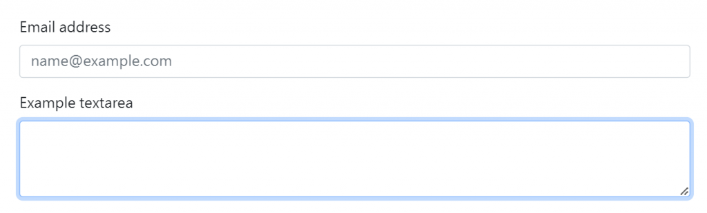
如果再加上.form-control-lg可以使原本input變高一點,而.form-control-sm則相反。
範例:
<input class="form-control form-control-lg" type="text" placeholder=".form-control-lg" aria-label=".form-control-lg example">
<input class="form-control" type="text" placeholder="Default input" aria-label="default input example">
<input class="form-control form-control-sm" type="text" placeholder=".form-control-sm" aria-label=".form-control-sm example">
效果: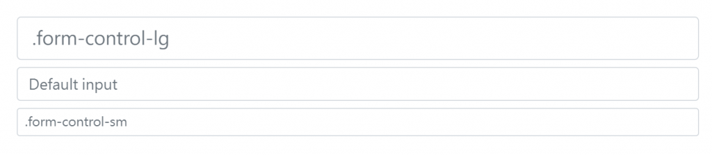
在input加上 disabled屬性使其外觀呈現灰色,並移除 pointer 事件(點擊沒反應)。
如果是在input加上 readonly屬性外觀會跟 disabled一樣是灰色,但點擊的話會有一圈藍色focus ring。
寫法範例:
<input class="form-control" type="text" placeholder="Disabled input" aria-label="Disabled input example" disabled>
<input class="form-control" type="text" placeholder="readonly input" aria-label="Readonly input example" readonly>
如果要把 元素設置為純文本,可以加上 .form-control-plaintext點擊時就不會那圈藍色focus ring的互動效果。
寫法範例:
<input type="text" readonly class="form-control-plaintext" id="staticEmail" value="email@example.com">
點擊時效果:
P.S.如果想使表單水平並排可以使用格線系統,例如:
<form class="row g-3">
  <div class="col-auto">
    <label for="staticEmail2" class="visually-hidden">Email</label>
    <input type="text" readonly class="form-control-plaintext" id="staticEmail2" value="email@example.com">
  </div>
  <div class="col-auto">
    <label for="inputPassword2" class="visually-hidden">Password</label>
    <input type="password" class="form-control" id="inputPassword2" placeholder="Password">
  </div>
  <div class="col-auto">
    <button type="submit" class="btn btn-primary mb-3">Confirm identity</button>
  </div>
</form>
效果:
檔案的input 記得加上type="file",範例如下:
<div class="mb-3">
  <label for="formFile" class="form-label">Default file input example</label>
  <input class="form-control" type="file" id="formFile">
</div>
效果: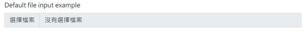
顏色選擇的input 記得加上type="color",範例如下:
<label for="exampleColorInput" class="form-label">Color picker</label>
<input type="color" class="form-control form-control-color" id="exampleColorInput" value="#563d7c" title="Choose your color">
效果: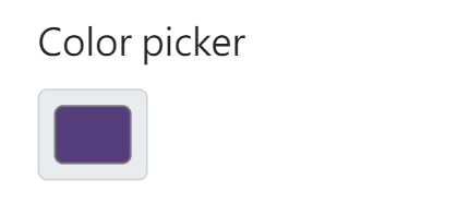
資料清單可以讓我們在input打字,它會出現一些選項符合我們打的字。例如下圖我打"s
"它就會出現list中有符合"s"的選項讓我選。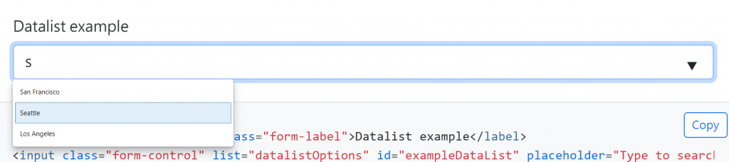
如果要實踐這樣的效果需要在datalist的input中加入list="..."對應datalist的id名稱。
範例程式碼:
<label for="exampleDataList" class="form-label">Datalist example</label>
<input class="form-control" list="datalistOptions" id="exampleDataList" placeholder="Type to search...">
<datalist id="datalistOptions">
  <option value="San Francisco">
  <option value="New York">
  <option value="Seattle">
  <option value="Los Angeles">
  <option value="Chicago">
</datalist>
效果: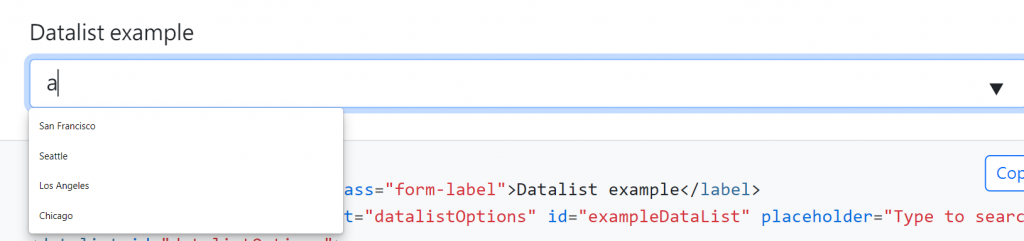


 看影片追技術