按鈕算是Bootstrap中非常重要的元件之一,我們不只可以在<button>上使用它,也可以在<a> 或 <input>上使用(可以使用 role="button"增加網頁親和性)。它的結構是.btn,之後才在結構上添加樣式例如.btn-primary。.btn的scss如下(只有.btn時它的背景色是透明的,多了padding還有圓角,點擊後它還會有一圈框框):
.btn {
  display: inline-block;
  font-family: $btn-font-family;
  font-weight: $btn-font-weight;
  line-height: $btn-line-height;
  color: $body-color;
  text-align: center;
  text-decoration: if($link-decoration == none, null, none);
  white-space: $btn-white-space;
  vertical-align: middle;
  cursor: if($enable-button-pointers, pointer, null);
  user-select: none;
  background-color: transparent;
  border: $btn-border-width solid transparent;
  @include button-size($btn-padding-y, $btn-padding-x, $btn-font-size, $btn-border-radius);
  @include transition($btn-transition);

  &:hover {
    color: $body-color;
    text-decoration: if($link-hover-decoration == underline, none, null);
  }

  .btn-check:focus + &,
  &:focus {
    outline: 0;
    box-shadow: $btn-focus-box-shadow;
  }

  .btn-check:checked + &,
  .btn-check:active + &,
  &:active,
  &.active {
    @include box-shadow($btn-active-box-shadow);

    &:focus {
      @include box-shadow($btn-focus-box-shadow, $btn-active-box-shadow);
    }
  }

  &:disabled,
  &.disabled,
  fieldset:disabled & {
    pointer-events: none;
    opacity: $btn-disabled-opacity;
    @include box-shadow(none);
  }
之後我們可以幫它加上各種背景色,使用.btn-*,如下:
<button type="button" class="btn btn-primary">Primary</button>
<button type="button" class="btn btn-secondary">Secondary</button>
<button type="button" class="btn btn-success">Success</button>
<button type="button" class="btn btn-danger">Danger</button>
<button type="button" class="btn btn-warning">Warning</button>
<button type="button" class="btn btn-info">Info</button>
<button type="button" class="btn btn-light">Light</button>
<button type="button" class="btn btn-dark">Dark</button>

<button type="button" class="btn btn-link">Link</button>
效果: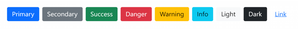
我們也可以使用.btn-outline-*來讓按鈕只有外框跟文字有該顏色;在hover時背景才會填滿顏色。
例如:
<button type="button" class="btn btn-outline-primary">Primary</button>
<button type="button" class="btn btn-outline-secondary">Secondary</button>
<button type="button" class="btn btn-outline-success">Success</button>
<button type="button" class="btn btn-outline-danger">Danger</button>
<button type="button" class="btn btn-outline-warning">Warning</button>
<button type="button" class="btn btn-outline-info">Info</button>
<button type="button" class="btn btn-outline-light">Light</button>
<button type="button" class="btn btn-outline-dark">Dark</button>
效果:
可以加入 .btn-lg 或 .btn-sm 來套用較大較小尺寸
我們可以在按鈕加上disabled屬性使按鈕不能被點擊(pointer-events: none),而且外觀會稍微變淺。
如果是<a>元素的話請注意是加.disabled類別,因為它不支持disabled屬性。
範例程式碼:
<button type="button" class="btn btn-lg btn-primary" disabled>Primary button</button>
<a href="#" class="btn btn-secondary btn-lg disabled">Link</a>
效果: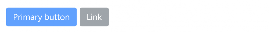
如果想讓按鈕佔滿整個區塊的話,我們可以用 display 和 gap 通用類別,建立跟響應式、滿版的按鈕。
範例程式碼:
<div class="d-grid gap-2">
  <button class="btn btn-primary" type="button">Button</button>
  <button class="btn btn-primary" type="button">Button</button>
</div>
效果: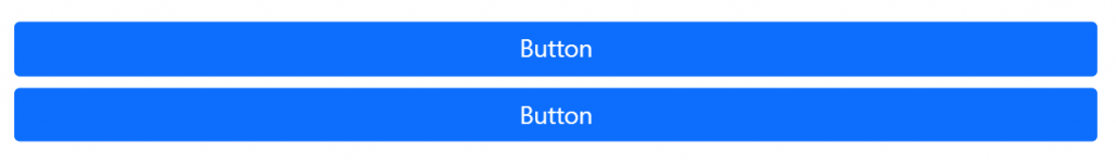
當然,我們也可以用.w-100來達到滿寬效果,但比較沒有那麼彈性。
如果是響應式的話用 display 和 gap 通用類別則比.w-100更容易達成,例如這是md以下滿寬,md以上單行的寫法:
<div class="d-grid gap-2 d-md-block">
  <button class="btn btn-primary" type="button">Button</button>
  <button class="btn btn-primary" type="button">Button</button>
</div>
此外我們也可以用格線系統的col-*來調整它的寬度,例如下面範例的.col-6就是佔50%寬度;.mx-auto則是讓它水平置中:
<div class="d-grid gap-2 col-6 mx-auto">
  <button class="btn btn-primary" type="button">Button</button>
  <button class="btn btn-primary" type="button">Button</button>
</div>
效果如下圖:
使用 data-bs-toggle="button" 來切換按鈕的 active 狀態,這要事先載入Bootstrap的Javascript,如果要讓它初始狀態就是active的話,要手動加上.active。
範例:
<a href="#" class="btn btn-primary" role="button" data-bs-toggle="button">Toggle link</a>
效果: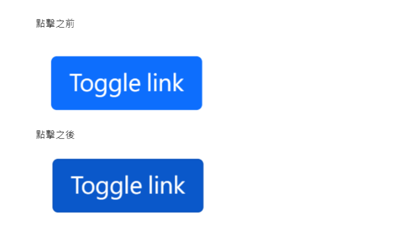
如果要讓一系列的按鈕可以併再一起成一直排或一橫列的話,可以在這群按鈕的外層加上.btn-group來實現。
例如:
<div class="btn-group" role="group" aria-label="Basic example">
  <button type="button" class="btn btn-primary">Left</button>
  <button type="button" class="btn btn-primary">Middle</button>
  <button type="button" class="btn btn-primary">Right</button>
</div>
效果: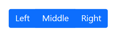
如果要讓它垂直的話就使用.btn-group-vertical。


 看影片追技術