今天來講bootstrap元件的警報(Alerts),Alerts可以用簡短的程式碼就能傳達想要的警示情境效果。
Alerts可以用在任何長度的文本,寫法是加上.alert搭配想要的情境主題色.alert-情境色(例如 .alert-peimary)。.alert這個class的css效果是:
.alert {
    position: relative;
    padding: 1rem 1rem;
    margin-bottom: 1rem;
    border: 1px solid transparent;
    border-radius: .25rem;
}
範例程式碼:
<div class="alert alert-primary" role="alert">
  A simple primary alert—check it out!
</div>
<div class="alert alert-secondary" role="alert">
  A simple secondary alert—check it out!
</div>
<div class="alert alert-success" role="alert">
  A simple success alert—check it out!
</div>
<div class="alert alert-danger" role="alert">
  A simple danger alert—check it out!
</div>
<div class="alert alert-warning" role="alert">
  A simple warning alert—check it out!
</div>
<div class="alert alert-info" role="alert">
  A simple info alert—check it out!
</div>
<div class="alert alert-light" role="alert">
  A simple light alert—check it out!
</div>
<div class="alert alert-dark" role="alert">
  A simple dark alert—check it out!
</div>
效果如圖: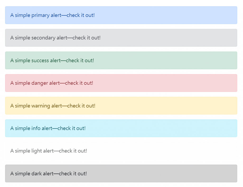
此外我們還可以用使用 .alert-link 來使alert中的連結符合alert的色彩。
例如:
<div class="alert alert-primary" role="alert">
  A simple primary alert with <a href="#" class="alert-link">an example link</a>. Give it a click if you like.
</div>
<div class="alert alert-secondary" role="alert">
  A simple secondary alert with <a href="#" class="alert-link">an example link</a>. Give it a click if you like.
</div>
<div class="alert alert-success" role="alert">
  A simple success alert with <a href="#" class="alert-link">an example link</a>. Give it a click if you like.
</div>
如圖: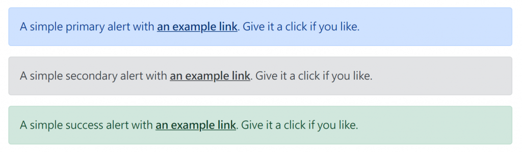
Alerts裡面還可以包含其他的 HTML 元素,像是標題、段落以及分隔線,或是icon等(icon的對齊可以使用flex-box調整)。
例如:
<div class="alert alert-primary" role="alert">
    <h4 class="alert-heading">Well done!</h4>
    <p>Aww yeah, you successfully read this important alert message. This example text is going to run a bit longer so that you can see how spacing within an alert works with this kind of content.</p>
    <hr>
    <div class="d-flex align-items-center">
      <svg xmlns="http://www.w3.org/2000/svg" width="24" height="24" fill="currentColor" class="bi bi-exclamation-triangle-fill flex-shrink-0 me-2" viewBox="0 0 16 16" role="img" aria-label="Warning:">
        <path d="M8.982 1.566a1.13 1.13 0 0 0-1.96 0L.165 13.233c-.457.778.091 1.767.98 1.767h13.713c.889 0 1.438-.99.98-1.767L8.982 1.566zM8 5c.535 0 .954.462.9.995l-.35 3.507a.552.552 0 0 1-1.1 0L7.1 5.995A.905.905 0 0 1 8 5zm.002 6a1 1 0 1 1 0 2 1 1 0 0 1 0-2z" />
      </svg>
      <div>
        An example alert with an icon
      </div>
    </div>
  </div>
效果: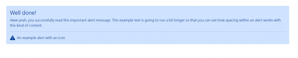
如果要使用bootstrap製作警報移除的按鈕的話,有幾個步驟:
.alert-dismissible class,這時alert右上方會出現一個有padding的關閉按鈕,這時候還沒有關閉的功能。data-bs-dismiss="alert" 屬性來觸發 JavaScript 函式,這時就可以有關閉效果了,然後記得使用<button>如此可以確保跨裝置使用。.alert上使用.fade 和 .show 類別使其有動態漸變效果。


 看影片追技術