哈囉 昨天分享了transition屬性與transform屬性,今天讓我們來看看這2者合併做成的簡易動畫~~
每天我都會將這篇文章裡的關鍵字、使用的語法、問題等做成清單,透過回想或許能幫助您加深記億喲

Animation : 可以透過影格( keyframes )來決定每個階段元素所套用的樣式。還可以使用包含以下兩種的動畫效果。你可以分開設定或放一起設定(也可以選擇只設定以下的幾個就好)。
transition : 一個元素從A外觀到B外觀中間為了使過程看來平滑所增添的效果。
transform : 對一個元素進行translate、rotate、scale等的效果。
讓我們看看MDN文件的說明~
CSS animations 有三種好處:
對於不複雜的動畫來說,CSS animation 是好選擇。你甚至不必懂得 JavaScript。
在資源消耗上,CSS animation 有優勢,即使在系統負載超過 50% 仍可有效運作。在 JavaScript 上要達到一樣的目的有賴於你寫出品質非常好的 code。事實上,CSS animation 在運作上可以適時的減少 frame 量或以其它技術減少資源消耗。
CSS animation 讓瀏覽器來負責動畫的產生過程,如此可以擁有較好的優化。
<body>
  <div class="container">
    <div class="box">==></div>
  </div>
</body>
.container {
  width: 300px;
  height: 300px;
  background-color: #faebd7;
  margin: 10px;
}
.box {
  width: 100px;
  height: 100px;
  background-color: black;
}
.box1 {
  font-size: 40px;
  text-align: center;
  position: absolute;
  top: 50%;
  left: 50%;
  }
font-size只是方便觀看box1旋轉的動向。
這邊有幾點可以來複習一下喲~~
absolute屬性會相對於父層的**已定位的元素(static以外)**進行定位,這時它就不會佔據頁面的空間。
如果box1的父層都沒有定位,那麼box1會相對於<html>元素進行定位(也就是)瀏覽器窗口的左上角。(如圖)
所以記得在它的父層(container)要設定position:relative才能相對container成功定位absolute喲!
如果沒有設置top:50%及left:50%(移動位置),他就會默認在它的父層的左上角,這是默認的定位點。
這時候你會發現box1只有左上角成功定位在container的中心點,所以還需要透過translate進行平移才能讓整個box1置中在container裡面。但這邊建議將動畫都放在@keyframes裡面,這有助於日後維護。(如圖)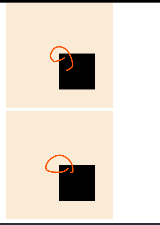
現在要來對box1進行動畫設定拉~我們要對它設定旋轉(rotate)、平移(translate)的動畫、並且在間格中設定不同顏色~
@keyframes box1-animation {
  0% {
    transform: translate(-50%, -50%) rotate(360deg);
    background-color: red;
  }
  14% {
    background-color: orange;
  }
  28% {
    background-color: yellow;
  }
  42% {
    background-color: green;
  }
  56% {
    background-color: blue;
  }
  68% {
    background-color: rgb(75, 0, 130);
  }
  82% {
    background-color: purple;
  }
  100% {
    transform: translate(-50%, -50%) rotate(0deg);
    background-color: red;
  }
}
0%代表動畫一開始,100%代表動畫結束,在
0%時設定translate位置在container的正中間,100%時設定translate位置在container的正中間**,如果你的動畫次數是設定無限的話,那代表它會持續在中間。**
0%時設定rotate位置在是(0deg),100%時設定rotate位置在是(360deg),綜合以上,你的動畫會一直在container的正中間不停順時鐘旋轉。
你可以任意設定間格,在這裡是將100/7 = 14.2,大約14為一個間格進行彩虹的七色設定。綜合以上,你的動畫會在一直container的正中間不停順時鐘旋轉,並且在每個間隔換顏色。
6.現在已經將動畫內容設定好,現在就要在box1裡面透過Animation這個屬性呼叫動畫,並且設定各項功能
我們新增box1並新增annimation,這是簡寫,代表使用@keyframs box1-animation這個動畫
、持續時間2秒、均速、無限次數。
.box1 {
  font-size: 40px;
  text-align: center;
  position: absolute;
  top: 50%;
  left: 50%;
  animation: box1-animation 2s linear infinite;
}
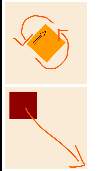
因為有了箭頭,你可以看到現在是逆時針旋轉,那麼如果你想將它順時鐘旋轉的話呢~?
<div class="box box1"><==</div>直接把箭頭位置更改,嘿嘿好偷雞!animation: box1-animation 2s linear infinite reverse;7.再來設定第二個box讓它從左上移置右下,從黑色轉換到紅色。
我們建立一個新的box2
.box2 {
  font-size: 40px;
  text-align: center;
  position: absolute;
  top: 0%;
  left: 0%;
  animation: box2-animation linear 2s infinite;
}
@keyframes box2-animation {
  from {
    transform: translate(0px, 0px);
    background-color: black;
  }
  to {
    transform: translate(200px, 200px);
    background-color: red;
  }
}
現在box2是由左上往右下移動,要讓它從右下往左上不停來回移動有甚麼方法嗎~
你可以設定@keyframes,用間格的方式,0%在左上角,50%時在右下角,100%時在左上角~
@keyframes box2-animation {
  0% {
    transform: translate(0px, 0px);
    background-color: black;
  }
  50% {
    transform: translate(200px, 200px);
    background-color: red;
  }
  100% {
    transform: translate(0px, 0px);
    background-color: black;
  }
}
好啦今天就到此結束謝謝~~~中秋節快樂!!
https://codepen.io/ywngjyyj-the-vuer/pen/QWzQYQz?editors=1100
https://codepen.io/ywngjyyj-the-vuer/pen/NWeBGBO
https://developer.mozilla.org/zh-TW/docs/Web/CSS/CSS_animations/Using_CSS_animations
https://www.casper.tw/development/2021/10/04/css-animation/


 看影片追技術