今天開始講元件了,bootstrap提供很多實用的元件,基本上是複製官方文件的原始碼,搭配通用類別與helpers就行調整,我們可以輕鬆快速客製化它們變成自己想要的樣子~
所以,為了能夠輕鬆修改元件,我們必須要去了解它們的運作方式,所以接下來就來逐個講解元件吧!
bootstrap的手風琴可以透過點擊達到垂直收合展開的效果,這個元件會用到bootstrap的javascript,所以記得要載入。先看此範例程式碼:
<div class="accordion" id="accordionExample">
  <div class="accordion-item">
    <h2 class="accordion-header" id="headingOne">
      <button class="accordion-button" type="button" data-bs-toggle="collapse" data-bs-target="#collapseOne" aria-expanded="true" aria-controls="collapseOne">
        Accordion Item #1
      </button>
    </h2>
    <div id="collapseOne" class="accordion-collapse collapse show" aria-labelledby="headingOne" data-bs-parent="#accordionExample">
      <div class="accordion-body">
        <strong>This is the first item's accordion body.</strong> It is shown by default, until the collapse plugin adds the appropriate classes that we use to style each element. These classes control the overall appearance, as well as the showing and hiding via CSS transitions. You can modify any of this with custom CSS or overriding our default variables. It's also worth noting that just about any HTML can go within the <code>.accordion-body</code>, though the transition does limit overflow.
      </div>
    </div>
  </div>
  <div class="accordion-item">
    <h2 class="accordion-header" id="headingTwo">
      <button class="accordion-button collapsed" type="button" data-bs-toggle="collapse" data-bs-target="#collapseTwo" aria-expanded="false" aria-controls="collapseTwo">
        Accordion Item #2
      </button>
    </h2>
    <div id="collapseTwo" class="accordion-collapse collapse" aria-labelledby="headingTwo" data-bs-parent="#accordionExample">
      <div class="accordion-body">
        <strong>This is the second item's accordion body.</strong> It is hidden by default, until the collapse plugin adds the appropriate classes that we use to style each element. These classes control the overall appearance, as well as the showing and hiding via CSS transitions. You can modify any of this with custom CSS or overriding our default variables. It's also worth noting that just about any HTML can go within the <code>.accordion-body</code>, though the transition does limit overflow.
      </div>
    </div>
  </div>
  <div class="accordion-item">
    <h2 class="accordion-header" id="headingThree">
      <button class="accordion-button collapsed" type="button" data-bs-toggle="collapse" data-bs-target="#collapseThree" aria-expanded="false" aria-controls="collapseThree">
        Accordion Item #3
      </button>
    </h2>
    <div id="collapseThree" class="accordion-collapse collapse" aria-labelledby="headingThree" data-bs-parent="#accordionExample">
      <div class="accordion-body">
        <strong>This is the third item's accordion body.</strong> It is hidden by default, until the collapse plugin adds the appropriate classes that we use to style each element. These classes control the overall appearance, as well as the showing and hiding via CSS transitions. You can modify any of this with custom CSS or overriding our default variables. It's also worth noting that just about any HTML can go within the <code>.accordion-body</code>, though the transition does limit overflow.
      </div>
    </div>
  </div>
</div>
.accordion,然後它有一個id,這是給裡面item設定data-bs-target="父層id"用的。.accordion-item都有.accordion-header,那是用來放子項目的標題的。.accordion-header裡面有按鈕 .accordion-button,它使用data-bs-toggle="collapse" data-bs-target="子層accordion-collapse的id"來控制accordion的每個子項目的收合。.accordion-collapse,它們也會有自己的id用來控制收合(對應第3. 的 data-bs-target)。此外對應剛剛第1.,它會添加data-bs-target="父層id",以確保一次只有一項是展開的。.accordion-collapse上面添加.show會使初始時是展開的;如果是添加.collapse則該項初始時是收合的。效果如下圖: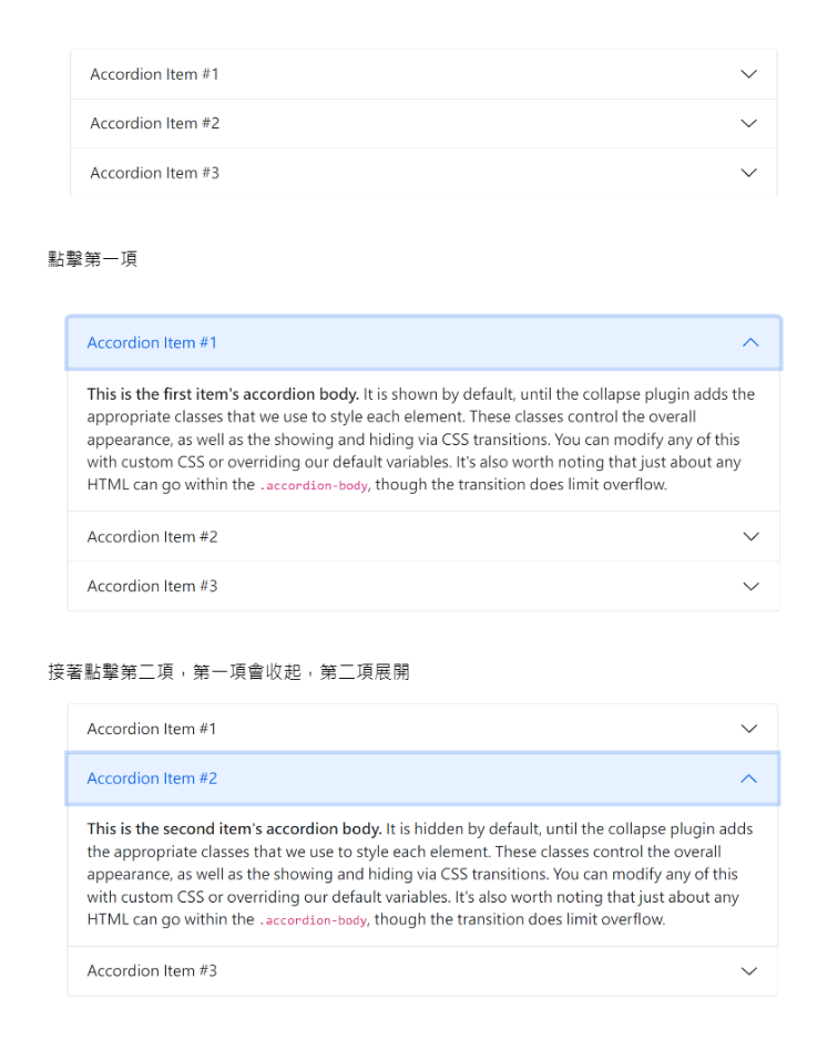
在.accordion加上.accordion-flush 來移除預設 background-color、 外框和圓角使該手風琴能和父容器緊鄰。如圖:
如果在每個.accordion-collapse移除掉(不放)data-bs-parent屬性的話,那它就不再一次只能有一個項目展開了。
小練習: 此CodePen有兩個小地方需要填空,可以試著完成它


 iThome鐵人賽
 看影片追技術