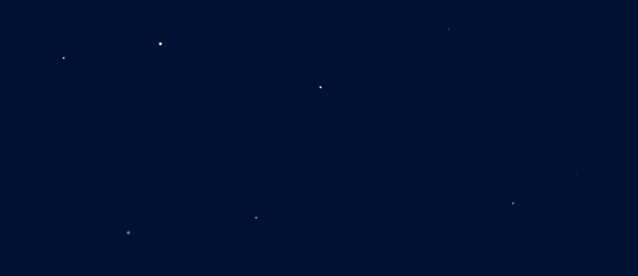
今天要介紹的是,利用css製作星星閃爍的效果
<div class="night-sky">
    <div class="star"></div>
    <div class="star"></div>
    <div class="star"></div>
    <div class="star"></div>
    <div class="star"></div>
    <div class="star"></div>
    <div class="star"></div>
    <div class="star"></div>
    <div class="star"></div>
    <div class="star"></div>
</div>
div,方便為每顆星星設置不同的樣式和動畫設置為全屏深藍色背景,移除外邊距並隱藏滾動條
body {
   margin: 0;
   height: 100vh;
   overflow: hidden;
   background-color: #001133;
}
使用相對定位以便於星星等元素的絕對定位,確保其高度與頁面一致
.night-sky {
    position: relative;
    height: 100%;
}
.star {
   position: absolute;
   background-color: white;
   border-radius: 50%;
   opacity: 0;
   animation: blink 1.5s infinite;
}
.star:nth-child(1) {
   top: 20%; left: 10%; width: 4px; height: 4px; animation-delay: 0s;
}
.star:nth-child(2) {
   top: 50%; left: 30%; width: 6px; height: 6px; animation-delay: 0.5s;
}
.star:nth-child(3) {
   top: 70%; left: 80%; width: 5px; height: 5px; animation-delay: 0.3s;
}
.star:nth-child(4) {
   top: 40%; left: 60%; width: 3px; height: 3px; animation-delay: 0.7s;
}
.star:nth-child(5) {
   top: 80%; left: 20%; width: 7px; height: 7px; animation-delay: 1s;
}
.star:nth-child(6) {
   top: 10%; left: 70%; width: 4px; height: 4px; animation-delay: 0.9s;
}
.star:nth-child(7) {
   top: 30%; left: 50%; width: 5px; height: 5px; animation-delay: 1.2s;
}
.star:nth-child(8) {
   top: 60%; left: 90%; width: 3px; height: 3px; animation-delay: 0.8s;
}
.star:nth-child(9) {
   top: 15%; left: 25%; width: 6px; height: 6px; animation-delay: 1.4s;
}
.star:nth-child(10) {
   top: 75%; left: 40%; width: 4px; height: 4px; animation-delay: 1.1s;
}
@keyframes blink {
    0%, 100% {
        opacity: 0;
   }
   50% {
       opacity: 1;
   }
}


 iThome鐵人賽
 看影片追技術