
在前端的開發日常中,切版佔了工作內容的一半,這是一個看似簡單卻又帶有非常多眉角的工作,尤其 CSS 的繁多屬性中也需要考慮權重和互斥的問題。在 Grafana Scenes 中,以 Dashboard 應用程式為例,內容都是方方正正的 Panel 元件,所以基本上整個 Layout 設計會以 display: flex 或 display: grid 來設定,因此本章節中將向讀者們介紹 Grafana Scenes 提供的 Layout 元件,非常直觀的使用,且只需要引入元件並帶入所需的參數,即可快速為頁面切出整齊劃一的佈局。
在正式進入元件介紹前,需要先了解 Dashboard Layout 是如何建置的:
SceneAppPage 所設定的層級,除此之外的部分才是 getScene 中所呈現的 EmbeddedScene 內容。$variables 等屬性使用,為維持 Grafana 的視覺一致性,如果是使用套件提供的元件則無法做排版設定。EmbeddedScene 的 body 屬性中需要建立的區塊了,使用方法及選擇為以下即將介紹的內容。Grafana Scene 提供的 layout 元件命名非常直觀,例如以 flex 和 grid 為基礎命名。layout 元件的子元件名稱則是在父層屬性後換成 Item,如:SceneFlexLayout、SceneGridLayout、SceneCSSGridLayout、SplitLayout、SceneFlexItem、SceneGridRow、SceneGridItem、SceneCSSGridItem 等。這些命名方式使得使用者光看名稱就能了解元件如何搭配使用。不過,每個元件還有其特殊的屬性,接下來我們將逐一介紹這些元件的特性。
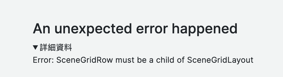
EmbeddedScene 的 body 屬性中如果需要使用上述的元件,必須確保以 Layout 的元件包覆 Item 或 Row 元件,Item 不可獨立產生一個 scene,會出現這樣的錯誤:
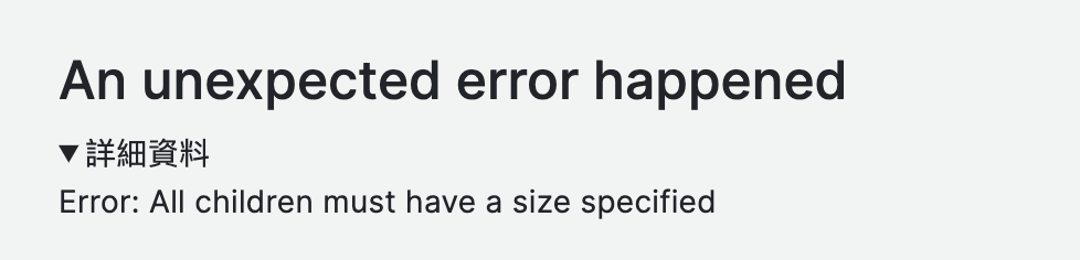
每一種 Layout 元件的 children 需要與其對應的 Item 配對使用,如果錯誤使用則會立刻出現型別錯誤的警告:
這兩個元件是最基礎的搭配,可以想像為 display: flex 的樣式效果,使用瀏覽器的 CSS flexbox Layout 來構建靈活的 Scene,SceneFlexLayout 可以設置 direction( row 或 colume )和 wrap 屬性來控制子元素的排列,而兩者共同的屬性為 width、height、minWidth、minHeight、maxWidth、maxHeight 等尺寸屬性。另外還有幾個特別屬性:
flexGrow: 1 或 alignSelf: 'stretch' 。flexGrow: 0 或 alignSelf: 'flex-start’ 。true
💡NOTICE
在設定高度(minHeight、height)時,如果自身沒有設定,而父層有設定,則會繼承父層的設定。若minHeight沒有設定,則預設為 0;而xSizing和ySizing的預設值為fill。
new SceneFlexLayout({
  children: [
    new SceneFlexItem({
      width: '100%',
      height: 300,
      md: {
        width: '100%',
        height: 200,
      },
      body: PanelBuilders.text().setTitle('Primary').setOption('content', 'Primary').build(),
    }),
  ],
}),
SceneGridLayout 的 children 有兩種模式,可以使用 SceneGridRow 包裹 SceneGridItem,或者直接將 SceneGridItem 作為 children。它是基於瀏覽器的 CSS Grid Layout 來構建的。SceneGridLayout 的最大特點在於其支持拖動(drag)、調整大小(resize)以及懶加載(lazy)功能。這些功能的實現是通過 react-grid-layout 和 react-virtualized-auto-sizer 兩個套件的組合來完成的,他們提供了拖動和調整大小的能力。
需要特別注意的是,children 的寬度和高度是根據 react-grid-layout 的計算方法和 scenes 的預設來設定的,目前無法自定義比例。預設的網格欄數(grid cols)是 24 (GRID_COLUMN_COUNT = 24),因此當寬度設定為滿格時,值為 24;小於 24 的值則會依據 react-grid-layout 的計算方式來決定寬度。
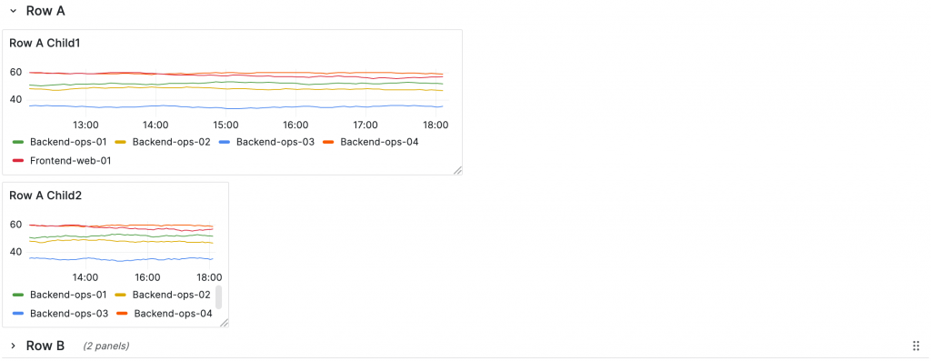
另外 SceneGridRow 有一個 isCollapsed 的屬性可以實現一條 Row 的折疊功能。而 Row 的 isDraggable 功能則是可以在 Row 閉合狀態下拖曳整條 Row,例如下圖的 Row B,所以如果 isCollapsed 為 false isDraggable 為 true 則無法進行拖曳。另外雖然有 isResizable 的屬性,但基本上沒有用處,因為 Layout 會判斷如果 children 是 SceneGridRow 型別,就將 isResizable 設為 false。
children 下的 component 必須有 width 和 height 的設定,否則會無法判斷 layout 需要多少寬高,SceneGridLayout 本身無法設定 width 和 height,但 children 第一層的 component 例如 SceneGridItem 和 SceneGridRow 可以設定 width 和 height,如果 children 第一層有設置,第二層無設定,會直接抓取附層的 width 和 height。
若希望 SceneGridLayout 下的 children 可以拖曳,子元件本身要設定 isDraggable: true ,SceneGridLayout 本身也要設定 isDraggable: true 才有拖曳的功能。
isLazy 為該 scene page 載入時,有懶載入的效果。
new SceneGridLayout({
  isDraggable: true,
  isResizable: true,
  children: [
    new SceneGridRow({
      title: "Row A",
      key: "Row A",
      isCollapsed: true,
      isDraggable: true,
      isResizable: false,
      y: 0,
      x: 0,
      children: [
        new SceneGridItem({
          x: 0,
          y: 1,
          width: 12,
          height: 5,
          isResizable: true,
          isDraggable: true,
          body: PanelBuilders.timeseries().setTitle("Row A Child1").build(),
        }),
      ],
    }),
  ],
});
SceneCSSGridLayout 和 SceneGridLayout 的 CSS 模式一樣,兩者的差別有兩者:
SceneCSSGridLayout 的 CSS 屬性有 autoRows、templateRows、templateColumns、rowGap、columnGap、justifyItems、alignItems 和 justifyContent
repeat(auto-fit, minmax(400px, 1fr))
Split 功能是用來創建可調整大小的分割佈局元件。children 只能使用兩個 SceneFlexItem(primary 和 secondary),並且可以設定分隔的方向和各自的樣式。此外,initialSize 屬性可以用來設定 primary 和 secondary 的切割比例。
這個分割功能需要調整項目的大小,與 SceneGridLayout 不同,這裡的調整大小功能是 Grafana 自建的,並針對 onPointerUp、onPointerDown、onDoubleClick 等瀏覽器事件設定功能。例如,雙擊分隔線可以將比例調整為 1:1。另外,透過 useResizeObserver 監聽容器大小的變化,這樣可以根據螢幕的寬度/高度在窗口調整大小後動態更新比例。
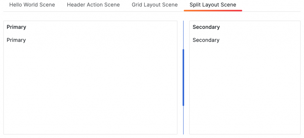
new EmbeddedScene({
  body: new SplitLayout({
    initialSize: 0.7,
    direction: "row",
    primary: new SceneFlexItem({
      minWidth: 300,
      body: PanelBuilders.text().setTitle("Primary").setOption("content", "Primary").build(),
    }),
    secondary: new SceneFlexItem({
      minWidth: 300,
      body: PanelBuilders.text().setTitle("Secondary").setOption("content", "Secondary").build(),
    }),
  }),
});
NestedScene 是一個嵌套式的 SceneObject,如同上面幾個 layout 和 item,如果希望這個 item 中也有 title 和折疊的功能,就可以使用 NestedScene,我們可以將複雜的 layout 拆分為更小的部分,並能夠重複使用已定義的 Scene,提升開發效率和程式碼的可讀性。
SceneNestedScene 本身是一個容器,需要在其 body 屬性中指定要嵌入的 Scene 內容。body 可以是任何符合 SceneLayout 類型的元件。
true 時,嵌入的 Scene 可以被折疊和展開,提供更好的使用者體驗。true 時,使用者可以從父層 layout 中移除該 Scene。new SceneFlexLayout({
direction: 'column',
children: [
getGraphAndTextPanel(),
new SceneFlexItem({
body: new NestedScene({
title: '可折疊的 Nested Scene',
canCollapse: true,
canRemove: true,
body: getGraphAndTextPanel(),
}),
}),
],
});
function getGraphAndTextPanel() {
return new SceneFlexLayout({
children: [
new SceneFlexItem({
body: PanelBuilders.text()
.setTitle('插值示例')
.build(),
}),
],
});
}
筆者語錄
其實對熟悉 CSS 設計的工程師來說,這樣的設計可以快速的上手建置應用程式的 layout,只要依照規則上元件的組合,可以輕鬆打造符合專案需求的 Dashboard 排版,並且確保 UI 的一致性與響應性。希望透過這篇文章,大家能對 Grafana Scenes 的 Layout 有更深入的理解,並在未來的專案中靈活應用。
https://grafana.com/developers/scenes/visualizations
https://github.com/grafana/scenes


 看影片追技術