在現代前端開發中,擁有一個可靠、可重用且類型安全的UI元件庫是提高開發效率和維護性的關鍵。本文將介紹如何使用 TypeScript 和 UnoCSS 來創建一個強大的UI元件庫,並同時整合過去的工具,並利用 Vue 3 的各種特性來實現高度可定製和易於使用的元件。
在本文中,我們將逐步構建以下常用UI元件:
每個元件都將展示如何利用 TypeScript、UnoCSS 和其他工具來創建既美觀又功能強大的UI元件。我們將特別注重可重用性、可維護性、無障礙性和可測試性。
讓我們開始吧!
首先,我們需要建立一個基礎結構來組織我們的UI元件庫。
.
├── README.md
├── bun.lockb
├── index.html
├── package.json
├── public
│   └── vite.svg
├── src
│   ├── App.vue
│   ├── assets
│   │   └── vue.svg
│   ├── components
│   │   ├── Card.vue
│   │   ├── ColorPicker.vue
│   │   ├── ToolTip.vue
│   │   ├── button
│   │   │   ├── Button.vue
│   │   │   ├── DangerButton.vue
│   │   │   ├── PrimaryButton.vue
│   │   │   ├── SafeButton.vue
│   │   │   └── SecondaryButton.vue
│   │   └── input
│   │       ├── TextInputLarge.vue
│   │       ├── TextInputMedium.vue
│   │       └── TextInputSmall.vue
│   ├── main.ts
│   ├── style.css
│   └── vite-env.d.ts
├── tsconfig.json
├── tsconfig.node.json
├── uno.config.ts
└── vite.config.ts
讓我們從最基本的 Button 元件開始。
<script setup lang="ts">
  const { label = 'button' } = defineProps<{
    label?: string;
  }>();

  defineEmits<{
    click: [];
  }>();
</script>

<template>
  <button
    :aria-label="label"
    @click.prevent="$emit('click')"
    border-none
    px-3
    py-2
    rounded-md
    cursor-pointer
    box-border
    text="hover:white"
    bg="blue-400
    hover:blue-800"
  >
    <slot></slot>
  </button>
</template>
在這個 Button 元件中,我們使用了 TypeScript 來定義 props 和 emits,確保類型安全。
並且個人在設計按鈕時,個人講求簡單,這樣無論未來展開還是擴充都很方便,樣式的部分我會分開來視為不同的 component 做使用,
理由是我希望遵守 sfc(single-file-component) ,單一元件實現單一功能就好
<script setup lang="ts">
import DangerButton from './components/ui/DangerButton.vue';
import PrimaryButton from './components/ui/PrimaryButton.vue';
import SafeButton from './components/ui/SafeButton.vue';
import SecondaryButton from './components/ui/SecondaryButton.vue';
</script>
<template>
<main px-6 py-4>
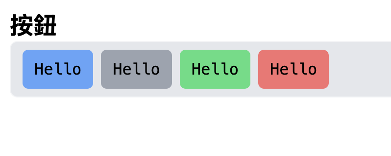
<h3 text-2xl font-bold>按鈕</h3>
<div flex items-center gap-x-2 data-testid="area" rounded-lg px-3 py-2 border="solid 1px gray-100" bg-gray-200>
<PrimaryButton>Hello</PrimaryButton>
<SecondaryButton>Hello</SecondaryButton>
<SafeButton>Hello</SafeButton>
<DangerButton>Hello</DangerButton>
</div>
</main>
</template>
接下來,讓我們創建一個可重用的 Input 元件
<script setup lang="ts">
  import { useId } from 'vue';

  const { id = useId(), isShowLabel = true, errorMessage = '', disabled = false } = defineProps<{
    label: string;
    id?: string;
    isShowLabel?: boolean;
    errorMessage?: string;
    disabled?: boolean;
  }>();

  const errorID = useId();
  const modelValue = defineModel<string | number>({ default: '' });
</script>

<template>
  <div>
    <label v-show="isShowLabel" :for="id">{{ label }}</label>
    <input
      w-full
      px-2 py-1
      rounded-md
      outline-none
      shadow-lg
      :aria-describedby="errorMessage ? errorID : undefined"
      :id :disabled
      v-model="modelValue"
    />
    <span v-show="errorMessage" :id="errorID">{{ errorMessage }}</span>
  </div>
</template>
也一樣,input 元件我們以簡單為主,並且根據不同大小進行擴充分別建立 TextInputSmall, TextInputMedium, TextInputLarge
的元件分別進行管理
<script setup lang="ts">
import { shallowRef } from 'vue';
import TextInputSmall from './components/input/TextInputSmall.vue';
import TextInputMedium from './components/input/TextInputMedium.vue';
import TextInputLarge from './components/input/TextInputLarge.vue';

const textInputResult = shallowRef<string>('');
</script>

<template>
  <main px-6 py-4 space-y-4>
    <h3 text-2xl font-bold>輸入框</h3>
    <div flex items-center gap-x-2  data-testid="area" rounded-lg px-3 py-2 border="solid 1px gray-100" bg-gray-200>
      <div flex items-start gap-x-4>
        <TextInputSmall label="Small Input" v-model="textInputResult" />
        <TextInputMedium label="Medium Input" v-model="textInputResult" />
        <TextInputLarge label="Large Input" v-model="textInputResult" />
      </div>
      <div v-show="textInputResult !== ''" data-testid="sample" rounded-lg px-3 py-2 border="solid 1px red-500" bg-red-200>
        {{ textInputResult }}
      </div>
    </div>
  </main>
</template>

<style lang="postcss">
html, body {
  padding: 0;
  margin: 0;
}

* {
  box-sizing: border-box;
  @apply font-mono;
}
</style>

Card 元件是一個常用的容器元件,讓我們來實現它。
<script setup lang="ts">
  const { testID = 'card' } = defineProps<{
    testID?: string;
  }>();
</script>

<template>
  <div :data-testid="testID" px-6 py-4 rounded-md shadow-xl bg-gray-100>
    <slot></slot>
  </div>
</template>```

這個 Card 元件非常簡單,通常當作 Layout 使用即可,以下範例

```html
<Card>
  <article aria-label="這是卡片區塊" grid="~ cols-4" gap-x-8>
    <div col-span-1 data-testid="round" w-full aspect-square bg-cover bg-center bg-no-repeat rounded-full bg-blue-400 overflow-hidden style="background-image: url('https://encrypted-tbn0.gstatic.com/images?q=tbn:ANd9GcSGxg4vdRumipbFU9v65Vjjez5poSzdu415uA&s')" />
    <section col-span-3 space-y-4>
      <h3 text-2xl font-bold>好澀喔~~~</h3>
      <p text-wrap>If you're visiting this page, you're likely here because you're searching for a random sentence. Sometimes a random word just isn't enough, and that is where the random sentence generator comes into play. By inputting the desired number, you can make a list of as many random sentences as you want or need. Producing random sentences can be helpful in a number of different ways. For writers, a random sentence can help them get their creative juices flowing. Since the topic of the sentence is completely unknown, it forces the writer to be creative when the sentence appears. There are a number of different ways a writer can use the random sentence for creativity. The most common way to use the sentence is to begin a story. Another option is to include it somewhere in the story. A much more difficult challenge is to use it to end a story. In any of these cases, it forces the writer to think creatively since they have no idea what sentence will appear from the tool.</p>
    </section>
  </article>
</Card>

Tooltip 是一個需要處理定位和交互的更複雜的元件。我們可以使用 Vue 3 的 Teleport 和 @vueuse/core 來實現它。但我不要....我想用 popover web api 去實現。
<script setup lang="ts">
  import { useId, watch, useTemplateRef, computed } from 'vue';

  const { anchorName = 'tooltip' } = defineProps<{
    anchorName?: string;
  }>();
  const id = useId();
  const customToolTip = useTemplateRef<HTMLDivElement>('tooltip');
  const isShow = defineModel<boolean>({ default: false });

  const anchor = computed<string>(() => `--${anchorName}`);
  const anchorLeft = computed<string>(() => `anchor(--${anchorName} left)`);
  const anchorBottom = computed<string>(() => `anchor(--${anchorName} bottom)`);

  watch(isShow, (currentShow) => {
    const toolTip = customToolTip.value;
    if (toolTip === null) return;
    if (currentShow) {
      toolTip.showPopover();
      return;
    }
    toolTip.hidePopover();
  });
</script>

<template>
  <div ref="tooltip" :id px-3 py-2 rounded-lg bg-gray-700 text-white shadow-lg popover="manual" m-0 mt-2 p-0 class="my-tooltip tooltip-popover">
    <slot />
  </div>
</template>

<style scoped>
.my-tooltip {
  position-anchor: v-bind(anchor);
  inset-block-start: v-bind(anchorBottom);
  inset-inline-start: v-bind(anchorLeft);
}

@keyframes fadeIn {
  from {
    opacity: 0;
  }
  to {
    opacity: 1;
  }
}

.tooltip-popover {
  animation: fadeIn 0.3s ease-in-out;
}
</style>
這個 Tooltip 元件使用了 popover 處理,使用方法如下
<div>
  <h3 text-2xl font-bold>ToolTip</h3>
  <SecondaryButton style="anchor-name: --tooltip;" @click="toggleToolTip">This is Tool Tip</SecondaryButton>
  <ToolTip v-model="isShowToolTip">hello</ToolTip>
</div>
(todo:)
最後,讓我們實現一個 ColorPicker 元件。
<script setup lang="ts">
import { useEyeDropper } from '@vueuse/core';
import { computed, onMounted, ref, shallowRef, watch, useTemplateRef } from 'vue';

// type::
interface RGB {
  r: number
  g: number
  b: number
}

interface HSV {
  h: number
  s: number
  v: number
}

const defaultColors = [
  '#EC5428',
  '#F19135',
  '#FAD649',
  '#A6EA99',
  '#5BCBCF',
  '#4191F7',
  '#B73082',
  '#E77F61',
  '#EF7F31',
  '#F5D348'
] as const;
type DefaultColors = (typeof defaultColors)[number];

interface SlidePosition {
  top: string
}

// props & emits
const { initColor = '#409EFF' } = defineProps<{
   initColor?: string
}>();

const emit = defineEmits<{
  click: [];
  'update:initColor': [color: string];
  'update:color': [color: string];
}>();

const { open, sRGBHex } = useEyeDropper();

const isShowColorPicker = shallowRef(false);
const colorBlock = useTemplateRef<HTMLCanvasElement>('colorBlock');
const colorHue = useTemplateRef<HTMLCanvasElement>('colorHue');

const slidePos = ref<SlidePosition>({
  top: '0px'
});

const currentColor = computed<string>({
  get() {
    return initColor;
  },
  set(nV) {
    emit('update:initColor', nV);
  }
});

// render hue
const renderHueColor = () => {
  const canvas = colorHue.value;
  if (!canvas)
    return;
  const ctx = canvas.getContext('2d', {
    willReadFrequently: true
  })!;
  const { width: w, height: h } = canvas;
  const grd = ctx.createLinearGradient(0, 0, 0, h);
  grd.addColorStop(0, '#FF0000'); // red
  grd.addColorStop(1 / 6, '#FF00FF'); // purple
  grd.addColorStop(2 / 6, '#0000FF'); // blue
  grd.addColorStop(3 / 6, '#00FFFF'); // green
  grd.addColorStop(4 / 6, '#00FF00'); // green
  grd.addColorStop(5 / 6, '#FFFF00'); // yellow
  grd.addColorStop(1, '#FF0000'); // red
  ctx.fillStyle = grd;
  ctx.fillRect(0, 0, w, h);
};
// render block
const renderBlockColor = (color: string) => {
  const canvas = colorBlock.value;
  if (!canvas)
    return;
  const ctx = canvas.getContext('2d', {
    willReadFrequently: true
  })!;
  const { width: w, height: h } = canvas;
  ctx.fillStyle = color;
  ctx.fillRect(0, 0, w, h);
  // fill white
  ctx.fillStyle = createLinearGrd(ctx, 'rgba(255,255,255,1)', 'rgba(255,255,255,0)', w, null);
  ctx.fillRect(0, 0, w, h);
  // fill black
  ctx.fillStyle = createLinearGrd(ctx, 'rgba(0,0,0,0)', 'rgba(0,0,0,1)', null, h);
  ctx.fillRect(0, 0, w, h);
};

// createLinearGradient
const createLinearGrd = (ctx: CanvasRenderingContext2D, color1: string, color2: string, w: number | null, h: number | null) => {
  const grd = ctx.createLinearGradient(0, 0, w || 0, h || 0);
  grd.addColorStop(0, color1);
  grd.addColorStop(1, color2);
  return grd;
};

const selectHue = (e: MouseEvent) => {
  if (!(e.target instanceof HTMLCanvasElement))
    return;
  const canvas = colorHue.value;
  if (!canvas)
    return;
  const { top: hueTop, height: h } = canvas.getBoundingClientRect();
  const ctx = e.target.getContext('2d', {
    willReadFrequently: true
  })!;
  const mousemove = (e: MouseEvent) => {
    let y = e.clientY - hueTop;
    if (y < 0)
      y = 0;
    if (y > h)
      y = h;
    slidePos.value = { top: `${y - 2}px` };
    const imgData = ctx.getImageData(0, Math.min(y, h - 1), 1, 1);
    const [r, g, b] = imgData.data;
    renderBlockColor(rgbToHex(r, g, b));
  };
  mousemove(e);
  const mouseup = () => {
    document.removeEventListener('mousemove', mousemove);
    document.removeEventListener('mouseup', mouseup);
  };
  document.addEventListener('mousemove', mousemove);
  document.addEventListener('mouseup', mouseup);
};

// select color
const selectColor = (color: string) => {
  currentColor.value = color;
  renderBlockColor(color);
  renderSlide();
};

// check input is hex unit
const confirm = () => {
  if (/^#?([a-f0-9]{6}|[a-f0-9]{3})$/i.test(currentColor.value)) {
    selectColor(currentColor.value);
    emit('update:color', currentColor.value);
    isShowColorPicker.value = false;
  }
  else {
    alert('not hex');
  }
};

const openEye = () => open();

const renderSlide = () => {
  const hsv = rgbToHsv(hexToRgb(currentColor.value));
  const pos = (1 - hsv.h / 360) * 180; // 180 = canvas height
  slidePos.value = {
    top: `${pos}px`
  };
};

const rgbToHex = (r: number, g: number, b: number) => {
  const toHex = (c: number) => {
    const hex = c.toString(16);
    return hex.length === 1 ? `0${hex}` : hex;
  };

  return `#${toHex(r)}${toHex(g)}${toHex(b)}`;
};

const hexToRgb = (hex: string) => {
  const r = Number.parseInt(hex.substring(1, 3), 16);
  const g = Number.parseInt(hex.substring(3, 5), 16);
  const b = Number.parseInt(hex.substring(5, 7), 16);
  return { r, g, b };
};

const rgbToHsv = (rgb: RGB): HSV => {
  const { r, g, b } = rgb;
  const max = Math.max(r, g, b);
  const min = Math.min(r, g, b);
  const delta = max - min;

  let h = 0;
  let s = 0;
  const v = max / 255;

  if (delta !== 0) {
    s = delta / max;

    if (r === max) {
      h = (g - b) / delta + (g < b ? 6 : 0);
    }
    else if (g === max) {
      h = (b - r) / delta + 2;
    }
    else {
      h = (r - g) / delta + 4;
    }

    h *= 60;
  }

  return { h, s, v };
};

onMounted(() => {
  renderHueColor();
  selectColor(currentColor.value);
});

watch(sRGBHex, (nV) => {
  currentColor.value = nV;
});
</script>

<template>
  <div relative h-8 w-8 rounded-md border="1px solid #E6E6E6">
    <button
      :style="{ 'background-color': currentColor }"
      border="1px solid #909399"
      absolute
      bottom-0
      left-0
      right-0
      top-0
      m-auto
      h-6
      w-6
      cursor-pointer
      rounded
      outline-none
      @click="isShowColorPicker = !isShowColorPicker"
    />
    <div v-show="isShowColorPicker" id="color-picker" w-320px flex flex-col gap-8px rounded p-10px border="1px solid #E4E7ED">
      <div flex gap-8px>
        <div relative h-180px w-280px>
          <canvas ref="colorBlock" width="280" height="180" />
        </div>
        <div relative h-180px w-12px @mousedown.prevent.stop="selectHue">
          <canvas ref="colorHue" cursor-pointer width="12" height="180" />
          <div :style="slidePos" left="1/2" translate-x="-1/2" bg="#F0F0F0" h-4px w-14px rounded border="1px solid base" />
        </div>
      </div>
      <div flex gap-10px>
        <div
          v-for="(defaultColor, idx) in defaultColors"
          :key="idx"
          cursor-pointer
          rounded
          :style="{ 'background-color': `${defaultColor}` }"
          @click="selectColor(defaultColor)"
        />
      </div>
      <div flex items-center gap-10px>
        <span>HEX</span>
        <input v-model="currentColor" type="text" placeholder="#409EFF" py-2px outline-none border="1px solid base">
        <button border="1px solid base" cursor-pointer rounded px-12px py-2px outline-none @click="openEye">
          eye
        </button>
        <button border="1px solid base" cursor-pointer rounded px-12px py-2px outline-none @click="confirm">
          OK
        </button>
      </div>
    </div>
  </div>
</template>```

這個 ColorPicker 元件使用了 Canvas 還有 `eyeDropper` 處理,使用方法如下

```html
<template>
  import { shallowRef } from 'vue';
  const color = shallowRef('#409EFF');
</template>

<div>
  <h3 text-2xl font-bold>Color picker</h3>
  <ColorPicker v-model:initColor="color" />
  <div data-testid="area" rounded-lg px-3 py-2 :style="`background-color:${color}`">
    現在的顏色 : {{ color }}
  </div>
</div>

在本文中,我們成功地使用 TypeScript 和 UnoCSS 創建了一個全面的UI元件庫。我們實現了 Button、Input、Card、Tooltip 、ColorPicker 等常用元件,並充分利用了 Vue 3 的各種特性。
補充:筆者本來要寫9個元件像是 客製化的 Modal 還有 DateTimePicker, Alert 等,但考量到版面問題會超過千行,還有有些元件值得分割,所以規劃為三個簡單元件,一個中等元件,一個困難元件
如果,筆者未來有機會得獎出書在考慮把剩下的元件補充在書本中,包含 ToolTip 用 Teleport 的寫法。
在實際項目中使用這些元件時,你可能需要根據具體需求進行進一步的定制和擴展。例如,你可能想要添加更多的主題選。

 看影片追技術