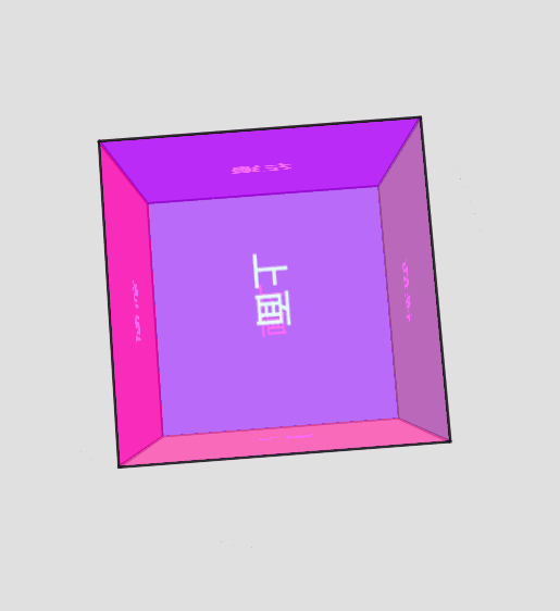
這篇文章要介紹如何創建一個透明的立方體,裡面顯示不同的顏色,需要使用 perspective 和 transform
創建一個名為 scene 的容器,裡面包含一個名為 cube 的立方體,每個面都用 div 標籤表示,並使用 face 類別進行樣式設置。
每個面都有各自的方向(前、後、左、右、上、下)並包含相應的文字標籤。
<div class="scene">
    <div class="cube">
        <div class="face front">前</div>
        <div class="face back">後</div>
        <div class="face left">左邊</div>
        <div class="face right">右邊</div>
        <div class="face top">上面</div>
        <div class="face bottom">下面</div>
    </div>
</div>
使用 Flexbox 將 body 的內容在垂直和水平上居中,及利用 height設置高度,佔滿整個視窗
body {
  display: flex;
  justify-content: center;
  align-items: center;
  height: 100vh;
  margin: 0;
  background-color: #e0e0e0;
}
.scene 是立方體的容器,設置為 200 像素的寬和高
.scene {
  width: 200px;
  height: 200px;
  perspective: 600px;
}
.cube {
  width: 100%;
  height: 100%;
  position: relative;
  transform-style: preserve-3d;
  animation: rotate 10s infinite linear;
}
rotate 的動畫,持續 10 秒並無限循環
使用 Flexbox 讓中心對齊,文字大小為 24 像素,每個面都有2像素的黑色邊框
.face {
  position: absolute;
  width: 200px;
  height: 200px;
  opacity: 0.8;
  border: 2px solid #000;
  display: flex;
  justify-content: center;
  align-items: center;
  font-size: 24px;
  font-weight: bold;
  color: white;
}
背景為紅色,並平移到 Z 軸 的 100 像素位置
.front {
  background-color: rgba(255, 0, 0, 0.7)
  transform: translateZ(100px);
}
背景為綠色,並在 Y軸上旋轉 180度,然後平移到 Z軸的100像素位置
.back {
  background-color: rgba(0, 255, 0, 0.7);
  transform: rotateY(180deg) translateZ(100px);
}
背景為藍色,並在Y軸上旋轉 -90度,然後平移到Z軸的100像素位置
.left {
  background-color: rgba(0, 0, 255, 0.7);
  transform: rotateY(-90deg) translateZ(100px);
}
背景為黃色,並在Y軸上旋轉90度,然後平移到Z軸的100像素位置
.right {
  background-color: rgba(255, 255, 0, 0.7);
  transform: rotateY(90deg) translateZ(100px);
}
背景為品紅色,並在X軸上旋轉90度,然後平移到Z軸的100像素位置
.top {
  background-color: rgba(255, 0, 255, 0.7);
  transform: rotateX(90deg) translateZ(100px);
}
背景為青色,並在X軸上旋轉 -90度,然後平移到Z軸的100像素位置
.bottom {
  background-color: rgba(0, 255, 255, 0.7);
  transform: rotateX(-90deg) translateZ(100px);
}
用@keyframes定義一個動畫,從 rotateX(0)、rotateY(0) 變到 rotateX(360deg)、rotateY(360deg),使立方體在 X 和 Y 軸上持續旋轉
@keyframes rotate {
  from {
      transform: rotateX(0) rotateY(0);
  }
  to {
      transform: rotateX(360deg) rotateY(360deg);
  }
}


 iThome鐵人賽
 看影片追技術