在 ggplot2 的語法設計中,aesthetic(美學映射) 就像是數據的化妝術。
透過它,使用者可以決定資料變數如何轉換成圖表上的顏色、形狀、線條或位置。
沒有 aes(),圖表就像素顏般單調;有了 aes(),數據才真正展現出它的樣貌。
在 ggplot2 中,aes() 是最核心的設定,以下是常見的引數(arguments):
這些美學映射可以放在最外層 ggplot() 裡(全域設定),也可以放在 geom_xxx() 裡(局部設定),依情境自由運用。
以下範例展示如何用最精簡的程式碼,繪製「不同來源的電廠在各年度煤及煤產品耗用量」的折線圖。
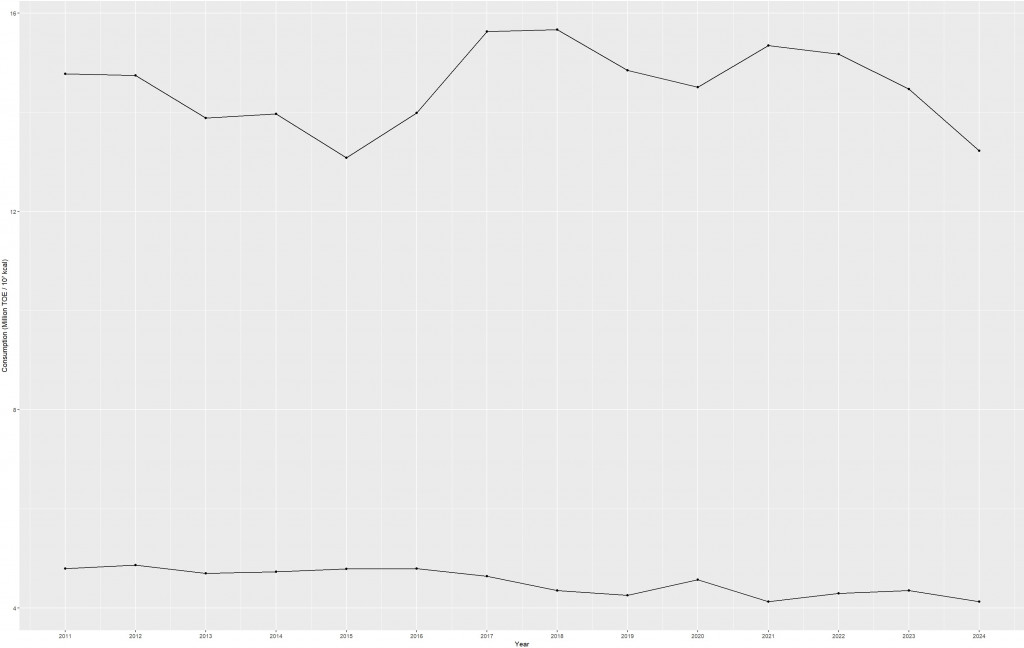
資料來源為台灣經濟部能源署(https://www.esist.org.tw/),內容涵蓋 2011 年至 2024 年間煤及煤產品於發電用途上的耗用數據。
此處在 aes() 中映射:x = 年份(Year)、y = 耗用量(Consumption,並換算為百萬單位)、group = 發電來源(Source);再搭配 geom_line() 與 geom_point(),即可呈現台電與民營電廠在 2011–2024 年間的耗用狀況。
ggplot(data = Cons,
       aes(x = Year,
           y = Consumption / 1e6,
           group = Source)) +
  geom_line() +
  geom_point() +
  scale_x_continuous(breaks = seq(2011, 2024, 1)) +
  labs(y = "Consumption (Million TOE / 10⁷ kcal)")
延續上述例子,進一步加入 color 與 shape 的映射:
color = Source → 不同來源使用不同顏色區分shape = Source → 點的形狀亦根據來源改變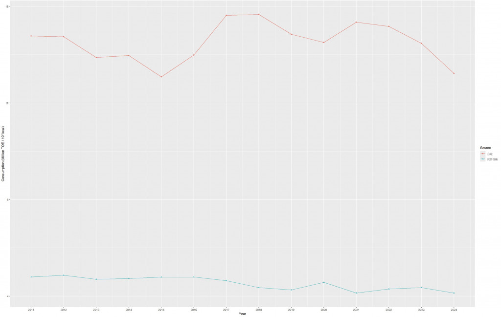
這裡可以看到 aes() 同時出現在 ggplot() 主層 與 geom_point() 子層,代表能針對不同圖層設定不同的美學屬性。
ggplot(data = Cons,
       aes(x = Year,
           y = Consumption / 1e6,
           group = Source,
           color = Source)) +
  geom_line() +
  geom_point(aes(shape = Source)) +
  scale_x_continuous(breaks = seq(2011, 2024, 1)) +
  labs(y = "Consumption (Million TOE / 10⁷ kcal)")
這張圖不僅清楚比較不同來源在 2011–2024 年 的耗用情況,也展現 aes(color = Source) 如何幫助我們直觀分辨資料來源。
group 與 color?在這個例子裡,group 與 color 是關鍵:
group = Source
告訴 ggplot2:不同來源(台電、民營電廠)的資料要各自連線。若缺少 group,所有點可能被視為同一組而錯接成一條「大亂線」。
color = Source
在分組正確的前提下,再以顏色加強視覺辨識。若只有 group 沒有 color,雖能正確分線,但讀者難以快速區分來源。
簡單來說:
group 解決「線要怎麼連」
color 解決「誰是誰的辨識問題」
兩者搭配,才能得到正確又好讀的折線圖。
aes() 是 數據與圖表的橋樑:
geom_xxx() 對應的映射(位置、顏色、大小、形狀、線型……),讓數據的故事更清晰。This article introduces aesthetic mapping (aes) in ggplot2 as the bridge between data and its visual expression. With aes(), variables are mapped to visual properties such as position (x, y), color, shape, size, and line type, while group determines how observations are connected or partitioned. Using coal and coal-product consumption for power generation in Taiwan (2011–2024) from the Bureau of Energy as an example, we show how a few lines of code produce a multi-series line chart. The first example maps years to the x-axis, consumption to the y-axis (scaled to millions), and groups by source to draw separate lines. The second example adds color and shape mappings to improve readability and quick identification of sources. The results indicate that Taiwan Power Company consistently consumes more coal than independent power producers, peaking around 2017–2018, while IPPs (Independent Power Producers) remain relatively stable. We emphasize why group and color matter: group ensures the correct connection of points within each source, and color provides immediate visual distinction. Together, they produce a clear, interpretable trend visualization that demonstrates how aesthetic mapping is essential for accurate and effective storytelling with data.


 iThome鐵人賽