在 ggplot2 中,分面 (Facets) 是非常重要的核心元素之一,能協助我們將資料依照分類變數進行拆分與比較。這對於含有多個類別屬性的資料分析特別有幫助。
本日延續 ggplot2 內建的 diamonds 資料,固定 Cut 車工 為 Ideal,並限定在 1–2 克拉 的情況下,觀察 Carat (克拉)、Color (顏色等級)、Clarity (淨度) 與 Price (價格) 的關係。
library(tidyverse)

data(diamonds)

diam_Ideal_color_grade <- diamonds %>%
  filter(cut == "Ideal", between(carat, 1, 2)) %>%
  rename(color_grade = color)
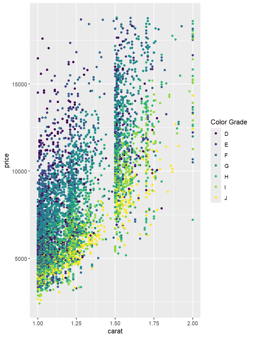
在沒有分面下,顯示價格與克拉數之間的關係,並依照顏色等級呈現不同顏色。
ggplot(diam_Ideal_color_grade, aes(x = carat, y = price, color = color_grade)) +
  geom_point() +
  labs(color = "Color Grade")
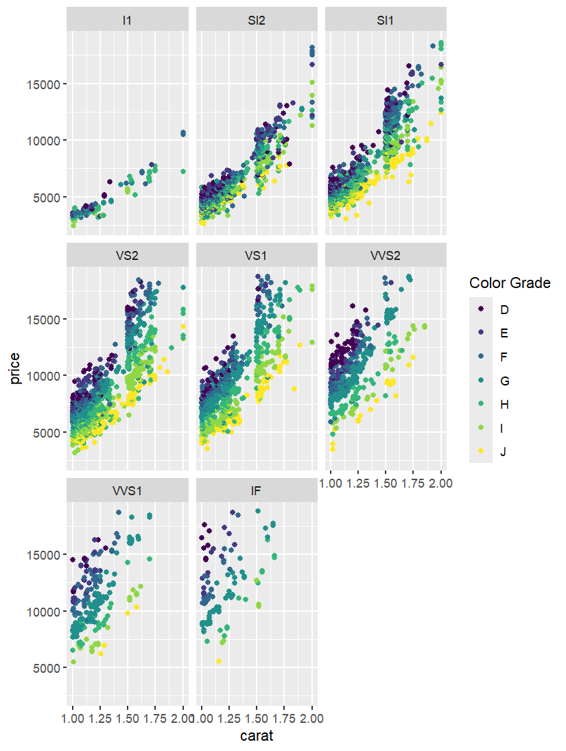
採用facet_wrap argument, 根據Clarity 淨度,將散點圖分開,可以觀察到不同淨度下,克拉數,顏色等級與價格的關係。
ggplot(diam_Ideal_color_grade, aes(x = carat, y = price, color = color_grade)) +
  geom_point() +
  facet_wrap(~ clarity) +
  labs(color = "Color Grade")
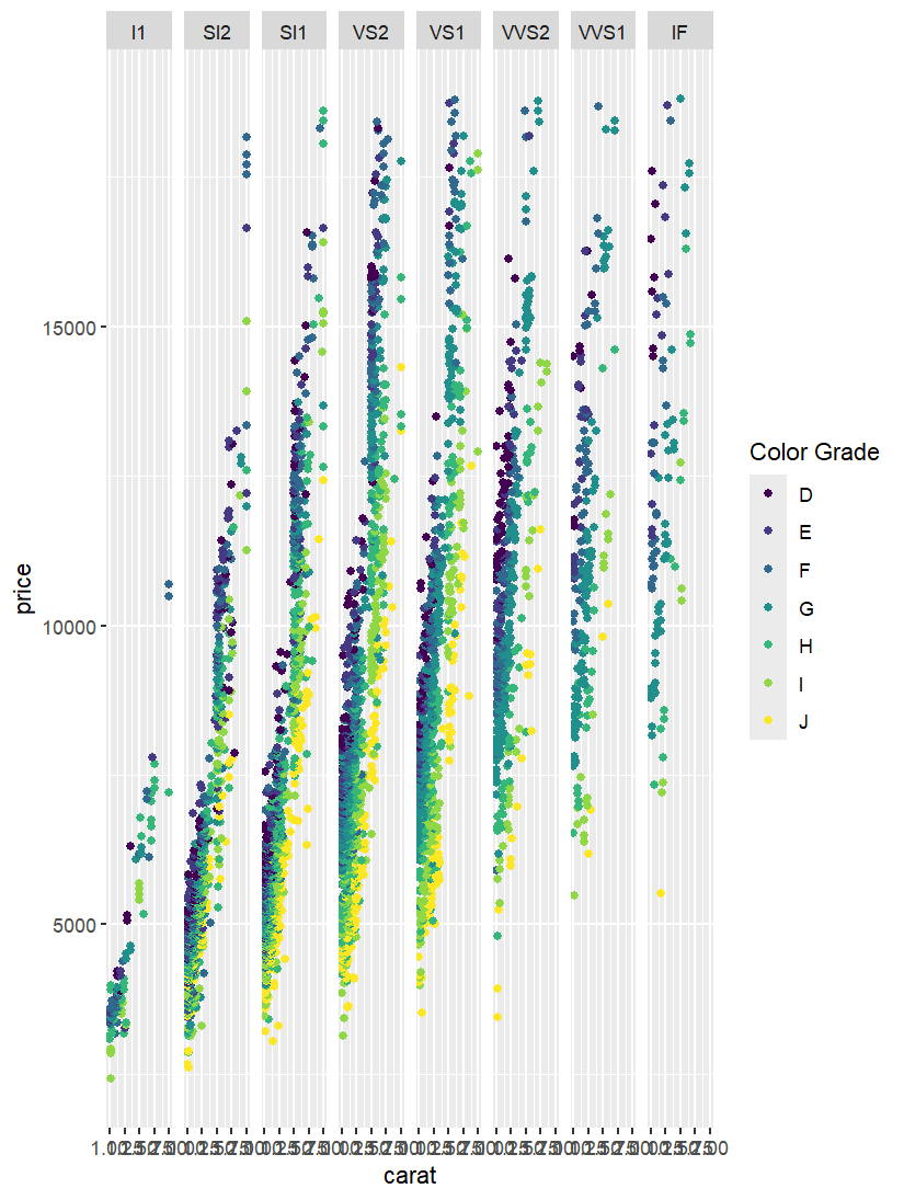
採平行排列,更方便橫向比較不同淨度間的差異。
ggplot(diam_Ideal_color_grade, aes(x = carat, y = price, color = color_grade)) +
  geom_point() +
  facet_grid(~ clarity) +
  labs(color = "Color Grade")
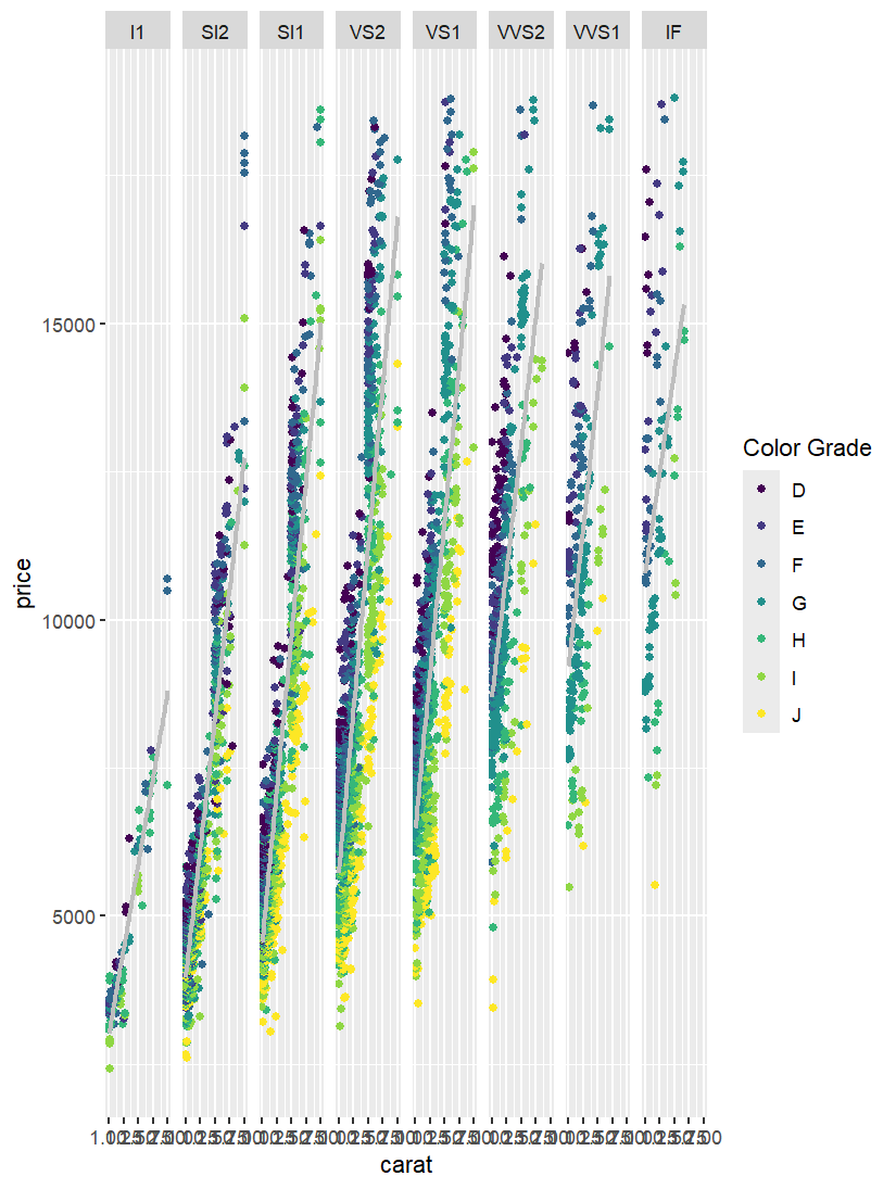
為了觀察每個分隔圖中觀察值的趨勢,加上迴歸線更明顯呈現出價格與克拉數之間的關係。
ggplot(diam_Ideal_color_grade, aes(x = carat, y = price, color = color_grade)) +
  geom_point() +
  geom_smooth(aes(group = 1), method = "lm", se = FALSE, color = "grey") +
  facet_grid(~ clarity) +
  labs(color = "Color Grade")
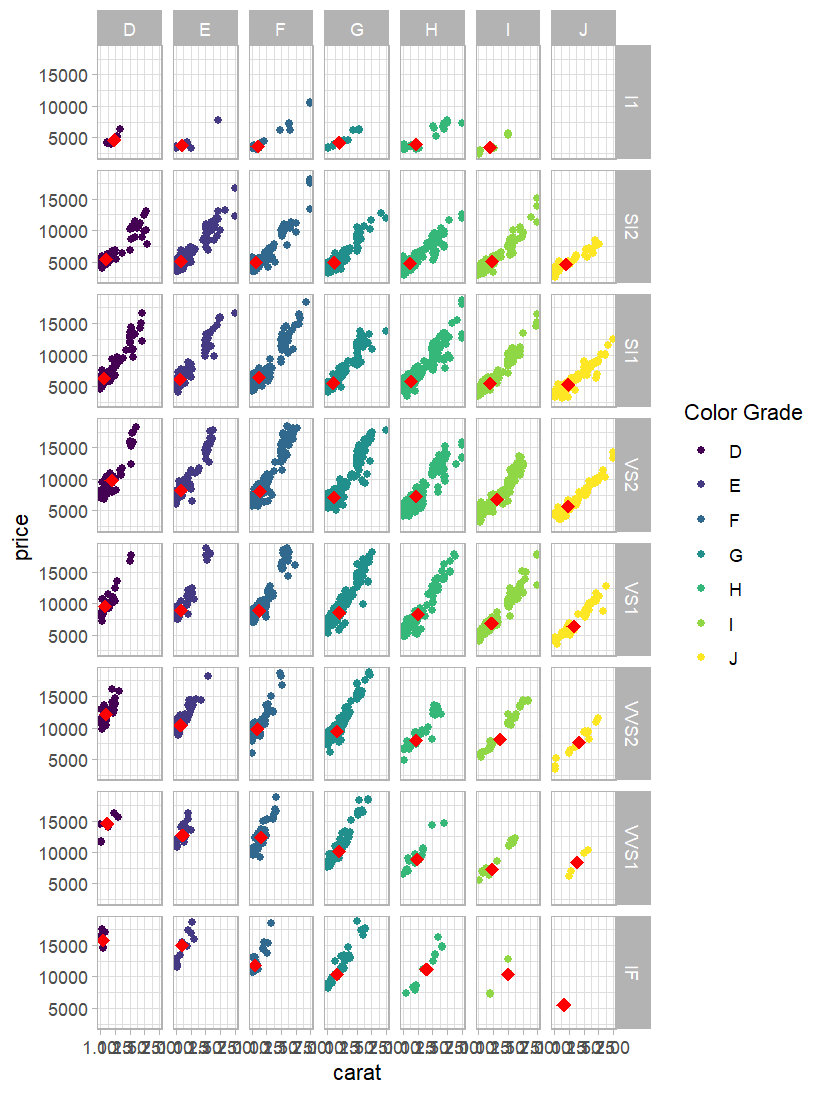
在每個分隔圖中加入 中位數 (紅色菱形)。更清楚呈現數據的集中趨勢,並便於比較不同組合下的分布。
median_data <- diam_Ideal_color_grade %>%
  group_by(clarity, color_grade) %>%
  summarise(med_carat = median(carat),
            med_price = median(price), .groups = "drop")

ggplot(diam_Ideal_color_grade, aes(x = carat, y = price, color = color_grade)) +
  geom_point() +
  geom_point(data = median_data, aes(x = med_carat, y = med_price),
             inherit.aes = FALSE, size = 3, shape = 18, color = "red") +
  facet_grid(clarity ~ color_grade) +
  labs(color = "Color Grade") +
  theme_light()
分面 (Facets) 能在多分類變數下有效展現數據結構,幫助我們清楚比較不同群組的差異。然而,當分類數量過多時,圖表可能變得過於繁雜,降低可讀性。因此,應根據分析目的,謹慎選擇分面變數。
In this post, I explore the use of faceting in ggplot2 to enhance the visualization of categorical information within the diamonds dataset. By fixing the cut to Ideal and focusing on diamonds between 1 and 2 carats, I examine the relationships among carat, color grade, clarity, and price.
The first example demonstrates a scatter plot without faceting, highlighting the strong positive correlation between carat and price, while also showing that color grade significantly affects diamond value. In the second example, I apply facet_wrap(~ clarity), which separates the plot by clarity levels, allowing us to observe that higher clarity tends to increase prices, in addition to the previously identified patterns.
Next,I switch to facet_grid(~ clarity) for a cleaner horizontal comparison across clarity groups. Adding regression lines in the fourth example further emphasizes the strong and consistent relationship between carat and price across all clarity levels.
Finally,I use facet_grid(clarity ~ color_grade) to display both clarity and color simultaneously. Median points are added to each panel, enabling clearer insights into the central tendencies of each subgroup. Overall, facets provide a powerful tool for dissecting and interpreting complex data, though caution is needed to maintain readability when dealing with many categories.

