在 ggplot2 裡,每一張圖是由多個「圖層 (layer)」堆疊而成。
這些圖層不僅限於幾何圖形 (geoms),也可以是文字、註解、統計資訊等。
使用者可以依照需求與想要強調的內容,持續增加圖層,讓圖表更完整、更有說服力。
圖層的核心元素包含:
使用 ggplot2 內建的 diamonds 資料,挑選 切工為 Ideal,重量在 1.25–1.75 carat 之間 的鑽石,並比較不同純淨度 (clarity) 的價格分布。
小提醒:這裡有用到一些資料前處理的流程,透過 tidyverse 中的 dplyr 套件完成。tidyverse 是 R 裡非常實用的套件組合。
library(tidyverse)

data(diamonds)

diam_Ideal <- diamonds %>%
  filter(cut == "Ideal", between(carat, 1.25, 1.75))

ggplot(data = diam_Ideal,
       aes(x = clarity, y = price)) +
  geom_boxplot()
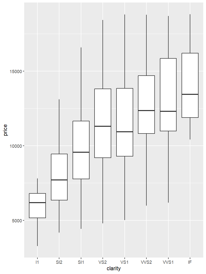
這是一個最基本的圖層組合:資料 + 美學映射 + 箱型圖。
在範例 1 的基礎上,我們再加上一層散布點,讓每個觀測值的分布更清楚呈現。
ggplot(data = diam_Ideal,
       aes(x = clarity, y = price)) +
  geom_boxplot() +
  geom_jitter(width = 0.1, color = "#1b98e0")
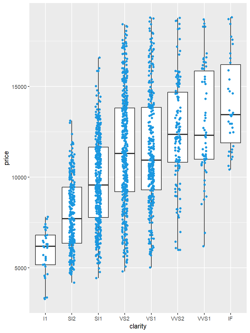
這裡的 geom_jitter() 就是另一個圖層,透過隨機抖動避免點重疊,讓視覺效果更直觀。
圖層不只限於圖形,還能加入統計數字與自訂註解。
ggplot(data = diam_Ideal,
       aes(x = clarity, y = price)) +
  geom_boxplot() +
  geom_jitter(width = 0.1, color = "#1b98e0") +
  stat_summary(fun = mean,
               geom = "point",
               color = "red",
               size = 6,
               shape = 15) +
  annotate(geom = "text",
           x = 5,
           y = 1000,
           label = "Plot with the annotation",
           size = 5,
           color = "blue")
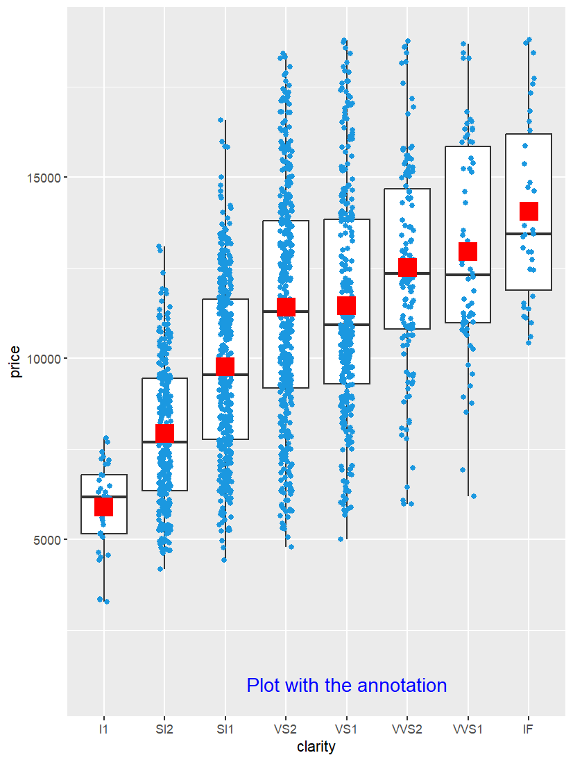
這裡:
stat_summary() 用紅色方塊標示 平均值 (mean)。annotate() 插入自訂文字,補充解釋。這樣的組合讓圖表同時呈現 分布 + 個別點 + 統計資訊 + 註解,資訊更完整。
在 ggplot2 中,所有圖層的底層建構函數是 layer():
layer(
  geom = NULL,
  stat = NULL,
  data = NULL,
  mapping = NULL,
  position = NULL,
  params = list(),
  inherit.aes = TRUE,
  ...
)
"point", "boxplot")"identity", "count")head)"jitter")👉 常用的 geom_*() 與 stat_*() 其實就是 layer() 的包裝,讓我們快速建構圖層。
例如:
ggplot(mpg, aes(displ, hwy)) + geom_point()
等同於:
ggplot(mpg, aes(displ, hwy)) +
  layer(geom = "point", stat = "identity", position = "identity",
        params = list(na.rm = FALSE))
換句話說,geom_xxx() 是 layer() 的簡化版本。
只有在需要自訂 geom/stat 的時候,才需要直接呼叫 layer()。
圖層 (layer) 是 ggplot2 的靈魂。
掌握 堆疊的概念,就能靈活組合圖表,建立科學、系統又有說服力的資料視覺化。
圖層能幫助我們:
In ggplot2, every plot is constructed through layers. A layer can be a geometric object (e.g., points, lines, boxplots), a statistical transformation, or even annotations. By stacking layers, users can enrich their plots and emphasize different aspects of their data.
This article demonstrates layering with three examples. First, a boxplot shows the distribution of diamond prices across clarity levels for "Ideal" cut diamonds within a defined carat range. Second, we add geom_jitter() to overlay individual points on top of the boxplot, making the distribution clearer. Finally, we enhance the plot with stat_summary() to highlight the mean and annotate() to add custom text.
At the core, ggplot2 layers are built by the layer() function, which combines data, aesthetics, geoms, stats, and positions. The commonly used functions like geom_point() or geom_boxplot() are simply convenient wrappers of layer(). Recognizing this reveals that ggplot2 is more than just drawing charts—it is about composing flexible, layered visual narratives.

