今天延續昨天的主題,換成使用Great Tables搭配Polars來複刻各國關稅表。
本日大綱如下:
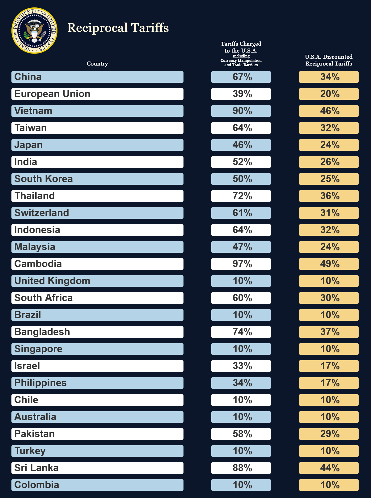
以下為本日作品預覽:
import polars as pl
from great_tables import GT, google_font, html, loc, style, vals

logo = vals.fmt_image("logo.png", height=150)[0]

data = {
    "country": [
        "China",
        "European Union",
        "Vietnam",
        "Taiwan",
        "Japan",
        "India",
        "South Korea",
        "Thailand",
        "Switzerland",
        "Indonesia",
        "Malaysia",
        "Cambodia",
        "United Kingdom",
        "South Africa",
        "Brazil",
        "Bangladesh",
        "Singapore",
        "Israel",
        "Philippines",
        "Chile",
        "Australia",
        "Pakistan",
        "Turkey",
        "Sri Lanka",
        "Colombia",
    ],
    "tariffs_charged": [
        "67%",
        "39%",
        "90%",
        "64%",
        "46%",
        "52%",
        "50%",
        "72%",
        "61%",
        "64%",
        "47%",
        "97%",
        "10%",
        "60%",
        "10%",
        "74%",
        "10%",
        "33%",
        "34%",
        "10%",
        "10%",
        "58%",
        "10%",
        "88%",
        "10%",
    ],
    "reciprocal_tariffs": [
        "34%",
        "20%",
        "46%",
        "32%",
        "24%",
        "26%",
        "25%",
        "36%",
        "31%",
        "32%",
        "24%",
        "49%",
        "10%",
        "30%",
        "10%",
        "37%",
        "10%",
        "17%",
        "17%",
        "10%",
        "10%",
        "29%",
        "10%",
        "44%",
        "10%",
    ],
}

dark_navy_blue = "#0B162A"  # background
light_blue = "#B5D3E7"  # row
white = "#FFFFFF"  # row
yellow = "#F6D588"  # "reciprocal_tariffs" column
gold = "#FFF8DE"  # logo
建議使用uv安裝(留意great與tables中間為底線連接):
uv add great_tables
由於Great Tables目前是pl.DataFrame.style命名空間所使用的套件,所以可以透過下面的語法來建構表格:
df.style.xxx()
其中df.style會返回Great Tables的GT物件的instance。
我個人則比較喜歡直接使用GT物件,如:
from great_tables import GT

GT(df)
原因是如果未來Polars決定採用其它套件的話(註1),我們所寫的程式將不需要更改。
在取得GT物件的instance後,我們就可以使用其Fluent API,不斷呼叫其提供的各種功能來製表。
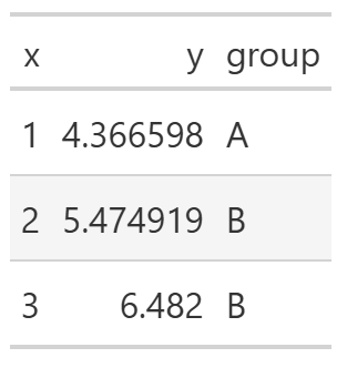
舉例來說,有一個df_demo dataframe如下:
import polars as pl
from great_tables import GT, loc, style

df_demo = pl.DataFrame(
    {
        "x": [1, 2, 3],
        "y": [4.366598, 5.474919, 6.482],
        "group": ["A", "B", "B"],
    }
)
shape: (3, 3)
┌─────┬──────────┬───────┐
│ x   ┆ y        ┆ group │
│ --- ┆ ---      ┆ ---   │
│ i64 ┆ f64      ┆ str   │
╞═════╪══════════╪═══════╡
│ 1   ┆ 4.366598 ┆ A     │
│ 2   ┆ 5.474919 ┆ B     │
│ 3   ┆ 6.482    ┆ B     │
└─────┴──────────┴───────
其預設的表格樣式如下:
GT(df_demo)
使用者可以使用各種GT提供的函數來修改表格,例如:
(
    GT(df_demo)
    .tab_header("Title", "Subtitle")
    .cols_align("center")
    .fmt_number("y", decimals=2)
    .tab_style(
        style=style.fill("papayawhip"),
        locations=loc.body("group", rows=[1, 2]),
    )
    .opt_stylize(style=4, color="blue")
)
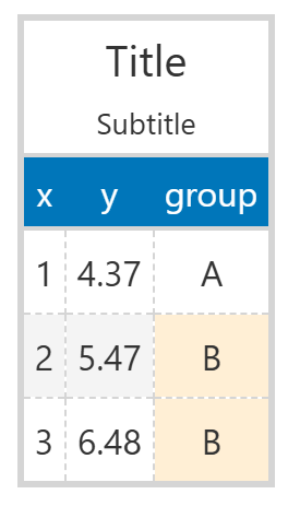
簡單說明如下:
有興趣了解更多Great Tables的朋友,可以參考小弟去年的參賽作品。
將dataframe的建構步驟封裝在tweak_df()中。
def tweak_df():
    return (
        pl.DataFrame(data)
        .with_row_index("mod")
        .with_columns(
            pl.col("mod").mod(2),
            *[pl.lit("").alias(str(i)) for i in range(4)],
        )
        .with_columns(
            # "country" and "tariffs_charged" columns
            pl.when(pl.col("mod").eq(0))
            .then(
                change_border_radius_expr(
                    pl.col("country", "tariffs_charged"),
                    pl.String,
                    "5px",
                    dark_navy_blue,
                    light_blue,
                )
            )
            .otherwise(
                change_border_radius_expr(
                    pl.col("country", "tariffs_charged"),
                    pl.String,
                    "5px",
                    dark_navy_blue,
                    white,
                )
            ),
            # "reciprocal_tariffs" column
            change_border_radius_expr(
                pl.col("reciprocal_tariffs"),
                pl.String,
                "5px",
                dark_navy_blue,
                yellow,
            ),
        )
        .select(
            [
                "0",
                "country",
                "1",
                "tariffs_charged",
                "2",
                "reciprocal_tariffs",
                "3",
            ]
        )
        # add a row at the end of the table
        .pipe(
            lambda df_: pl.concat(
                [df_, pl.DataFrame({col: "" for col in df_.columns})],
                how="vertical",
            )
        )
    )
分段說明如下:
pl.DataFrame建構初始dataframe。.with_columns(expr1, *[exprs])
True,而如果該行索引值為奇數返回False。此結果將作為後續不同背景顏色的依據。.with_columns(expr1, expr2)
pl.when().then().otherwise()巧妙地針對「"country"」及「"tariffs_charged"」列,對奇數及偶數行分別進行操作。change_border_radius_expr()使用pl.Expr.map_elements()來逐行呼叫change_border_radius()。def change_border_radius_expr(
cols: pl.Expr,
return_dtype: pl.DataType,
border_radius: int,
background_color1: str,
background_color2: str,
) -> pl.Expr:
return cols.map_elements(
lambda x: change_border_radius(
x, border_radius, background_color1, background_color2
),
return_dtype=return_dtype,
)
change_border_radius()使用兩個<div>來達成圓角效果,並於兩個<div>中施加不同背景顏色。def change_border_radius(
x: str,
border_radius: int,
background_color1: str,
background_color2: str,
) -> str:
return f"""\
<div style="background-color: {background_color1};border: None">\
<div style="border-radius: {border_radius};\
background-color:{background_color2};">\
{x}\
</div>\
</div>\
"""
change_border_radius_expr()即可。pl.DataFrame.select()重新排列各列順序。pl.DataFrame.pipe()巧妙地在最後添加空行,作為美觀之用。將製表步驟封裝在plot_g()中。
def plot_g():
return (
GT(df)
.cols_align(
"center", columns=["tariffs_charged", "reciprocal_tariffs"]
)
.cols_label(
{
"country": html(
f"""\
<br>\
<div>\
{logo} \
<span style="color: {gold}; font-size: 40px;">\
  Reciprocal Tariffs\
</span>\
</div>\
<br>\
<b>Country</b>\
"""
),
"tariffs_charged": html(
"""\
<b>Tariffs Charged<br>to the U.S.A.</b>\
<br>\
<span style="font-size: 12px;">\
Including<br>Currency Manipulation<br>and Trade Barriers\
</span>\
"""
),
"reciprocal_tariffs": html(
"<b>U.S.A. Discounted<br>Reciprocal Tariffs</b>"
),
"0": "",
"1": "",
"2": "",
"3": "",
}
)
.cols_width(
{
"country": "50%",
"0": "3%",
"1": "7%",
"2": "7%",
"3": "3%",
"tariffs_charged": "18%",
"reciprocal_tariffs": "18%",
}
)
# set the background color of the labels and body to `dark_navy_blue`
.tab_style(
style=style.fill(color=dark_navy_blue),
locations=[loc.column_labels(), loc.body()],
)
# set the border color of the body to `dark_navy_blue`
.tab_style(
style=style.borders(sides="all", color=dark_navy_blue),
locations=loc.body(),
)
# set the font for the body text
.tab_style(
style=style.text(
font=google_font(name="Trajan Pro"),
weight="bold",
size="xx-large",
),
locations=loc.body(),
)
# set the font for the labels
.tab_style(
style=style.text(
font=google_font(name="Georgia"),
weight="bold",
size="large",
),
locations=loc.column_labels(),
)
# set the text color of the labels to `white`
.tab_style(
style=style.text(color=white), locations=loc.column_labels()
)
# center-align the labels
.tab_style(
style=style.css("text-align: center;"),
locations=loc.column_labels(),
)
# set the body background color to `dark_navy_blue` for the last row
.tab_style(
style=style.fill(color=dark_navy_blue),
locations=loc.body(rows=[-1]),
)
# hide the bottom line of the label section
.tab_options(column_labels_border_bottom_style="hidden")
# need to adjust `window_size` to obtain a higher-quality figure
.save("reciprocal_tariffs_gt.png", web_driver="firefox", window_size=(1200, 1000))
)
分段說明如下:
["0", "1", "2", "3"]四列設為空字串「""」,這樣一來這四列列名就不會出現於表格中。style=參數指定,而施加的具體位置則由locations=指定。此處我們連續呼叫了數次GT.tab_style()(註2):
label及body兩個地方的背景顏色為dark_navy_blue。body內的間隔線為dark_navy_blue。body的字型種類及大小。label的字型種類及大小。label的字型顏色為white。label中的字為靠中對齊。dark_navy_blue。column_labels_border_bottom_style="hidden"來隱藏label與body間的橫線。window_size=調整為適合的大小。此外,預設的web_driver=為「"chrome"」,但個人覺得「"firefox"」的效果最佳。實際執行本日程式:
tweak_df()生成df dataframe。plot_g()進行繪圖。df = tweak_df()
plot_g()
註1:Polars曾經將其DataFrame.plot的預設套件由hvPlot改為Altair。
註2:此處可以將同位置的各種style收集為一列表傳給style=,也就是一個位置呼叫一次GT.tab_style()即可。但由於想保留Great Tables能夠透過呼叫函數來逐漸修改表格的設計哲學,所以採用此寫法。
個人部落格文章:Clone the Reciprocal Tariffs Table Using Great Tables。


 iThome鐵人賽