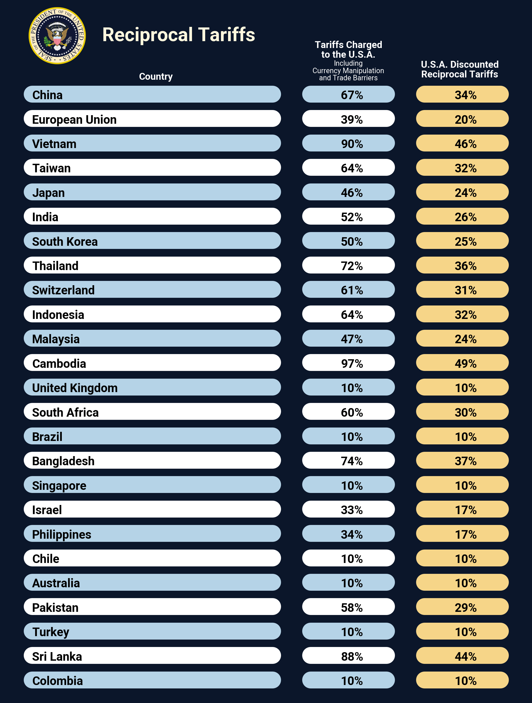
今明兩天我們將嘗試複刻美國總統Donald Trump於2025年4月2日,在Truth Social上所公布的各國關稅表。
今天將先使用Polars進行資料處理後,再發揮創意使用偏向繪圖的Plotnine製表。
本日大綱如下:
以下為本日作品預覽:
import polars as pl
from matplotlib.figure import Figure
from plotnine import (
    aes,
    element_blank,
    element_rect,
    element_text,
    geom_segment,
    geom_text,
    ggplot,
    position_nudge,
    scale_color_identity,
    scale_size_identity,
    scale_y_discrete,
    theme,
    theme_void,
    watermark,
)

logo_filename = "logo_resized.png"

data = {
    "country": [
        "China",
        "European Union",
        "Vietnam",
        "Taiwan",
        "Japan",
        "India",
        "South Korea",
        "Thailand",
        "Switzerland",
        "Indonesia",
        "Malaysia",
        "Cambodia",
        "United Kingdom",
        "South Africa",
        "Brazil",
        "Bangladesh",
        "Singapore",
        "Israel",
        "Philippines",
        "Chile",
        "Australia",
        "Pakistan",
        "Turkey",
        "Sri Lanka",
        "Colombia",
    ],
    "tariffs_charged": [
        "67%",
        "39%",
        "90%",
        "64%",
        "46%",
        "52%",
        "50%",
        "72%",
        "61%",
        "64%",
        "47%",
        "97%",
        "10%",
        "60%",
        "10%",
        "74%",
        "10%",
        "33%",
        "34%",
        "10%",
        "10%",
        "58%",
        "10%",
        "88%",
        "10%",
    ],
    "reciprocal_tariffs": [
        "34%",
        "20%",
        "46%",
        "32%",
        "24%",
        "26%",
        "25%",
        "36%",
        "31%",
        "32%",
        "24%",
        "49%",
        "10%",
        "30%",
        "10%",
        "37%",
        "10%",
        "17%",
        "17%",
        "10%",
        "10%",
        "29%",
        "10%",
        "44%",
        "10%",
    ],
}

country, tariffs_charged, reciprocal_tariffs = data.keys()

dark_navy_blue = "#0B162A"  # background
light_blue = "#B5D3E7"  # row
white = "#FFFFFF"  # row
yellow = "#F6D588"  # "reciprocal_tariffs" column
gold = "#FFF8DE"  # logo

fontname_georgia = "Georgia"  # title
fontname_roboto = "Roboto"  # body

# column width
x_col1_start, x_col1_end = 5, 52.5
x_col2_start, x_col2_end = 60, 75
x_col3_start, x_col3_end = 82.5, 97.5

# x-position for body text
x_col1_text = 5
x_col2_text = x_col2_start + (x_col2_end - x_col2_start) / 3 + 1
x_col3_text = x_col3_start + (x_col3_end - x_col3_start) / 3 + 1
df dataframe將建構df dataframe的步驟封裝在tweak_df()中。
def tweak_df() -> pl.DataFrame:
    return (
        pl.DataFrame(data)
        .with_row_index()
        .with_columns(
            pl.col(country).cast(pl.Categorical),
            pl.when(pl.col("index").mod(2).eq(0))
            .then(pl.lit(light_blue))
            .otherwise(pl.lit(white))
            .alias("color_mod"),
        )
    )
分段說明如下:
pl.DataFrame建構dataframe。pl.DataFrame.with_row_index()生成索引列。pl.with_columns():
pl.Categorical型別。textdata_df dataframe將建構textdata_df dataframe的步驟封裝在get_textdata_df()中,作為繪製標題及各列列名之用。
def get_textdata_df(
    x_ref: float = 0.0, y_ref: float = 0.0
) -> pl.DataFrame:
    title_fontsize = 16
    title_fontweight = "bold"
    heading_fontsize = 8
    heading_fontweight = "bold"
    subheading_fontsize = 6
    subheading_fontweight = "normal"

    textdata_df = pl.DataFrame(
        {
            "label": [
                "Reciprocal Tariffs",  # title
                "Country",  # col1
                "Tariffs Charged",  # col2
                "to the U.S.A.",
                "Including",
                "Currency Manipulation",
                "and Trade Barriers",
                "U.S.A. Discounted",  # col3
                "Reciprocal Tariffs",
            ],
            "x": [
                x_ref + 34.0,
                x_ref + 29.5,
                x_ref + 67.5,
                x_ref + 67.5,
                x_ref + 67.5,
                x_ref + 67.5,
                x_ref + 67.5,
                x_ref + 89.5,
                x_ref + 89.5,
            ],
            "y": [
                y_ref + 27,
                y_ref + 25.5,
                y_ref + 26.8,
                y_ref + 26.4,
                y_ref + 26.1,
                y_ref + 25.8,
                y_ref + 25.5,
                y_ref + 26.0,
                y_ref + 25.6,
            ],
            "color": [
                gold,
                white,
                white,
                white,
                white,
                white,
                white,
                white,
                white,
            ],
            "fontsize": [
                title_fontsize,
                heading_fontsize,
                heading_fontsize,
                heading_fontsize,
                subheading_fontsize,
                subheading_fontsize,
                subheading_fontsize,
                heading_fontsize,
                heading_fontsize,
            ],
            "fontweight": [
                title_fontweight,
                heading_fontweight,
                heading_fontweight,
                heading_fontweight,
                subheading_fontweight,
                subheading_fontweight,
                subheading_fontweight,
                heading_fontweight,
                heading_fontweight,
            ],
            "fontname": [
                fontname_georgia,
                fontname_georgia,
                fontname_georgia,
                fontname_georgia,
                fontname_georgia,
                fontname_georgia,
                fontname_georgia,
                fontname_georgia,
                fontname_georgia,
            ],
        }
    )
    return textdata_df
將製表步驟封裝為plot_g()、themify()及add_ax_text()三個函數:
plot_g()進行主要繪圖工作。themify()設定主題及微調圖表參數。plot_g()def plot_g() -> ggplot:
geom_segment_props = {"size": 8, "lineend": "round"}
geom_text_props = {
"ha": "left",
"va": "center",
"position": position_nudge(y=-0.08),
"size": 10,
"fontweight": "bold",
}
return (
ggplot(data=df, mapping=aes(y=country, yend=country))
# col1 segment
+ geom_segment(
mapping=aes(
x=x_col1_start, xend=x_col1_end, color="color_mod"
),
**geom_segment_props,
)
# col2 segment
+ geom_segment(
mapping=aes(
x=x_col2_start, xend=x_col2_end, color="color_mod"
),
**geom_segment_props,
)
# col3 segment
+ geom_segment(
mapping=aes(x=x_col3_start, xend=x_col3_end),
color=yellow,
**geom_segment_props,
)
# col1 text
+ geom_text(aes(x=x_col1_text, label=country), **geom_text_props)
# col2 text
+ geom_text(
aes(x=x_col2_text, label=tariffs_charged), **geom_text_props
)
# col3 text
+ geom_text(
aes(x=x_col3_text, label=reciprocal_tariffs), **geom_text_props
)
# using "color_mod" column directly
+ scale_color_identity()
# expand extra space
+ scale_y_discrete(
limits=df.select(country).reverse().to_series().to_list(),
expand=(0.02, 0, 0, 1.5),
)
# title and headers
+ geom_text(
data=get_textdata_df(),
mapping=aes(
x="x",
y="y",
label="label",
color="color",
size="fontsize",
fontweight="fontweight",
fontname="fontname",
),
va="bottom",
ha="center",
)
# using "fontsize" column directly
+ scale_size_identity()
# logo
+ watermark(logo_filename, 100, 2235)
)
分段說明如下:
ggplot物件。指定data=為df,並使用aes將「"country"」列映射給y=及yend=後傳給mapping=。color=,因為固定為黃色,所以不能置於aes中。如果將color=置於aes中,Plotnine會認為是希望針對yellow,也就是「"#F6D588"」列進行mapping。但df中並沒有「"#F6D588"」列存在,故會報錯。aes中作為label=。aes中的color=,也就是「"color_mod"」列中的顏色,不必再次mapping。y=也就是「"country"」列為pl.Categorical型別,所以可以透過指定limits=來控制其顯示順序。expand=來控制scaling的大小。geom_text(),指定data=為get_textdata_df(),並利用aes設定映射關係後傳給mapping=。aes中的size=,也就是「"fontsize"」列中的顏色,不必再次mapping。themify()呼叫theme_void()作為基本主題後,再呼叫theme()進行細部微調:
def themify(p: ggplot) -> Figure:
    return (
        p
        + theme_void()
        + theme(
            legend_position="none",  # turns off the legend
            axis_text_x=element_blank(),
            axis_text_y=element_blank(),
            axis_title_x=element_blank(),
            axis_title_y=element_blank(),
            panel_background=element_rect(fill=dark_navy_blue),
            plot_background=element_rect(fill=dark_navy_blue),
            text=element_text(family=fontname_roboto),
            dpi=300,
            figure_size=(6, 8),
        )
    ).draw(show=False)
實際執行本日程式:
tweak_df()生成df dataframe。plot_g()進行繪圖。themify()設定主題。df = tweak_df()
p = plot_g()
fig = themify(p)
fig
個人部落格文章:Clone the Reciprocal Tariffs Table Using Plotnine。


 iThome鐵人賽