其實 Modal 可以說是我想到最適合拿來說明 slot 這個概念的元件了!
在開發公司的應用時,常常大量需要用到彈出視窗,不管是 alert, confirm, 又或是預覽資料、檢視等等的功能。
但以上提到的 modal 型式,有的有 header,有的有 footer,有的都沒有。
要想符合這些需求,這時候,slot(插槽)就是一個很重要的東西!有學過 Vue 應該對 slot 不陌生了,而在 Web Component 也是一樣的概念!
這個 modal 會有 header、content、footer 三大區塊,所以我們利用 具名 slot : slot name="區塊名稱"來定義我們要提供給外部使用的插槽。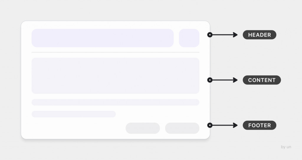
custom-modalmodal.js
class CustomModal extends HTMLElement {
  constructor() {
    super();

    const shadowRoot = this.attachShadow({ mode: 'open' });
    const cloneNode = this.render().cloneNode(true);
    shadowRoot.appendChild(cloneNode);
  }
}

render() {
  const template = document.createElement('template');

  template.innerHTML = `
    <style>
      .modal-container {
        padding: 20px;
        background-color: #dddddd;
        border-radius: 6px;
      }

      .modal-header {
        font-size: 20px;
        font-weight: 500;
        padding-bottom: 4px;
      }

      .modal-content {
        padding: 4px;
        border-top: 1px solid #999999;
        border-bottom: 1px solid #999999;
      }
    </style>

    <!-- 定義 modal 結構 -->
    <div class="modal-container">
      <div class="modal-header">
        <!-- 加入 slot : header -->
        <slot name="header"></slot>
      </div>

      <div class="modal-content">
        <!-- 加入 slot : content -->
        <slot name="content">
          <p class="default-content">預設文字</p>
        </slot>
      </div>

      <div class="modal-footer">
        <!-- 加入 slot : footer -->
        <slot name="footer"></slot>
      </div>
    </div>
  `

  return template.content;
}

customElements.define('custom-modal', CustomModal);
外部使用 custom-modal
index.html
<body>
  <div style="display: flex; width: 100%; height: 100%; align-items: center; justify-content: center;">
    <custom-modal></custom-modal>
  </div>

  <script src="modal.js"></script>
</body>
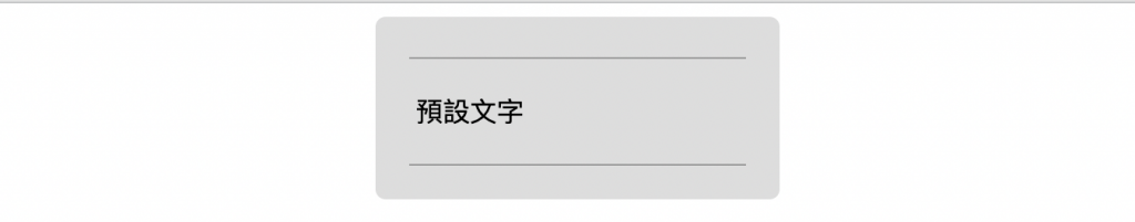
可以從呈現畫面看見,我們在 template 中定義的 slot 只有 <slot name="content"></slot> 插槽中有放 預設內容 ,所以在外部套用者沒有給定任何插槽內容時,就會呈現我們一開始在元件中給定的 預設內容,也就是預設文字四個字。
index.html
<body>
  <div style="display: flex; width: 100%; height: 100%; align-items: center; justify-content: center;">
    <custom-modal>
      <div slot="header" style="display: flex; justify-content: flex-start;">
        <h4 style="margin: 0;">彈出視窗</h4>
      </div>

      <div slot="content">
        <p>
          注意!這是一個彈出視窗!
        </p>
      </div>

      <div slot="footer" style="display: flex; justify-content: flex-end; padding-top: 12px">
        <button>關閉按鈕</button>
      </div>
    </custom-modal>
  </div>

  <script src="modal.js"></script>
</body>
你會發現,透過 slot 插槽,我們可以使用自己定義的內容,並且可以替換掉原本元件預設的內容!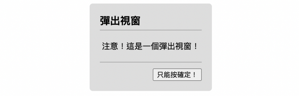
第二元件的雛型已經出現了!
關於 slot 的應用就先介紹到這裡,下一步,我們終於要進入學習路徑中我認為最複雜的一項概念,也就是 樣式,我們下篇見囉!


 看影片追技術