

前兩天我們認識了 Chart.js 的整體架構、
config三大區塊(type、data、options),也畫出了第一張折線圖。今天要專注在另一個超常用的圖表類型:長條圖(Bar Chart)。內容包含單一資料集與多資料集長條圖的畫法、如何切換成水平長條圖(indexAxis),以及柱子的顏色、邊框、圓角等樣式細節。
長條圖的建立方式,跟折線圖幾乎一模一樣,唯一的差別只有 type 要改成 'bar':
const config = {
  type: 'bar', // 圖表類型:長條圖
  data: {
    labels: ['一月', '二月', '三月', '四月', '五月', '六月'],
    datasets: [
      {
        label: '2024 年銷售額(萬元)',
        data: [12, 19, 8, 15, 22, 17],
        backgroundColor: 'rgba(75, 192, 192, 0.5)',
        borderColor: 'rgb(75, 192, 192)',
        borderWidth: 1
      }
    ]
  },
  options: {
    responsive: true,
    scales: {
      y: {
        beginAtZero: true
      }
    }
  }
};
跟折線圖的 data.datasets 相比,長條圖多了一些專屬於「柱子外觀」的欄位,例如 borderRadius(圓角)、borderSkipped(跳過某個邊框)、barPercentage(柱子寬度佔比)等,稍後會逐一介紹。
由於長條圖背後是由 BarController 負責繪製,若你使用手動註冊的寫法(Day 2 提到的「寫法 B」),至少需要註冊:
BarController(控制器)BarElement(柱狀元素)CategoryScale(X 軸,類別軸)LinearScale(Y 軸,數值軸)若使用 chart.js/auto 或 CDN 完整版,則不需要額外處理,直接使用即可。
先從最單純的情境開始:只有一組資料。這是長條圖最常見的入門用法,例如「各科目成績」、「各分店業績」等情境。
const ctx = document.getElementById('barChart');

new Chart(ctx, {
  type: 'bar',
  data: {
    labels: ['國文', '英文', '數學', '自然', '社會'],
    datasets: [
      {
        label: '小明的期中考成績',
        data: [85, 72, 90, 68, 77],
        backgroundColor: [
          'rgba(255, 99, 132, 0.6)',
          'rgba(255, 159, 64, 0.6)',
          'rgba(255, 205, 86, 0.6)',
          'rgba(75, 192, 192, 0.6)',
          'rgba(54, 162, 235, 0.6)'
        ],
        borderColor: [
          'rgb(255, 99, 132)',
          'rgb(255, 159, 64)',
          'rgb(255, 205, 86)',
          'rgb(75, 192, 192)',
          'rgb(54, 162, 235)'
        ],
        borderWidth: 1
      }
    ]
  },
  options: {
    responsive: true,
    plugins: {
      title: {
        display: true,
        text: '各科目成績分佈'
      },
      legend: {
        display: false // 只有一組資料集時,通常會關閉圖例
      }
    },
    scales: {
      y: {
        beginAtZero: true,
        max: 100
      }
    }
  }
});
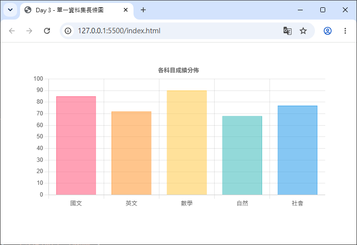
backgroundColor 與 borderColor 都可以傳入陣列,讓每一根柱子有各自不同的顏色(陣列的索引會依序對應到 data 陣列相同索引的柱子)。如果只傳入單一顏色字串,則所有柱子會套用同一種顏色。options.plugins.legend.display: false 關閉圖例顯示。options.scales.y.max: 100:由於是成績資料,手動將 Y 軸最大值鎖定在 100,讓圖表更符合情境(若不設定,Chart.js 會依資料自動計算適合的刻度上限)。當需要比較「多組資料」時(例如「今年 vs 去年」、「多個分店」),只要在 datasets 陣列中新增多個物件即可,Chart.js 會自動把同一個類別(labels)下的柱子並排顯示,這種形式也常被稱為分組長條圖(Grouped Bar Chart)。
new Chart(ctx, {
  type: 'bar',
  data: {
    labels: ['一月', '二月', '三月', '四月', '五月', '六月'],
    datasets: [
      {
        label: '2024 年銷售額(萬元)',
        data: [12, 19, 8, 15, 22, 17],
        backgroundColor: 'rgba(75, 192, 192, 0.6)',
        borderColor: 'rgb(75, 192, 192)',
        borderWidth: 1
      },
      {
        label: '2023 年銷售額(萬元)',
        data: [8, 15, 6, 12, 18, 14],
        backgroundColor: 'rgba(255, 99, 132, 0.6)',
        borderColor: 'rgb(255, 99, 132)',
        borderWidth: 1
      }
    ]
  },
  options: {
    responsive: true,
    plugins: {
      title: {
        display: true,
        text: '每月銷售額比較(2023 vs 2024)'
      }
    },
    scales: {
      y: {
        beginAtZero: true
      }
    }
  }
});
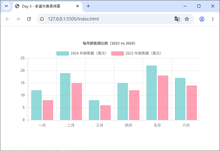
打開瀏覽器後,會看到每個月份底下並排出現兩根柱子,分別代表 2023 與 2024 年的資料,並且圖例會自動列出「2024 年銷售額」與「2023 年銷售額」兩個項目,方便使用者辨識。
💡 小提醒:多資料集長條圖預設是「並排顯示」,若想改成「堆疊」在一起(Stacked Bar Chart),需要額外在
options.scales.x與options.scales.y加上stacked: true。這個進階用法會在之後的章節(座標軸相關主題)詳細說明,今天先專注在基礎的並排長條圖。
在 Chart.js v2 的年代,水平長條圖有自己專屬的 type: 'horizontalBar';但從 Chart.js v3 開始,horizontalBar 已經被移除,改用更彈性的做法:只要在 options 中加入 indexAxis: 'y',就能把原本垂直的長條圖轉成水平方向。
indexAxis?indexAxis 用來指定「資料的索引軸(也就是 labels 對應的軸)」是 x 軸還是 y 軸:
indexAxis: 'x'(預設值):labels 對應 X 軸,柱子垂直往上長 → 垂直長條圖
indexAxis: 'y':labels 對應 Y 軸,柱子水平往右長 → 水平長條圖
new Chart(ctx, {
  type: 'bar',
  data: {
    labels: ['國文', '英文', '數學', '自然', '社會'],
    datasets: [
      {
        label: '小明的期中考成績',
        data: [85, 72, 90, 68, 77],
        backgroundColor: 'rgba(54, 162, 235, 0.6)',
        borderColor: 'rgb(54, 162, 235)',
        borderWidth: 1
      }
    ]
  },
  options: {
    indexAxis: 'y', // 切換成水平長條圖
    responsive: true,
    plugins: {
      title: {
        display: true,
        text: '各科目成績分佈(水平長條圖)'
      }
    },
    scales: {
      x: {
        beginAtZero: true,
        max: 100
      }
    }
  }
});
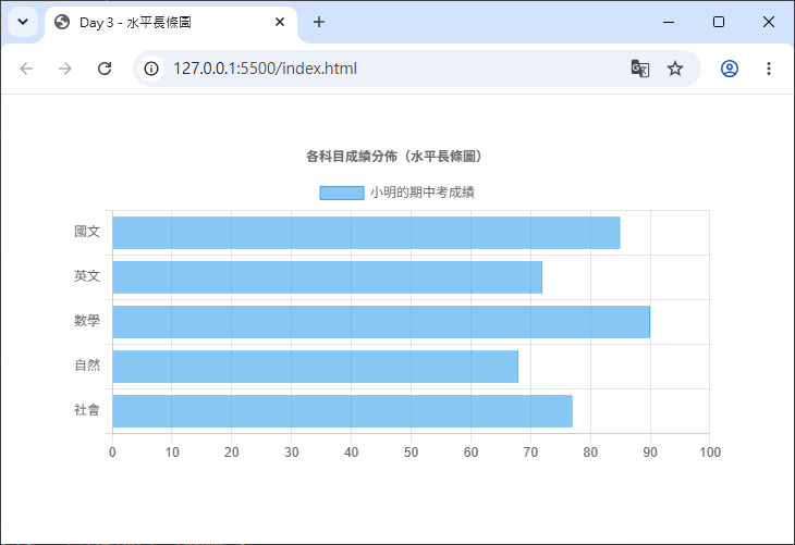
scales.y 上的選項(例如 beginAtZero、max)要改設定在 scales.x 上,因為此時數值軸變成 X 軸,類別軸變成 Y 軸。這是初學者最容易搞混的地方,務必記得:indexAxis 只是決定「哪一軸是類別軸」,但數值相關的座標軸設定要跟著轉移到另一個軸上。Chart.js 的長條圖提供了豐富的樣式選項,讓柱子可以呈現各種視覺效果。以下介紹幾個最常用的設定。
backgroundColor 與 borderColor:填色與邊框顏色前面範例已經看過,這兩個屬性可以是單一顏色字串(套用到所有柱子),也可以是顏色陣列(每根柱子套用不同顏色):
{
  data: [10, 20, 30],
  backgroundColor: 'rgba(75, 192, 192, 0.5)', // 單一顏色
  borderColor: 'rgb(75, 192, 192)',
  borderWidth: 2
}
{
  data: [10, 20, 30],
  backgroundColor: [ // 每根柱子不同顏色
    'rgba(255, 99, 132, 0.5)',
    'rgba(54, 162, 235, 0.5)',
    'rgba(255, 205, 86, 0.5)'
  ]
}
borderWidth:邊框寬度數字(Number)型別,單位是像素(px),代表柱子邊框的粗細。若設定為 0,則不會顯示邊框,只會呈現填色效果。
borderRadius:圓角borderRadius 讓柱子的角變成圓角,數值單位同樣是像素,讓長條圖看起來更現代、柔和:
{
  data: [10, 20, 30],
  backgroundColor: 'rgba(75, 192, 192, 0.6)',
  borderRadius: 8 // 四個角都套用 8px 圓角
}
borderRadius 也可以傳入物件,個別設定四個角落的圓角大小:
{
  borderRadius: {
    topLeft: 10,
    topRight: 10,
    bottomLeft: 0,
    bottomRight: 0
  }
}
上面這種寫法很常見於「只想讓柱子頂部呈現圓角,底部維持直角」的視覺效果(貼近柱子底座)。
borderSkipped:跳過邊框borderSkipped 用來指定「柱子的哪一邊不繪製邊框」,預設值是 'start'(也就是柱子靠近座標軸原點的那一邊)。這是因為柱子與座標軸相接的那一側,通常不需要畫邊框線,畫了反而會顯得多餘。
常見選項:'start'、'end'、'top'、'bottom'、'left'、'right'、true(跳過全部邊框)、false(不跳過,全部邊框都畫出來)。
⚠️ 注意:
borderSkipped也會影響borderRadius的顯示——被跳過邊框的那個角,圓角也會一併被跳過,不會顯示出來。
barPercentage 與 categoryPercentage:柱子寬度與間距這兩個選項控制柱子的「胖瘦」與「柱子之間的間距」:
barPercentage(預設 0.9):單一柱子在其所屬類別空間中所佔的寬度比例。categoryPercentage(預設 0.8):整個類別(可能包含多組資料集並排的柱子)在可用樣本空間中所佔的寬度比例。簡單來說:兩個數值都調大(接近 1.0),柱子會變胖、間距變小;調小則柱子變瘦、間距變大。
{
  data: [10, 20, 30],
  barPercentage: 0.5,
  categoryPercentage: 0.7
}
把上述樣式選項整合起來,做出一個圓角、有間距、顏色柔和的長條圖:
new Chart(ctx, {
  type: 'bar',
  data: {
    labels: ['一月', '二月', '三月', '四月', '五月', '六月'],
    datasets: [
      {
        label: '2024 年銷售額(萬元)',
        data: [12, 19, 8, 15, 22, 17],
        backgroundColor: 'rgba(75, 192, 192, 0.6)',
        borderColor: 'rgb(75, 192, 192)',
        borderWidth: 1,
        borderRadius: {
          topLeft: 8,
          topRight: 8,
          bottomLeft: 0,
          bottomRight: 0
        },
        borderSkipped: 'bottom', // 底部不畫邊框,符合圓角只在頂部的視覺效果
        barPercentage: 0.6,
        categoryPercentage: 0.7
      }
    ]
  },
  options: {
    responsive: true,
    scales: {
      y: {
        beginAtZero: true
      }
    }
  }
});
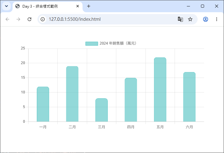
呈現效果會是:柱子頂部呈現圓角,底部貼齊 X 軸呈現直角,柱子之間留有適當間距,視覺上更加精緻美觀。
明天(Day 4)我們將認識圓餅圖(Pie Chart)與環狀圖(Doughnut Chart)的差異,學習 cutout 屬性的應用,以及如何呈現資料佔比與圖例顯示。


 iThome鐵人賽
 看影片追技術