

今天封面的主角是以前大家常用的 Bootstrap,以及現在較常見的 Tailwind CSS!或許有些東西現在已經比較少人使用,但還是可以參考舊專案的寫法,說不定會發現一些自己不知道的東西呢!(*´ω`)
進入主題!
昨天介紹了色彩模型與配色,今天接著認識如何透過文字顏色、邊框、外邊框與背景,為網頁元素建立清楚的層次與視覺效果。
直接開始介紹吧!
color 屬性用於設定元素的文字顏色。
p {
  color: blue;
} /* 關鍵字 */
h1 {
  color: #ff0000;
} /* 十六進位 */
.text {
  color: rgb(0, 255, 0);
} /* RGB */
.text {
  color: rgba(0, 0, 255, 0.5);
} /* RGBA(含透明度) */
設定文字顏色時,需留意文字與背景的對比度,確保文字的可讀性。
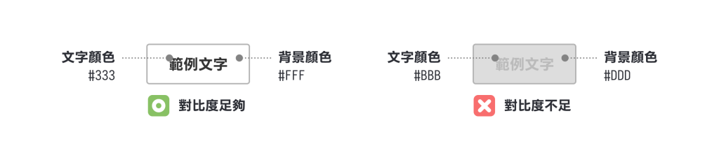
常見的文字與背景配色為白底黑字、黑底白字。雖然純白與純黑的搭配具有極大的對比度,但對部分使用者而言,過高的對比度反而會導致眼睛疲勞。因此,可以嘗試將純黑色(#000)稍微調整為深灰色(如 #333),減少視覺負擔。
連結文字或需要強調的內容,可以使用明顯對比的顏色以提升可見度。
若要設定容器中所有文字的顏色,可運用 CSS 的繼承特性,只需將顏色屬性設定在父元素上,所有子元素就會自動繼承該顏色設定。(例如:在 .text-box 設定文字顏色,內層的 h1 與 p 就會自動繼承 .text-box 的設定)
<div class="text-box">
  <h1>標題</h1>
  <p>文字</p>
</div>
border 屬性用於設定邊框的粗細、樣式和顏色。若僅需設定邊框顏色,可直接使用 border-color 屬性。元素的邊框分為上、下、左、右四個方向,每個邊框都可獨立設定不同顏色。(詳細設定可以參考 Day07 的部分)
.box {
  border: 1px solid red;               /* 四邊都是紅色 */
  border-color: red;                   /* 四邊都是紅色 */
  border-color: red blue;              /* 上下紅色、左右藍色 */
  border-color: red blue green;        /* 上紅、左右藍、下綠 */
  border-color: red blue green yellow; /* 上紅、右藍、下綠、左黃(順時針)*/
}
使用建議
可以利用框線或是不同的背景顏色,可以將不同類型的資訊區隔開來。
將元素高度設為 1px 並加上下邊框,即可製作水平分隔線。
.divider {
  height: 1px;
  border-bottom: 1px solid #ccc;  /* 灰色分隔線 */
  margin: 16px 0;
}
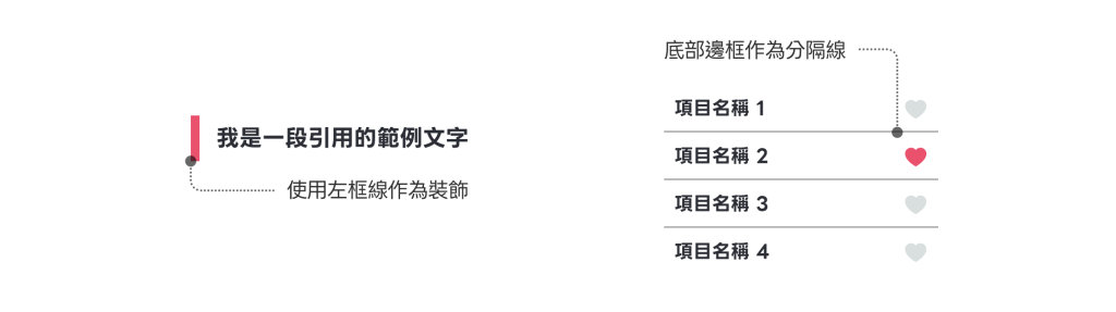
單邊邊框常被用作裝飾線條,例如:將左邊框作為標頭符號、引用標記,或是將下邊框用作清單項目的底線。
/* 使用單邊框作為裝飾元素 */
.section-title {
  border-left: 4px solid #de556f;  /* 左側邊框作為強調標記 */
  padding-left: 8px;
}
.list-item {
  border-bottom: 1px solid #eaeaea; /* 底部邊框作為分隔線 */
  padding-bottom: 8px;
  margin-bottom: 8px;
}
outline 是繪製在邊框外圍的線條。與 border 不一樣的是,outline 並不佔據空間,不會影響元素的排版,而它的設定方式與 border 類似。
.button {
  outline: 2px solid blue; /* 外邊框 */
  outline-color: red; /* 設定外邊框顏色 */
  outline-offset: 2px; /* 外邊框與元素的距離 */
}

如果想繪製外框線,但又因 border 會占據排版空間,可以嘗試使用 outline 繪製框線。
outline 常用於表單元素的焦點狀態(:focus),提示使用者當前操作位置。
/* 表單元素焦點狀態 */
.input:focus {
  outline: 2px solid #3498db;  /* 藍色外邊框 */
  outline-offset: 1px;         /* 設定與元素的距離 */
}
border 與 outline 兩者並用可實現雙框線效果。
/* 雙框線效果 */
.double-bordered {
  border: 2px solid #333;       /* 內邊框 */
  outline: 2px solid #999;      /* 外邊框 */
  outline-offset: 3px;          /* 設定外邊框間距 */
}
background 屬性可用於設定元素的背景,支援顏色、圖片、漸層等多種屬性。
background 屬性或 background-color 屬性來設定背景顏色。background: #f5f5f5; /* 淺灰色背景 */
background-color: rgba(255, 255, 255, 0.9); /* 半透明白色 */
background-color: hsl(200, 80%, 50%); /* 藍色背景 */
background 屬性或 background-image 屬性來設定背景圖片。background: url("image.jpg"); /* 背景圖片 */
background-image: url("photo.png"); /* 背景圖片 */
background: url("bg.jpg") no-repeat center; /* 圖片不重複,置中顯示 */
漸層效果(Gradient):網頁中的漸層與圖片類似,可以使用 background 屬性或 background-image 屬性來設定,包含線性漸層、放射漸層、圓錐漸層等。
線性漸層(linear-gradient()):線性漸層在直線方向上進行顏色過渡
to top、to bottom、to left、to right。也可以指定角度,例如:45deg、180deg。blue、red、#000000、hsl(200, 80%, 50%) 等格式。而在顏色後面可以補上百分比,表示顏色在漸層的位置,預設的起始顏色為 0%、結束顏色為 100%。/* 預設語法(方向由上到下) */
background: linear-gradient(起始顏色, 結束顏色);
/* 基本語法 */
background: linear-gradient(方向, 起始顏色, 結束顏色);
/* 多色漸層 */
background: linear-gradient(方向, 顏色1, 顏色2, 顏色3 ...);
/* 從左到右 */
background: linear-gradient(to right, red, blue);
/* 對角線 */
background: linear-gradient(to bottom right, red, blue);
/* 180 度*/
background: linear-gradient(180deg, #000000, #FFFFFF);
/* 90 度*/
background: linear-gradient(90deg, #000000 0%, #CCCCCC 40%, #FFFFFF 100%);
/* 色塊效果(無過渡) */
background: linear-gradient(45deg, red 0% 33%, white 33% 66%, blue 66% 100% );

放射漸層(radial-gradient()):放射漸層從中心點向外擴散,設定方式與線性漸層相似。
形狀:可以指定圓形 circle 或橢圓形 ellipse,橢圓形的長短軸則是看元素的長寬決定。
大小:可以指定放射的半徑,可以使用四種關鍵字分別是:預設值最遠角(farthest-corner)、最遠邊(farthest-side)、最近角(closest-corner)、最近邊(closest-side)。
位置:除了上下左右的關鍵字外,還可以設定 x 軸、y 軸的百分比,例如:50% 50%(中心)、0% 100%(左下角)、100% 0%(右上角)。
/* 預設語法(圓形放射) */
background: radial-gradient(起始顏色, 結束顏色);
/* 基本語法 */
background: radial-gradient(形狀 大小 at 位置, 起始顏色, 結束顏色);
/* 多色漸層 */
background: radial-gradient(形狀 大小 at 位置, 顏色1, 顏色2, 顏色3);

/* 起始顏色, 結束顏色 */
background: radial-gradient(red, blue);
/* 橢圓形放射 */
background: radial-gradient(ellipse, red, blue);
/* 指定大小 */
background: radial-gradient(circle 100px, red, blue);
/* 指定位置 */
background: radial-gradient(circle at top left, red, blue);
background: radial-gradient(circle at 30% 40%, red, blue);

圓錐漸層(conic-gradient()):圓錐漸層圍繞中心點旋轉。
at 50% 50%(中心)、at top left。/* 預設語法(從上方12點鐘方向開始旋轉) */
background: conic-gradient(起始顏色, 結束顏色);
/* 基本語法 */
background: conic-gradient(from 角度 at 位置, 起始顏色, 結束顏色);
/* 多色漸層 */
background: conic-gradient(from 角度 at 位置, 顏色1, 顏色2, 顏色3 ...);
/* 基本圓錐漸層 */
background: conic-gradient(red, yellow, green, blue, red);
/* 指定起始角度 */
background: conic-gradient(from 45deg, red, blue);
/* 指定中心點 */
background: conic-gradient(at 30% 40%, red, blue);

4. 漸層疊加:在單一 background 屬性上可以套用多個漸層效果,只需使用逗號分隔即可實現疊加效果。
/* 多重漸層疊加 */
.multi-gradient {
  background:
    linear-gradient(45deg, transparent 30%, rgba(255,255,255,0.3) 30%),
    linear-gradient(-45deg, transparent 30%, rgba(255,255,255,0.3) 30%),
    linear-gradient(to bottom, #ff0000, #0000ff);
}
使用建議
使用純色背景顏色,可以提高介面的簡潔性與可讀性,使用漸層增加不同層次感,但應符合整體設計風格。
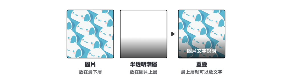
半透明色塊或漸層可作為遮罩層,置於文字與背景圖片之間,能有效防止背景圖片色彩干擾文字閱讀。
今天介紹了 color、border、outline 與 background 等需要使用顏色設定的屬性。善用顏色、框線與陰影,能讓資訊更容易閱讀、增加版面層次!建議可以多參考其他優秀作品,看看顏色與這些樣式是如何被運用的,下次就試著運用在自己的作品中吧!





 iThome鐵人賽
 看影片追技術