

經過前面 25 天的開發,KAKERU 的動態課表推算、重新產生課表、進階智慧合併與真實日曆打卡系統功能皆完成。
在明天正式進入雲端自動化部署 (DevOps) 階段前,我們必須補齊 APP 幾項細節:
Prompt
幫加上深淺色 (Dark/Light) 模式,請幫我規劃一套好維護的架構。
我的狀態管理是用 Zustand,幫我把使用者的顏色偏好、存進去,並用 persist 持久化。
另外,我希望能有一個獨立的colors.ts
來統一管理語意化的色塊(例如背景色、卡片色、主色調等),以及一個 Custom Hook,讓我的 UI 元件可以無腦呼叫並取得目前的顏色設定。
**產出內容與程式碼,**在 src/theme/colors.ts 定義標準語意化色票,並在 src/hooks/use-color-scheme.ts 封裝全域監聽 Hook:
export const Colors = {
  light: {
    background: '#F4F5F7',
    card: '#FFFFFF',
    cardBorder: '#ECEEF2',
    text: '#1A1D20',
    secondaryText: '#6B7280',
    primary: '#FF5722',
    inputBg: '#F9FAFB',
    overlayBg: 'rgba(0, 0, 0, 0.65)',
    // ... 其他次要顏色略 ...
  },
  dark: {
    background: '#121212',
    card: '#1E1E1E',
    cardBorder: '#2D2D2D',
    text: '#F3F4F6',
    secondaryText: '#9CA3AF',
    primary: '#FF5722',
    inputBg: '#252525',
    overlayBg: 'rgba(0, 0, 0, 0.85)',
    // ... 其他次要顏色略 ...
  },
};
import { useColorScheme as useRNColorScheme } from 'react-native';
import { useStore } from '../store/useStore';
export function useColorScheme(): 'light' | 'dark' {
  const themeMode = useStore((state) => state.themeMode);
  const systemScheme = useRNColorScheme();
  if (themeMode === 'dark') return 'dark';
  if (themeMode === 'light') return 'light';
  return systemScheme === 'dark' ? 'dark' : 'light';
}
Prompt
目前串了 Gemini API,每次生成課表大概都要等 5 到 10 秒。發現測試的時候,使用者在等待期間如果狂按送出按鈕,或是手癢去改輸入框的內容,整個 App 狀態就會大亂,甚至送出重複的 API 請求。
請幫我寫一個全螢幕的 Loading 遮罩元件(要能支援剛做好的深淺色模式),並且示範我要怎麼在打 API 的這段期間,把畫面上的輸入框和按鈕全部鎖死,直到 API 跑完才解開。
產出內容與程式碼,建立 src/components/LoadingOverlay.tsx,並在呼叫 API 的頁面中進行雙重鎖定:
import React from 'react';
import { ActivityIndicator, Modal, StyleSheet, Text, View } from 'react-native';
import { Colors } from '../theme/colors';
import { useColorScheme } from '../hooks/use-color-scheme';

export function LoadingOverlay({ visible, title, subtitle }: { visible: boolean; title: string; subtitle?: string }) {
  const isDark = useColorScheme() === 'dark';
  const theme = isDark ? Colors.dark : Colors.light;

  if (!visible) return null;

  return (
    <Modal transparent visible={visible} animationType="fade" statusBarTranslucent>
      <View style={[styles.overlay, { backgroundColor: theme.overlayBg }]}>
        <View style={[styles.dialogCard, { backgroundColor: theme.card }]}>
          <ActivityIndicator size="large" color="#FF5722" />
          <Text style={[styles.title, { color: theme.text }]}>{title}</Text>
          {subtitle && <Text style={{ color: theme.secondaryText, fontSize: 13 }}>{subtitle}</Text>}
        </View>
      </View>
    </Modal>
  );
}
// ... StyleSheet 樣式略 ...
在頁面中(例如 clinic.tsx、schedule.tsx)套用全鎖定防呆:
// 頁面中的雙重防護機制
<TextInput
  editable={!isLoading}
  style={[styles.input, { backgroundColor: isLoading ? '#E5E7EB' : theme.inputBg }]}
  value={text}
  onChangeText={setText}
/>

<TouchableOpacity disabled={isLoading} onPress={handleSubmit}>
  <Text>{isLoading ? 'AI 推演中...' : '送出'}</Text>
</TouchableOpacity>

<LoadingOverlay
  visible={isLoading}
  title="AI 教練正在重新推演課表..."
  subtitle="正在根據您的狀況進行個人化微調,請稍候"
/>
底層的狀態與防呆都寫好了,最後一步,我們要把這個開關實體化放到 UI 上,同時補上一個讓整個 APP 完成度瞬間拉滿的小細節:版本資訊卡片。
Prompt
「我的個人設定頁面已經差不多了,現在想在畫面最下方補上兩個商業 APP 必備的細節:
- 一個用來切換深淺色模式的開關卡片(請用原生 Switch 元件,並根據目前狀態顯示模式來增加視覺回饋)。
- 最底部放一個有質感的版本資訊區塊,顯示『KAKERU v1.0.0』,並加上『Powered by Gemini』的字樣。
請記得套用我們剛寫好的useColorSchemeHook,讓這兩張卡片的背景與文字顏色都能自動適配主題。」
import React, { useState } from 'react';
import { ScrollView, StyleSheet, Switch, Text, TextInput, TouchableOpacity, View } from 'react-native';
import { useColorScheme } from '../hooks/use-color-scheme';
import { useStore } from '../store/useStore';
import { Colors } from '../theme/colors';

const APP_VERSION = '1.0.0';

export default function ProfileScreen() {
  const isDark = useColorScheme() === 'dark';
  const theme = isDark ? Colors.dark : Colors.light;
  const setThemeMode = useStore((state) => state.setThemeMode);

  const toggleTheme = () => setThemeMode(isDark ? 'light' : 'dark');

  return (
    <ScrollView style={{ backgroundColor: theme.background }}>
      {/* ... 表單欄位、BMI 卡片與儲存按鈕略 ... */}

      {/* 介面主題 Switch 開關卡片 */}
      <View style={[styles.themeCard, { backgroundColor: theme.card, borderColor: theme.cardBorder }]}>
        <View style={styles.themeToggleRow}>
          <View style={{ flex: 1 }}>
            <Text style={[styles.themeTitle, { color: theme.text }]}>
              {isDark ? ' 深色模式 (Dark Mode)' : ' 淺色模式 (Light Mode)'}
            </Text>
            <Text style={{ color: theme.secondaryText, fontSize: 12 }}>
              {isDark ? '目前為沉浸暗色風格,點擊開關切換為淺色' : '目前為明亮淺色風格,點擊開關切換為深色'}
            </Text>
          </View>
          <Switch
            value={isDark}
            onValueChange={toggleTheme}
            trackColor={{ false: '#E2E8F0', true: '#FF5722' }}
          />
        </View>
      </View>

      {/* 底部版本號碼卡片 */}
      <View style={[styles.versionCard, { backgroundColor: theme.card, borderColor: theme.cardBorder }]}>
        <Text style={[styles.versionTitle, { color: theme.text }]}>KAKERU AI 跑步教練 · v{APP_VERSION}</Text>
        <Text style={{ color: theme.mutedText, fontSize: 11 }}>
          版本號碼:{APP_VERSION} · Powered by Gemini 2.5 Flash & Vision
        </Text>
      </View>
    </ScrollView>
  );
}
// ... StyleSheet 樣式略 ...
淺色模式: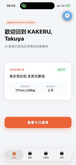
深色模式: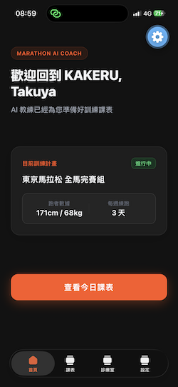
今天完成了上線前最後的細節優化:
至此,KAKERU 的後端大腦與前端介面開發,已經在本地端全數到位。
明天,專案將正式推進至系列文的最終章:DevOps 實戰!我們將邁入「Day 27 | 後端 CI/CD:用 GitHub Actions 自動部署 Cloud Run」。
我們將大幅減少手動輸入指令,實作一個「Push-to-Deploy (推播即部署)」流程。未來只要一個簡單的 git push,GitHub Actions 的雲端機器人就會自動接手編譯、打包,並以零停機的方式無縫發佈至 GCP。我們明天見!


 iThome鐵人賽
 看影片追技術