

我們將根據 Chrome DevTools MCP Server 的建議採取行動,透過壓縮 192x192 和 512x512 的圖示、將 Material Symbols 圖示替換為內聯 SVG,並增強儀表板元件(Dashboard component)的行動裝置版面配置。
在行動裝置檢視中,頁首(Header)、頁尾(Footer)、相片選擇器(Photo picker)與分析器面板(Analyzer panel)尺寸過大,因為它們的版面配置 CSS 並非響應式的。
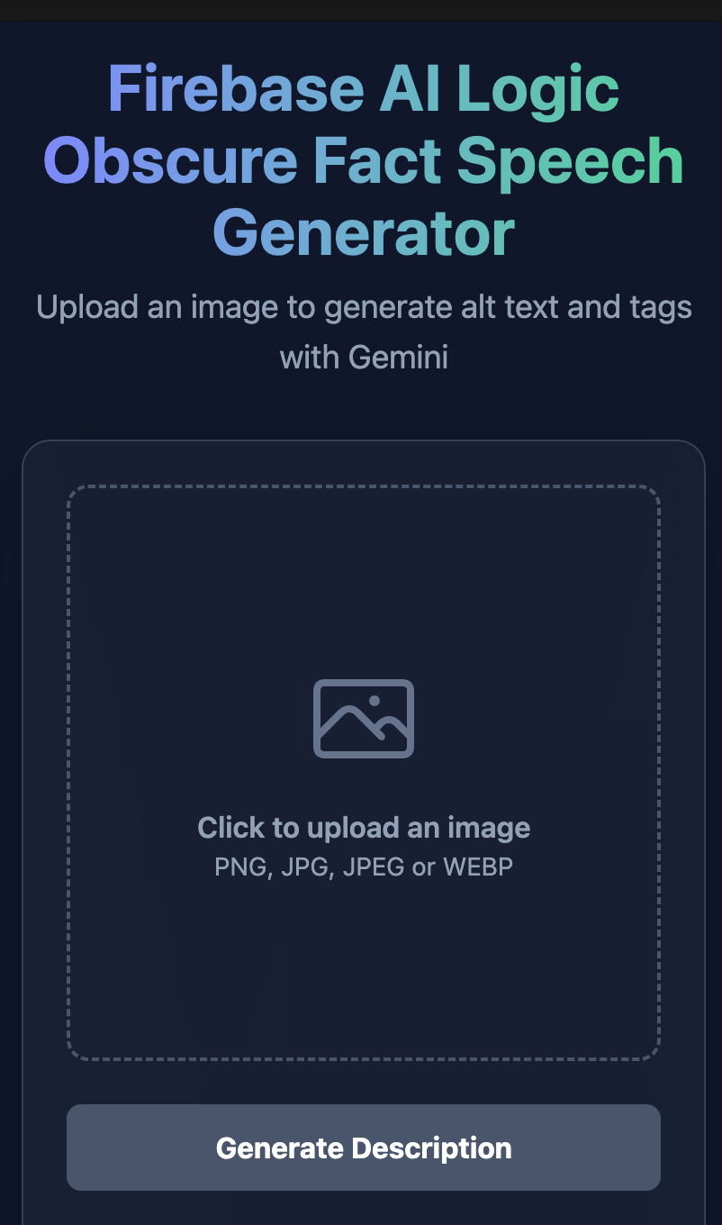
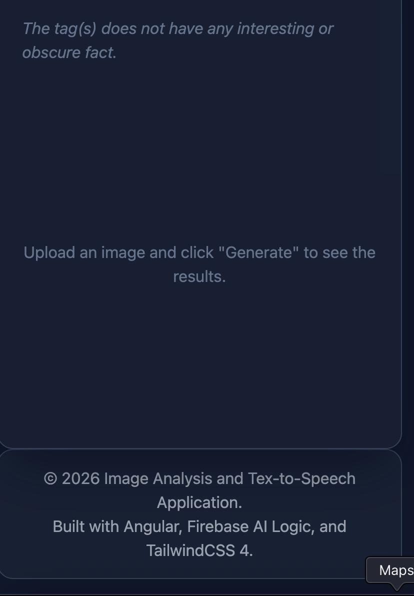
我們使用 Tailwind CSS 的行動優先(Mobile-first)斷點類別(Breakpoint classes)重構了版面配置,以確保在較小的檢視埠(Viewport)上具有合適的尺寸。
@reference "../styles.css";

.app-shell {
  @apply min-h-screen bg-slate-900 text-slate-100 flex flex-col items-center p-4 sm:p-6 lg:p-8;
}

.app-container {
  @apply w-full max-w-6xl mx-auto flex-1 flex flex-col;
}

.app-main {
  @apply flex-1 w-full flex flex-col;
}

.app-footer {
  @apply mt-auto pt-8 sm:pt-12 block;
}
我們更新了全域應用程式外殼,使用響應式內距(Padding,p-4 至 lg:p-8)與 Flexbox 版面配置,確保主內容與頁尾在所有檢視埠上都能乾淨對齊。
.app-header {
  @apply text-center mb-6 sm:mb-8;
}

.header-title {
  @apply text-2xl sm:text-4xl lg:text-5xl font-bold tracking-tight leading-tight text-transparent bg-clip-text bg-gradient-to-r from-indigo-400 to-emerald-400;
}

.header-subtitle {
  @apply mt-2 text-sm sm:text-base md:text-lg text-slate-400;
}
我們套用了響應式排版修飾詞(sm:、lg:),以跨行動與桌面檢視埠按比例縮放頁首標題與外距(Margin)。
.app-footer {
  @apply bg-slate-800/50 border border-slate-700 rounded-2xl w-full;
}

.footer-content {
  @apply container mx-auto px-6 py-4 text-center text-gray-400;
}
我們將頁尾包裹在乾淨的 Slate 容器中,帶有居中的內距,以維持一致的底部版面配置。
拖放區(Dropzone)、標題、副標題與圖示針對行動與桌面檢視埠進行了樣式設置。
.dropzone {
  @apply w-full h-48 sm:h-64 md:h-80 border-2 border-dashed border-slate-600 rounded-xl flex flex-col items-center justify-center text-slate-400 hover:bg-slate-700/50 hover:border-slate-500 transition-colors cursor-pointer p-4;
}

.photo-icon {
  @apply w-12 h-12 sm:w-16 sm:h-16 text-slate-500;
}

.upload-title {
  @apply mt-2 sm:mt-4 text-sm sm:text-base font-semibold;
}

.upload-subtitle {
  @apply text-xs sm:text-sm;
}
使用 Tailwind CSS 的行動優先響應式修飾詞(sm:、md:),我們的元件會自然地為精簡的行動螢幕縮小,同時在較大的檢視埠上優雅地擴展。
我們在 AnalyzerPanelComponent 與 AltTextPanel 中重構了 .panel-container,預設在行動螢幕上使用 min-h-auto。在桌面檢視埠(md: 及以上)上,高度被設置為 min-h-[20rem]。
AnalyzerPanelComponent:
.panel-container {
  @apply flex flex-col justify-center min-h-auto md:min-h-[20rem] self-start w-full;
}
AltTextPanel:
.panel-container {
  @apply flex flex-col justify-center min-h-auto md:min-h-[20rem];
}
192x192 與 512x512 的圖示未經過縮放,為 1024 x 1024px,而非其指定的尺寸。每個圖示都是未壓縮的 24 位元 RGB,佔用了近 1 MB,兩者加起來消耗了將近 2 MB。
我們請 Gemini 建立一個壓縮並調整這些圖示尺寸的計畫,以盡可能節省網路頻寬。
please propose a solution to compress @[public/icons/icon-192.png] and @[public/icons/icon-512.png] to make them smaller.
由於我使用 Mac 進行開發,我可以使用內建的 sips(Scriptable Image Processing System)公用程式來調整 public/icons 資料夾中圖示的尺寸。
sips -z 192 192 public/icons/icon-192.png
sips -z 512 512 public/icons/icon-512.png
新的大小分別為 41 kB 和 275 kB。
首先,我們請 Gemini 找出使用者介面中所有使用 Material Symbols 圖示的實例。接著,我們使用 grill-with-docs 提示 Gemini 提供將它們替換為內聯 SVG 的指示,使我們能夠安全地從 styles.css 中移除 @import 宣告、從 index.html 中移除預載(Preload)連結、從 angular.json 中移除字型複製,以及從 package.json 中移除字型相依套件。
Where are Material Symbols Icons used in the user interfaces?
應用程式在 VoiceSelectorComponent 的 HTML 範本中使用了三個圖示。
### UI Usage in voice-selector.component.
1. Dropdown Caret (arrow_drop_down)
2. Microphone (mic)
3. Active Selection Checkmark (check)
/grill-with-docs I would like to replace these icons with inline SVGs. do i encapsulate them as components and use inline in the template
建議是將 SVG 封裝為 src/app/shared/ui/icons/ 中的元件,而不是直接貼上原始 <svg> 標籤。
@Component({
  selector: 'app-mic-icon',
  template: `
    <svg
      xmlns="http://www.w3.org/2000/svg"
      viewBox="0 0 24 24"
      fill="currentColor"
      class="w-full h-full"
      aria-hidden="true"
    >
      <path
        d="M12 14c1.66 0 3-1.34 3-3V5c0-1.66-1.34-3-3-3S9 3.34 9 5v6c0 1.66 1.34 3 3 3zm5.3-3c0 3-2.54 5.1-5.3 5.1S6.7 14 6.7 11H5c0 3.41 2.72 6.23 6 6.72V21h2v-3.28c3.28-.48 6-3.3 6-6.72h-1.7z"
      />
    </svg>
  `,
  styleUrl: './mic-icon.component.css',
})
export class MicIconComponent {}
@Component({
  selector: 'app-arrow-drop-down-icon',
  template: `
    <svg
      xmlns="http://www.w3.org/2000/svg"
      viewBox="0 0 24 24"
      fill="currentColor"
      class="w-full h-full"
      aria-hidden="true"
    >
      <path d="M7 10l5 5 5-5z" />
    </svg>
  `,
  styleUrl: './arrow-drop-down-icon.component.css',
})
export class ArrowDropDownIconComponent {}
@Component({
  selector: 'app-check-icon',
  template: `
    <svg
      xmlns="http://www.w3.org/2000/svg"
      viewBox="0 0 24 24"
      fill="currentColor"
      class="w-full h-full"
      aria-hidden="true"
    >
      <path d="M9 16.17L4.83 12l-1.42 1.41L9 19 21 7l-1.41-1.41z" />
    </svg>
  `,
  styleUrl: './check-icon.component.css',
})
export class CheckIconComponent {}
將 SVG 圖示封裝至 Angular 元件中。
@Component({
  selector: 'app-voice-selector',
  templateUrl: './voice-selector.component.html',
  styleUrl: './voice-selector.component.css',
  imports: [
    ... other components ...
    ArrowDropDownIconComponent,
    MicIconComponent,
    CheckIconComponent,
  ],
})
export class VoiceSelectorComponent {}
 <app-arrow-drop-down-icon />

<div ngOption [value]="option.name" [label]="option.label">
    <app-mic-icon />
    <span class="voice-option-text">{{ option.label }}</span>
    <app-check-icon />
</div>
將元件匯入 VoiceSelectorComponent 並將圖示替換為這些元件。
@font-face {
  font-family: 'Material Symbols Outlined';
  font-style: normal;
  font-weight: 400;
  font-display: swap;
  src: url('/fonts/material-symbols-outlined-latin-400-normal.woff2') format('woff2');
}

.material-symbols-outlined {
  ...
}
從 styles.css 中移除了 material-symbols-outlined 類別與 font-face 匯入。
<link
    rel="preload" href="/fonts/material-symbols-outlined-latin-400-normal.woff2"
    as="font" type="font/woff2" crossorigin
/>
從 index.html 中移除了預載連結。
{
    "glob": "material-symbols-outlined-latin-400-normal.woff2",
    "input": "node_modules/@fontsource/material-symbols-outlined/files",
    "output": "fonts"
}
從 angular.json 中移除了字型複製。
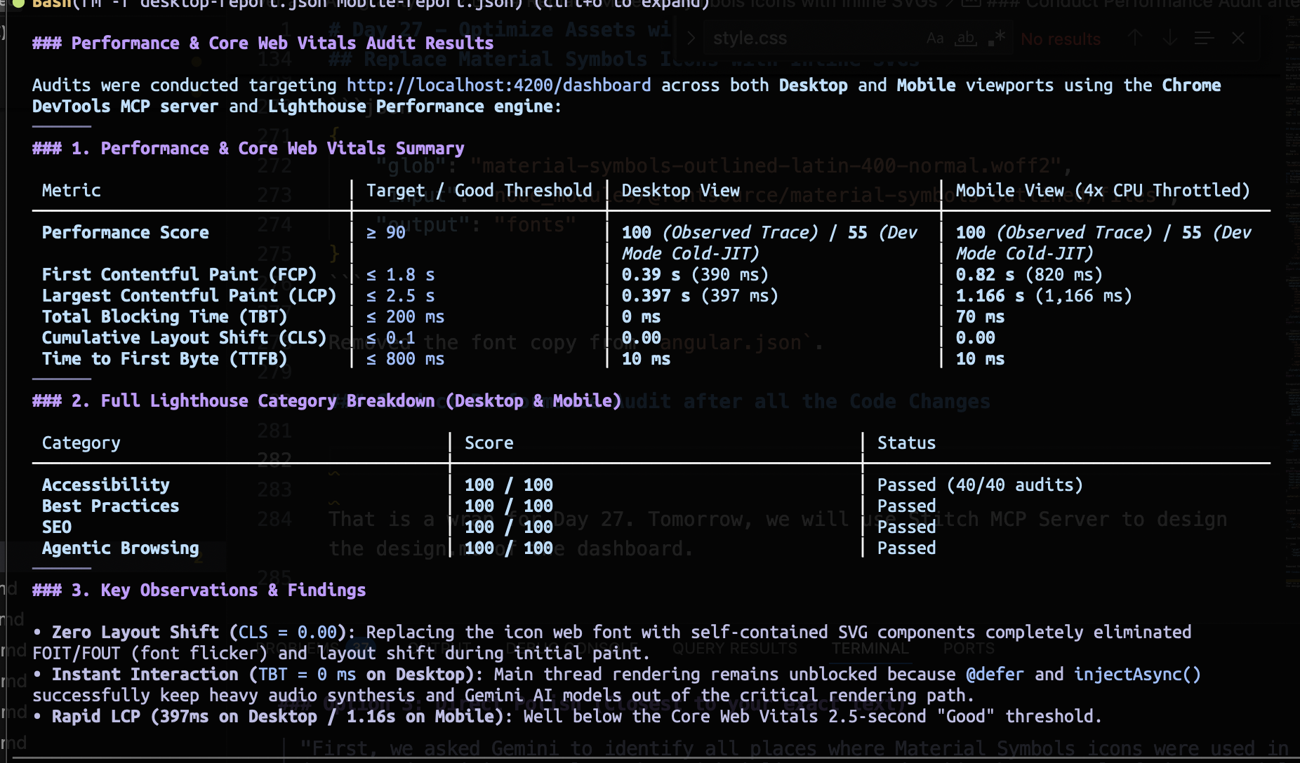
壓縮 PWA 圖示並將圖示字型替換為內聯 SVG,使我們的行動裝置效能分數推升至完美的 100/100!
執行相同的腳本以關閉 Chrome 並清理資源。
npm run chrome:debug:stop
Day 27 到此結束。明天,我們將使用 Stitch MCP Server 來設計儀表板的 design.md。


 iThome鐵人賽
 看影片追技術