
這篇將會把 EZoApp 裡頭剩下的 jqm 元件介紹完,不過其實還有一些 jqm 元件是 EZoApp 沒有列出來的,必須要我們自己手動撰寫程式碼,這部分會在明後天的文章裡頭介紹,今天就先來把剩下的 jqm 元件給搞定吧!
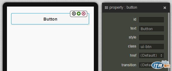
1. button
( 範例:http://jqmdesigner.appspot.com/designer.html#&ref=5693399747264512 )

<a class="ui-btn">Button</a>
由程式碼可以看到,按鈕其實就是一個加上了 ui-btn 樣式的超連結,也因為如此,你也可以自己修改樣式,就可以變成客製化的按鈕。
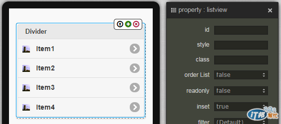
2. listview

( 範例:http://jqmdesigner.appspot.com/designer.html#&ref=4861860792762368 )
    <ul data-role="listview" data-inset="true">
      <li data-role="list-divider">Divider</li>
      <li>
        <a href="#">
          <img src="http://jqmdesigner.appspot.com/images/image.png" class="ui-li-icon">Item</a>
      </li>
    </ul>
jqm 的 listview 元件雖然就是清單,但卻已經幫我們區分好了標題與內容清單,更特別的是,裡頭還提供了篩選 ( filter ) 的功能,如果清單的內容很多,直接在 filter 的搜尋框輸入文字搜尋就可以篩選出特定的內容囉!相當的方便!
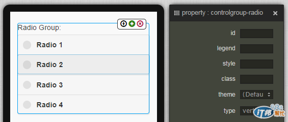
3. controlgroup-radio

( 範例:http://jqmdesigner.appspot.com/designer.html#&ref=5177529212076032 )
    <fieldset data-role="controlgroup" data-type="vertical">
      <legend>Radio Group:</legend>
      <input id="gk-104dlEd" name="gk-104dlEd" type="radio" data-iconpos="left">
      <label for="gk-104dlEd">Radio</label>
    </fieldset>
單選的按鈕,你可以藉由點選按鈕之後右上方出現的 + 號新增,不過新增的時候,name 會自動產生,也因為兩個單選按鈕的 name 不同,會導致無法單選,這時候只需要把 name 改為相同就可以囉!
    <fieldset data-role="controlgroup" data-type="vertical">
      <legend>Radio Group:</legend>
      <input id="gk-104dlEd" name="aa" type="radio" data-iconpos="left">
      <label for="gk-104dlEd">Radio1</label>
      <input id="gk-104PBuC" name="aa" type="radio" data-iconpos="left">
      <label for="gk-104PBuC">Radio2</label>
    </fieldset>
而身為 jqm 元件的 radio button,一定也會有一些與眾不同的功能,我們可以藉由屬性面板調整 iconPos 就可以控制 radio button 的位置。
而且除了基本的圓圈圈點選外,因為 jqm 元件的誕生目的是為了行動裝置,所以也有提供了比較適合行動裝置的點選方式,我們只要點選外層的 fieldset,並將 type 設為 horizontal,就可以改變 radio button 的呈現方式噢!
4. controlgroup-checkbox
( 範例:http://jqmdesigner.appspot.com/designer.html#&ref=5666576736976896 )

    <fieldset data-role="controlgroup" data-type="vertical">
      <legend>Radio Group:</legend>
      <input id="gk-104dlEd" name="aa" type="radio" data-iconpos="left">
      <label for="gk-104dlEd">Radio1</label>
      <input id="gk-104PBuC" name="aa" type="radio" data-iconpos="left">
      <label for="gk-104PBuC">Radio2</label>
    </fieldset>
與單選的 radio button 互為兄弟的 checkbox 是負責多選,與 radio button 的設定幾乎一模一樣,也可以點選外層的 fieldset,並將 type 設為 horizontal,就可以改變 checkbox 的呈現方式。

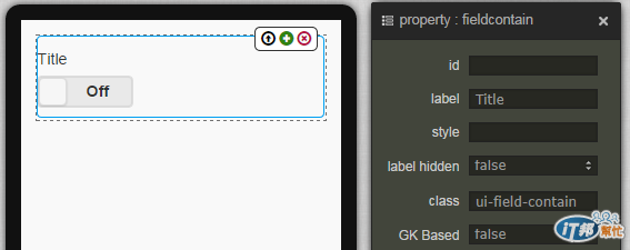
5. flipswitch
( 範例:http://jqmdesigner.appspot.com/designer.html#&ref=5073935540420608 )

    <div class="ui-field-contain">
      <label for="gk-104rgdq">Title</label>
      <input type="checkbox" data-role="flipswitch" id="gk-104rgdq">
    </div>
flipswitch 就是我們在手機「設定」裡頭很常見的開關,其實它也是 checkbox 的一種變形,可以看到程式碼裡頭 type 就是 checkbox,不過裡頭多了一個 data-role=”filpswitch”,所以它就會變成開關的形式呈現。
6. selectmenu
( 範例:http://jqmdesigner.appspot.com/designer.html#&ref=4889026997780480 )

    <div class="ui-field-contain">
      <label for="gk-104mhHQ">Title</label>
      <select id="gk-104mhHQ">
        <option value="option1">Option 1</option>
      </select>
    </div>
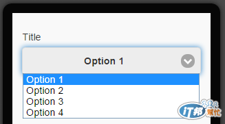
下拉選擇清單的元件,其實就是 select 和 option 的組合,不過必須要透過直接添加 option 的方式才能增加額外的選項
    <div class="ui-field-contain">
      <label for="gk-104mhHQ">Title</label>
      <select id="gk-104mhHQ">
        <option value="option1">Option 1</option>
        <option value="option2">Option 2</option>
        <option value="option3">Option 3</option>
        <option value="option4">Option 4</option>
      </select>
    </div>
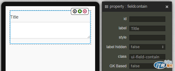
7. textarea-input
( 範例:http://jqmdesigner.appspot.com/designer.html#&ref=6014926904623104 )

    <div class="ui-field-contain">
      <label for="gk-1043Poc" class>Title</label>
      <textarea id="gk-1043Poc" name></textarea>
    </div>
讓使用者可以輸入多行文字的元件
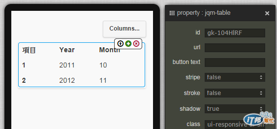
8. jqm-table
( 範例:http://jqmdesigner.appspot.com/designer.html#&ref=5188934900383744 )

    <table data-role="table" data-mode="columntoggle" class="ui-responsive ui-shadow gk-decorate" id="gk-104pqI6" is="jqm-table">
      <thead>
        <tr>
          <th data-priority="1">項目</th>
          <th data-priority="1">Year</th>
          <th data-priority="1">Month</th>
        </tr>
      </thead>
      <tbody>
        <tr>
          <th>1</th>
          <td>2011</td>
          <td>10</td>
        </tr>
        <tr>
          <th>2</th>
          <td>2012</td>
          <td>11</td>
        </tr>
      </tbody>
    </table>
表格元件,不過這不是一個普通的表格元件,如果仔細看,可以發現表格的右上方有一顆按鈕,點選之後會出現篩選欄位的選項,這也是一般的表格所辦不到的,如果不需要,就在屬性面板裡頭把 data-mode 由 columntoggle 改為 Reflow 即可。
下一篇會繼續介紹一些沒有出現在 EZoApp 裡頭但仍然很好用的元件。


 看影片追技術