
今天要用 CSS 畫緞帶
在商品的角落、標籤、文章標題、小書籤 都能派上用場
先作個斜標籤
<div class="ribbon">特價品</div>

.ribbon{
    position: absolute;
    top: 20px;
    left: 20px;
    /* 擺放位置 */

    width: 100px;
    height: 28px;
    background-color: #E53935;
    box-shadow: 0 4px 6px rgba(0, 0, 0, 0.1);
    /* 尺寸大小、顏色、陰影 */

    color: #fff;
    line-height: 28px;
    text-align: center;
    letter-spacing: 5.5px;
    /* 文字設定 */

    transform: rotate(45deg); /* 轉45度 */
}
設計好大小、文字置中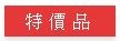
再用 transform: rotate(45deg) 轉45度 就完成了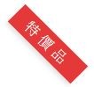
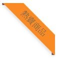
要作出向後折效果的標籤
用一個長方形 + 2個小三角形組合
就要用2個 div 為的是作到移動小三角形的位置
<div class="ribbon-wrap">
    <div class="ribbon">熱賣商品</div>
</div>
ribbon-wrap 是要隱藏超出的部分和移動位置
ribbon 是標籤的設定
做出向後折的小三角形
會用到 :after :before 和 position 相對定位
.ribbon-wrap{
    width: 106px;
    height: 108px;
    overflow: hidden;
    /* 當超過width和height的大小就隱藏 */

    position: absolute;
    top: 20px;
    left: 20px;
}
.ribbon {
    position: relative;
    left: -11px;
    top: 26px;
    width: 148px;
    background-color: #FB8C00;
    color: #006064;
    padding: 5px 0;
    text-align: center;
    transform: rotate(45deg);
    box-shadow: 0 4px 6px rgba(0, 0, 0, 0.1);
}
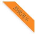
作到這裡就是平面的標籤
接著要作出向後折效果的三角形
.ribbon:before {
    content: "";
    border-top: 4px solid #795548;
    border-left: 4px solid transparent;
    border-right: 4px solid transparent;
    position: absolute;
    bottom: -4px;
    left: 0;
}
.ribbon:after {
    content: "";
    border-top: 4px solid #795548;
    border-left: 4px solid transparent;
    border-right: 4px solid transparent;
    position: absolute;
    bottom: -4px;
    right: 0;
}
水平緞帶
用2個 div 作 緞帶文字、三角形陰影 和 緞帶左右的尾端
<div class="ribbon">
   <div class="content">content</div>
</div>
先作 緞帶文字 的部分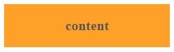
.ribbon {
    position: relative;
    width: 200px;
    padding: 20px;
    margin: 50px auto;
    background: #FFA000;
    font-size: 20px;
    color: #555;
    text-align: center;
}
這是標題內文的部分
接著作折疊的陰影
用到 :after :before 的 z-index 重疊順序 、 position 相對定位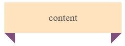
.content:before {
    content: "";
    position: absolute;
    border-style: solid;
    border-color: #8D6E63 transparent;
    bottom: -22px;
    left: 0;
    border-width: 22px 0 0 22px;
}
.content:after {
    content: "";
    position: absolute;
    border-style: solid;
    border-color: #8D6E63 transparent;
    bottom: -22px;
    right: 0;
    border-width: 22px 22px 0 0;
}
最後再用 z-index 把緞帶左右的尾端
推到 緞帶文字、陰影 的下一層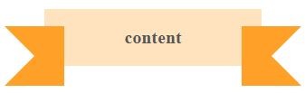
.ribbon:before {
    content: "";
    position: absolute;
    display: block;
    bottom: -22px;
    border: 33px solid #F57F17;
    z-index: -1;
    left: -44px;
    border-right-width: 33px;
    border-left-color: transparent;
}
.ribbon:after {
    content: "";
    position: absolute;
    display: block;
    bottom: -22px;
    border: 33px solid #F57F17;
    z-index: -1;
    right: -44px;
    border-left-width: 33px;
    border-right-color: transparent;
}
就完成標題的緞帶效果
--- 明日待續。


 iThome鐵人賽
 看影片追技術