開始推element的時候,
一定會開始接觸到margin吧!
你知道除了margin之外,還有其他的東西嗎?
一開始接觸margin的我只覺得:margin是一個「可以調整與其他element的距離」
但是事情不是那麼簡單的!
我們就來深入了解一下**盒模型(box model)**吧!
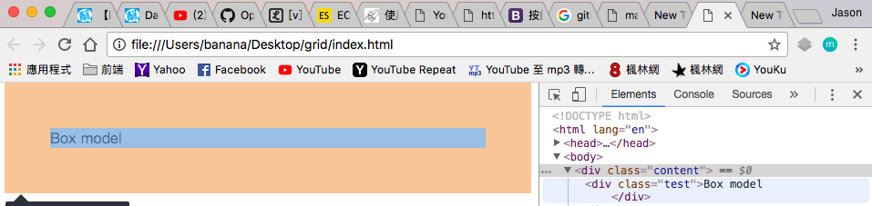
首先開啟google chrome,
接著對網頁上隨便一個element按右鍵>檢查,
就會開啟開發人員工具。
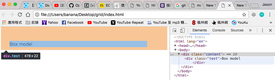
然後在右下角的Style,可以找到一個box model,
我們先來建立環境讓我們可以跟著做
index.html
<!DOCTYPE html>
<html lang="en">
<head>
    <meta charset="UTF-8">
    <meta name="viewport" content="width=device-width, initial-scale=1.0">
    <meta http-equiv="X-UA-Compatible" content="ie=edge">
    <title>Box model</title>
    <link rel="stylesheet" href="css/style.css" type="text/css">
</head>
<body>
    <div class="content">
        <div class="test">Box model</span>
    </div>
</body>
</html>
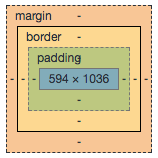
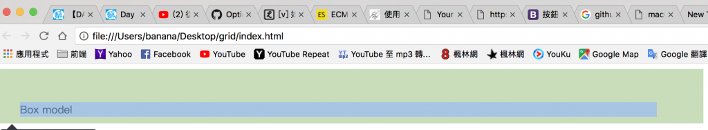
我們從最外層開始說吧!
我們平常在推的就是這層,叫做margin,
外側緊鄰其他element的margin、內側緊鄰border。
可以把element和其他element之間有一定的距離。margin不會吃到背景色。
.test{
    margin:50px;
}
會發現.tset被上下左右都被推了50px,
但是如果上下左右不想都推一樣的距離呢?
辦得到嗎?
Sure!
.test{
    margin-top:50px;
    margin-right:70px;
    margin-bottom: 10px;
    margin-left: 30px;
}
這樣寫不會很麻煩嗎?
會!
因此注意到了嗎?
我上面寫的順序不是我們一般熟悉的上下左右,
而是上右下左!
緊接著我們再改改,
.test{
    margin:50px 70px 10px 30px;
}
你會發現兩者的結果是一樣的。
不過css簡潔多了
其實margin和padding都可以套用這些變化:
margin:上 右 下 左; (四個值)
margin:上 (左右) 下; (三個值)
margin:(上下) (左右); (二個值)
margin:(上下左右); (一個值)
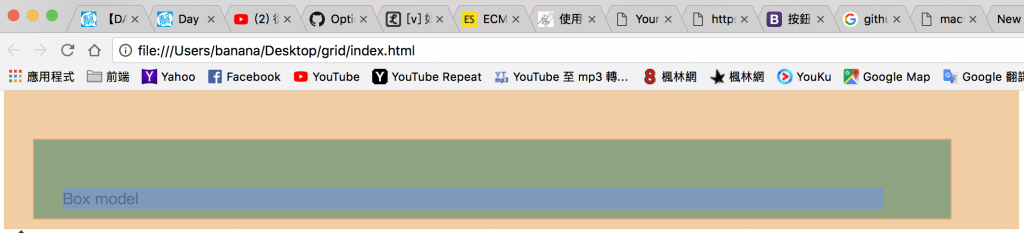
border是邊框,
外側緊鄰margin、內側緊鄰padding,
.test{
    border: solid red 1px;
}
會發現外層包了一層紅色、寬度1px的框。border的數值只需要用空格分開即可,
屬性不需要一個一個下,
例如:border-width、border-style、border-color
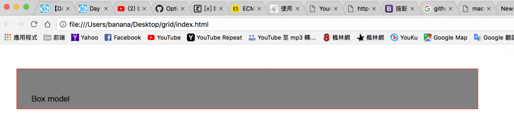
padding為內距,外側緊鄰border、內側緊鄰內容。
如果沒有padding,內容會黏著邊框。padding會吃到背景色。
.test{
    padding:50px 70px 10px 30px;
}
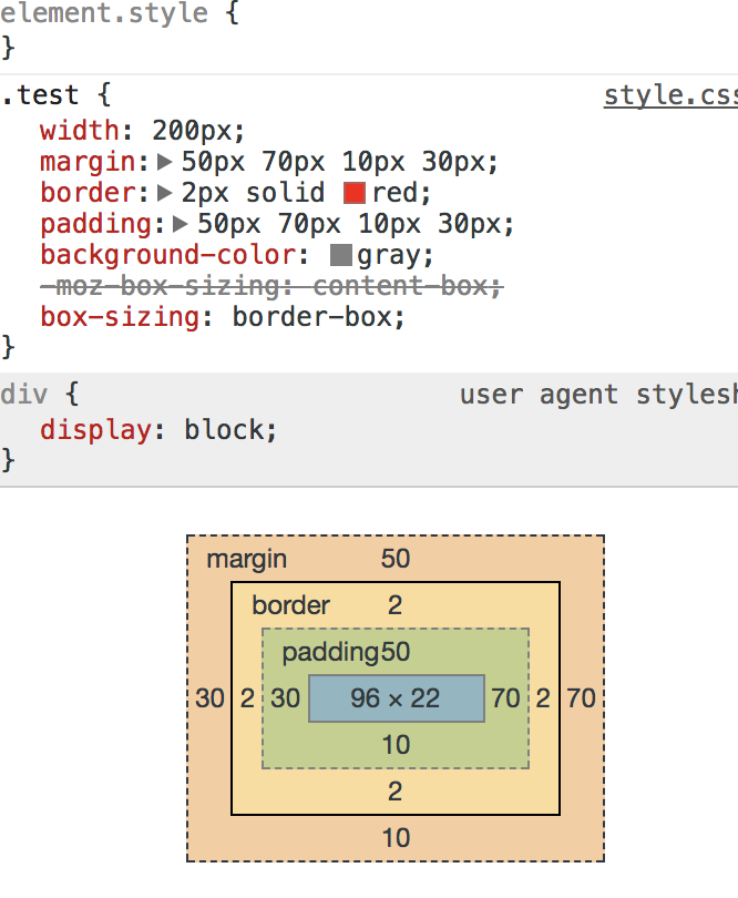
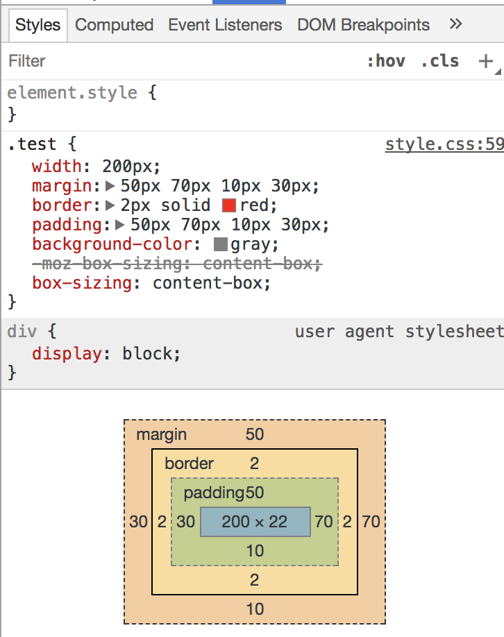
最後我們配上背景色,把三者都放在一起看吧!
如圖所示:上被推了50+1+50px
右被推了70+1+70px
下被推了10+1+10px
左被推了30+1+30px
同時畫面呈現長這樣:
只有padding有吃到backgronud-color ,margin則不會吃到。
最後,width/height到底指哪裡?
這個問題會是新手要了解的,
box-sizing我們來了解一下box-sizing: content-box;與box-sizing; border-box;
這是網頁的預設值,width=內容的寬度、heigh=內容的高度,
因此如果有padding、border或margin都會讓element更寬。
例如:
.test{
    width: 200px;
    margin:50px 70px 10px 30px;
    border:2px solid red;
    padding:50px 70px 10px 30px;
    background-color: gray;
    -moz-box-sizing: content-box;
         box-sizing: content-box;
}
則最後的element的寬=200px+2px+2px+70px+30px=302px
(內容+右border+左border+右padding+左padding)
但是這種計算方式不太符合人體工學,
因為border就像是包裝紙把內容包起來。
因此有了另外一種算法:box-sizing: border-box;
box-sizing: border-box;同樣是上面那個例子,
element的寬度=width=內容+右border+左border+r+右padding+左padding,
所以內容會自動被壓縮。
這種方式比較像是我們所期待、一個盒模型應有的寬度。
因此,就把他呼叫出來用吧!
.test{
    width: 200px;
    margin:50px 70px 10px 30px;
    border:2px solid red;
    padding:50px 70px 10px 30px;
    background-color: gray;
    -moz-box-sizing: border-box;
         box-sizing: border-box;
}
以上就是我所認知的box model。


 iThome鐵人賽
 看影片追技術