今天要在WebGIS中加入一些資訊圖表,利用D3.js來實作圖表並與地圖互動,D3.js非常具有彈性且多樣,能與地圖結合有錦上添花的感覺,let's go!
D3.js是資料視覺化的利器,光從官方網站範例就琳瑯滿目,例如我們要畫一個bar chart
//設定畫布及x,y軸比例尺等

  var svg = d3.select("#svg"),
    margin = { top: 20, right: 20, bottom: 30, left: 40 },
    width = +svg.attr("width") - margin.left - margin.right,
    height = +svg.attr("height") - margin.top - margin.bottom;
  var x = d3.scaleBand().rangeRound([0, width]).padding(0.1);
  var y = d3.scaleLinear().rangeRound([height, 0]);

  var column = svg.append("g")
    .attr("transform", "translate(" + margin.left + "," + margin.top + ")");


  //設定資料範圍
  x.domain(data.map(function (d) { return d.letter; }));
  y.domain([0, d3.max(data, function (d) { return d.frequency; })]);

  //x軸
  column.append("g")
    .attr("transform", "translate(0," + height + ")")
    .call(d3.axisBottom(x));

  //y軸
  column.append("g")
    .call(d3.axisLeft(y))
    .append("text")
    .attr("transform", "rotate(-90)")
    .attr("y", 6)
    .attr("dy", "0.71em")
    .attr("text-anchor", "end")
    .text("Frequency");

  //bar chart部分
  column.selectAll(".bar")
    .data(data)
    .enter().append("rect")
    .attr("class", "bar")
    .attr("x", function (d) { return x(d.letter); })
    .attr("y", function (d) { return y(d.frequency); })
    .attr("width", x.bandwidth())
    .attr("height", function (d) { return height - y(d.frequency); })
}
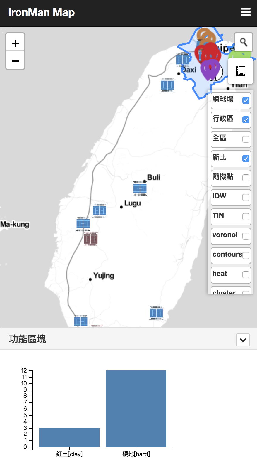
WebGIS的圖表當然就是圖層的屬性,在讀入geojson後,我們會需要把資料做些轉換,去產生圖表需要的資訊。
例如:
$.getJSON("./dist/assets/data/map.geojson", function (data) {
  featchdata(data);
});

function featchdata(d) {
  //資料

  var data = [];
  var tmp_type;
  var tmp_count = 0;
  $.each(d.features, function (k, v) {
    if (k == 0) {
      tmp_type = v.properties.surface;
      tmp_count++;
    }
    else if (k == d.length - 1) {
      tmp_count++;
      data.push({ "letter": tmp_type, "frequency": tmp_count })
    }
    else {
      if (tmp_type == v.properties.surface) {
        tmp_count++;
      } else {
        data.push({ "letter": tmp_type, "frequency": tmp_count })
        tmp_count = 1;
        tmp_type = v.properties.surface;
      }

    }


  });
上面圖表串接,我們加入一些地圖事件讓圖表動起來,圖表會跟著地圖實際涵蓋的範圍做變化
首先,加入地圖事件:
map.on('zoomend', function () {
  var d = pois.toGeoJSON();
  featchdata(d);
});

map.on('dragend', function () {
  var d = pois.toGeoJSON();
  featchdata(d);
});
接著,在前面的featchdata加入bounds判斷,讓圖表會根據bounds範圍呈現資料
使用的函式為turf.booleanPointInPolygon(point,polygon)
如下:
function featchdata(d0) {
var ext = map.getBounds()
  //資料

  var poly = turf.polygon([[
    [ext.getSouthWest().lng, ext.getSouthWest().lat],
    [ext.getNorthWest().lng, ext.getNorthWest().lat],
    [ext.getNorthEast().lng, ext.getNorthEast().lat],
    [ext.getSouthEast().lng, ext.getSouthEast().lat],
    [ext.getSouthWest().lng, ext.getSouthWest().lat]
  ]]);
  console.log(poly);
  var d = [];

  $.each(d0.features, function (k, v) {
    var pt = turf.point([v.geometry.coordinates[0], v.geometry.coordinates[1]]);

    if (turf.booleanPointInPolygon(pt, poly)) {
      d.push(v);
    }

  });
  var data = [];
  var tmp_type;
  var tmp_count = 0;

  $.each(d, function (k, v) {
    if (k == 0) {
      tmp_type = v.properties.surface;
      tmp_count++;
    }
    else if (k == d.length - 1) {
      tmp_count++;
      data.push({ "letter": tmp_type, "frequency": tmp_count })
    }
    else {
      if (tmp_type == v.properties.surface) {
        tmp_count++;
      } else {
        data.push({ "letter": tmp_type, "frequency": tmp_count })
        tmp_count = 1;
        tmp_type = v.properties.surface;
      }
    }
  });
  ...

  ...

  省略
}
成果略圖
在D3.js我們還加入一些click事件及css調整,可以直接看程式碼喔~,另外,除了D3.js以外,也可以使用單純圖表的C3.js或是highchart等較直覺的工具喔。