
Plotly是使用Python和Django框架構建的,前端使用JavaScript和可視化庫D3.js,HTML和CSS。使用Plotly可以創建出許多精美的互動式圖表。
Plotly was built using Python and the Django framework, with a front end using JavaScript and the visualization library D3.js, HTML and CSS. Plotly is a graphing library for making interactive graphs.
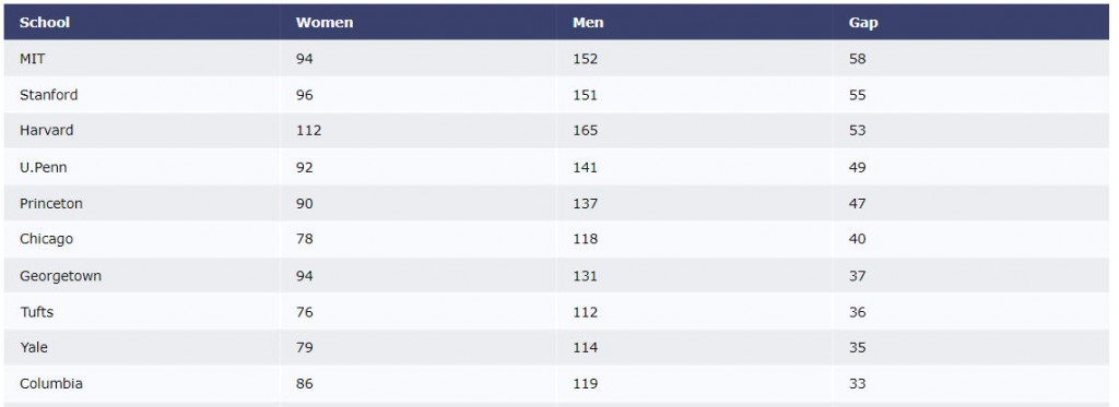
Import Data (in this example is a csv hosted on github) and display it in a table and a basic plot using Plotly.
from plotly.offline import iplot
import plotly.figure_factory as ff
import pandas as pd

df = pd.read_csv("https://raw.githubusercontent.com/plotly/datasets/master/school_earnings.csv")

table = ff.create_table(df)
iplot(table, filename='jupyter-table1')
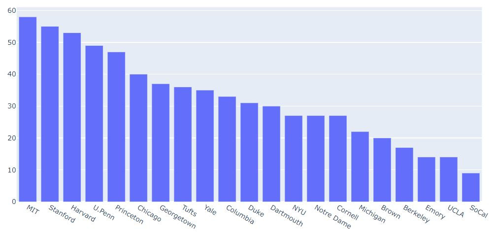
import plotly.graph_objects as go

schools = df.School
data = [go.Bar(x=df.School,
            y=df.Gap)]

iplot(data, filename='jupyter-basic_bar')
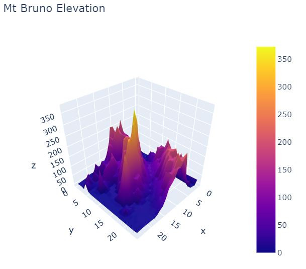
透過Numpy與Plotly,我們可以繪製精美的互動式3D圖表。
We can make sophisticated interactive 3D plots using Numpy and Plotly.
import plotly.graph_objects as go
import pandas as pd

# Read data from a csv
z_data = pd.read_csv('https://raw.githubusercontent.com/plotly/datasets/master/api_docs/mt_bruno_elevation.csv')

fig = go.Figure(data=[go.Surface(z=z_data.values)])

fig.update_layout(title='Mt Bruno Elevation', autosize=False,
                  width=500, height=500,
                  margin=dict(l=65, r=50, b=65, t=90))

fig.show()
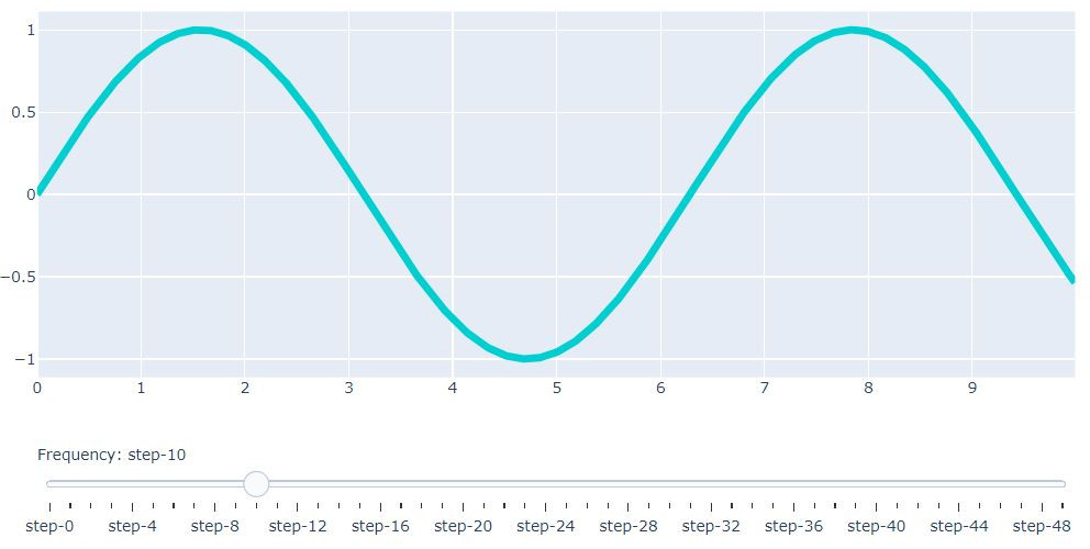
透過Plotly也可以為圖表添加圖表可控性,可以對圖表加上滾輪、按鈕等。
We can also add plot controls and IPython widgets through Plotly, such as sliders or buttons.
import numpy as np

data = [dict(
        visible = False,
        line=dict(color='#00CED1', width=6),
        name = '? = '+str(step),
        x = np.arange(0,10,0.01),
        y = np.sin(step*np.arange(0,10,0.01))) for step in np.arange(0,5,0.1)]
data[10]['visible'] = True

steps = []
for i in range(len(data)):
    step = dict(
        method = 'restyle',
        args = ['visible', [False] * len(data)],
    )
    step['args'][1][i] = True # Toggle i'th trace to "visible"
    steps.append(step)

sliders = [dict(
    active = 10,
    currentvalue = {"prefix": "Frequency: "},
    pad = {"t": 50},
    steps = steps
)]

layout = dict(sliders=sliders)
fig = dict(data=data, layout=layout)

iplot(fig, filename='Sine Wave Slider')
from IPython.display import YouTubeVideo # 嵌入youtube影片 embed youtube video
YouTubeVideo("wupToqz1e2g")

本篇程式碼請參考Github。The code is available on Github.
文中若有錯誤還望不吝指正,感激不盡。
Please let me know if there’s any mistake in this article. Thanks for reading.
Reference 參考資料:
[1] 第二屆機器學習百日馬拉松內容
[2] Visualization
[3] Plotly Python Open Source Graphing Library
[4] 給工程師的統計學及資料分析
[5] Jupyter Notebook Tutorial in Python
[6] Plotly

 iThome鐵人賽