
Seaborn是基於Matplotlib的Python繪圖庫,並有繪圖指令簡單、圖樣風格精美等優點。
Seaborn is a Python visualization library based on matplotlib. It is easy to use and provides a high-level interface for drawing attractive statistical graphics.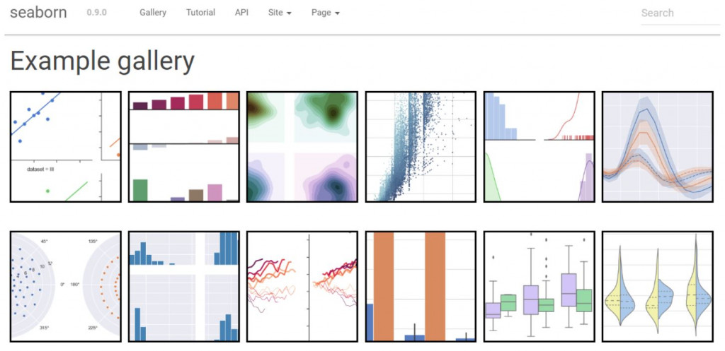
# 載入所需套件 import the packages we need
import seaborn as sns
import matplotlib.pyplot as plt
import numpy as np
import pandas as pd
import warnings
warnings.filterwarnings("ignore")
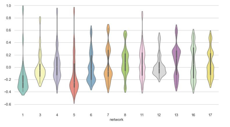
小提琴圖特點類似盒鬚圖,但更能夠展示資料分佈密度。 Violinplots are really close from a boxplots, but are better at showing the density of data.
sns.set(style="whitegrid")

# 使用seaborn官方提供的資料 Load the example dataset of brain network correlations
df = sns.load_dataset("brain_networks", header=[0, 1, 2], index_col=0)

# 取用指定資料 Pull out a specific subset of networks
used_networks = [1, 3, 4, 5, 6, 7, 8, 11, 12, 13, 16, 17]
used_columns = (df.columns.get_level_values("network")
                          .astype(int)
                          .isin(used_networks))
df = df.loc[:, used_columns]

# 運算相關矩陣以及平均 Compute the correlation matrix and average over networks
corr_df = df.corr().groupby(level="network").mean()
corr_df.index = corr_df.index.astype(int)
corr_df = corr_df.sort_index().T

# 設定窗口 Set up the matplotlib figure
f, ax = plt.subplots(figsize=(11, 6))

# 繪製小提琴圖(以較窄的寬度) Draw a violinplot with a narrower bandwidth than the default
sns.violinplot(data=corr_df, palette="Set3", bw=.2, cut=1, linewidth=1)

# 最終化圖形 Finalize the figure
ax.set(ylim=(-.7, 1.05))
sns.despine(left=True, bottom=True)
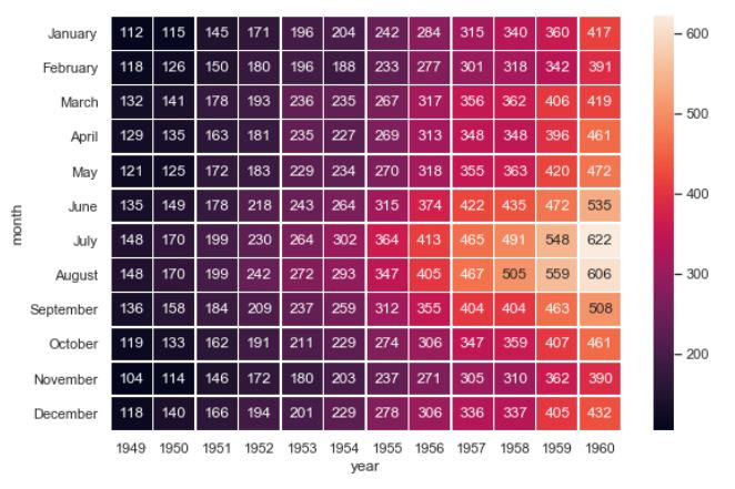
熱圖以顏色變化來顯示資料,以色彩深淺直觀的來顯示數值大小。
Heatmap show individual values in a matrix with different colors, allowing us to feel the data intuitively by just looking at the matrix.
sns.set()

# 載入資料 Load data
flights_long = sns.load_dataset("flights")
flights = flights_long.pivot("month", "year", "passengers")

# 繪製顯示數值的熱圖 Draw a heatmap with the numeric values in each cell
f, ax = plt.subplots(figsize=(9, 6))
sns.heatmap(flights, annot=True, fmt="d", linewidths=.5, ax=ax)
sns.set(style="white", rc={"axes.facecolor": (0, 0, 0, 0)})
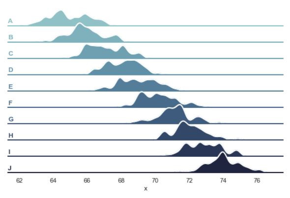
# 創建資料 Create the data
rs = np.random.RandomState(1979)
x = rs.randn(500)
g = np.tile(list("ABCDEFGHIJ"), 50)
df = pd.DataFrame(dict(x=x, g=g))
m = df.g.map(ord)
df["x"] += m
# 初始化網格化對象 Initialize the FacetGrid object
pal = sns.cubehelix_palette(10, rot=-.25, light=.7)
g = sns.FacetGrid(df, row="g", hue="g", aspect=15, height=.5, palette=pal)
# 繪製密度 Draw the densities in a few steps
g.map(sns.kdeplot, "x", clip_on=False, shade=True, alpha=1, lw=1.5, bw=.2)
g.map(sns.kdeplot, "x", clip_on=False, color="w", lw=2, bw=.2)
g.map(plt.axhline, y=0, lw=2, clip_on=False)
# 定義成函數 Define and use a simple function to label the plot in axes coordinates
def label(x, color, label):
ax = plt.gca()
ax.text(0, .2, label, fontweight="bold", color=color,
ha="left", va="center", transform=ax.transAxes)
g.map(label, "x")
# 讓子圖重疊 Set the subplots to overlap
g.fig.subplots_adjust(hspace=-.25)
# 移除一些不必要的座標資訊 Remove axes details that don't play well with overlap
g.set_titles("")
g.set(yticks=[])
g.despine(bottom=True, left=True)
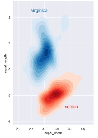
多個雙變量的核密度估計圖。
Multiple bivariate KDE plots.
sns.set(style="darkgrid")
iris = sns.load_dataset("iris")

# 指定鳶尾花子集 Subset the iris dataset by species
setosa = iris.query("species == 'setosa'")
virginica = iris.query("species == 'virginica'")

# 設定視窗 Set up the figure
f, ax = plt.subplots(figsize=(8, 8))
ax.set_aspect("equal")

# 繪製核密度估計圖 Draw the two density plots
ax = sns.kdeplot(setosa.sepal_width, setosa.sepal_length,
                 cmap="Reds", shade=True, shade_lowest=False)
ax = sns.kdeplot(virginica.sepal_width, virginica.sepal_length,
                 cmap="Blues", shade=True, shade_lowest=False)

# 加上標籤 Add labels to the plot
red = sns.color_palette("Reds")[-2]
blue = sns.color_palette("Blues")[-2]
ax.text(2.5, 8.2, "virginica", size=16, color=blue)
ax.text(3.8, 4.5, "setosa", size=16, color=red)
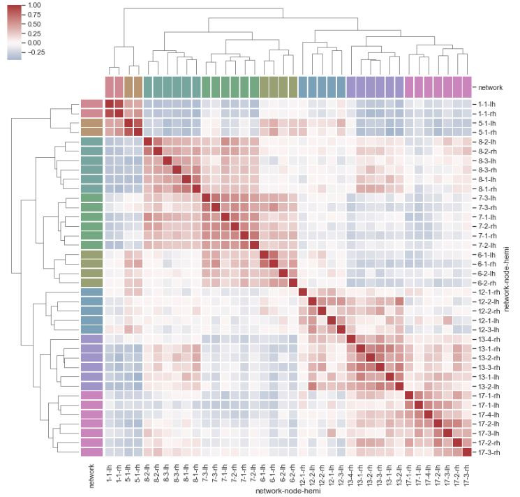
群集熱圖有兩個部分 - 數值色塊熱圖與分類樹狀圖。從數值色塊可以直觀觀測數據,而樹狀圖則可提供分組歸類結果。
Clustermap contains two parts - heatmap and tree plot. The heatmap gives us intuition of the value, yet the tree plot show the clustering result.
sns.set()
df = sns.load_dataset("brain_networks", header=[0, 1, 2], index_col=0)

used_networks = [1, 5, 6, 7, 8, 12, 13, 17]
used_columns = (df.columns.get_level_values("network")
                          .astype(int)
                          .isin(used_networks))
df = df.loc[:, used_columns]

used_networks = [1, 5, 6, 7, 8, 12, 13, 17]
used_columns = (df.columns.get_level_values("network")
                          .astype(int)
                          .isin(used_networks))
df = df.loc[:, used_columns]

# 為不同類別創建色盤 Create a categorical palette to identify the networks
network_pal = sns.husl_palette(8, s=.45)
network_lut = dict(zip(map(str, used_networks), network_pal))

# 將色盤轉為向量,繪製在矩陣旁 Convert the palette to vectors that will be drawn on the side of the matrix
networks = df.columns.get_level_values("network")
network_colors = pd.Series(networks, index=df.columns).map(network_lut)

# 繪圖 Draw the full plot
sns.clustermap(df.corr(), center=0, cmap="vlag",
               row_colors=network_colors, col_colors=network_colors,
               linewidths=.75, figsize=(13, 13))
在五篇談論不同視覺化工具與圖表的介紹,想以這張從網路找到的圖片做個小結。如果處理資料初期不曉得該繪製何種圖表,可以查找這張圖片作為參考。
After five articles discussing different types of visualization tools and methods, this picture from the internet is good way to sum up. When we have a set of data and not knowing which visualization method to use, looking up this picture might provide am idea.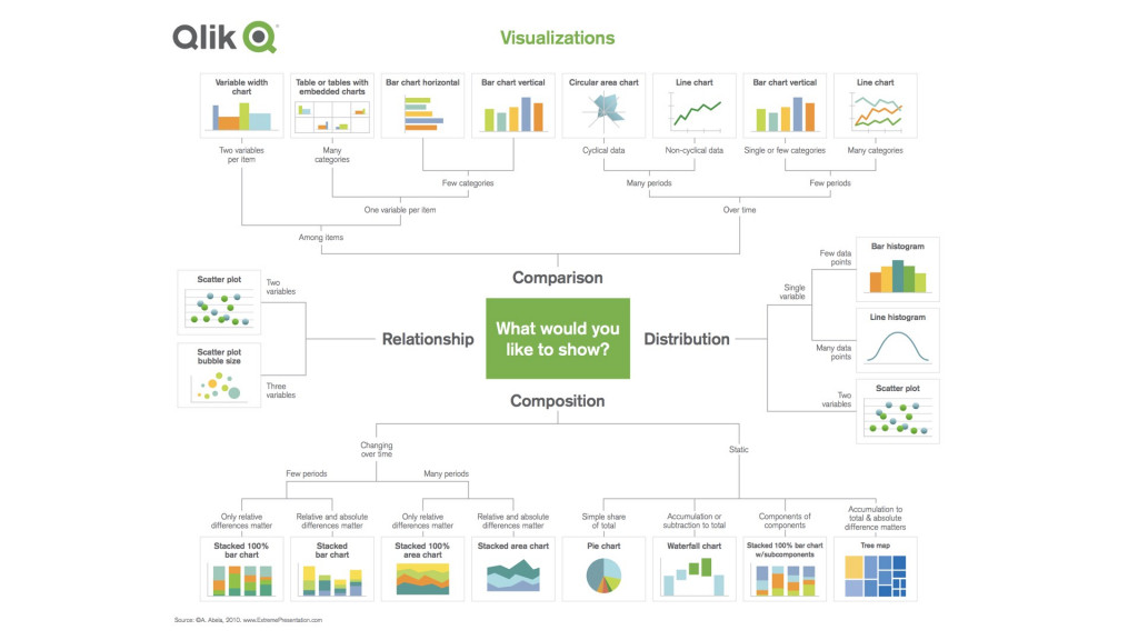
本篇程式碼請參考Github。The code is available on Github.
文中若有錯誤還望不吝指正,感激不盡。
Please let me know if there’s any mistake in this article. Thanks for reading.
Reference 參考資料:
[1] 第二屆機器學習百日馬拉松內容
[2] Visualization
[3] Seaborn: statistical data visualization
[4] 給工程師的統計學及資料分析
[5] Visualizations
