在前一篇30天Flutter手滑系列 - 文字(Text Widgets)、圖片相關組件(Assets, Images, Icon Widgets)與文字輸入(Input Widgets),介紹了靜態的widgets後,其實已經差不多可以設計一個基本的畫面了,要如何讓他們排列成預期中的樣子,那就得要來學習這個章節。
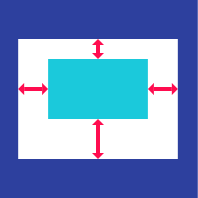
用來控制child對齊位置的widget。
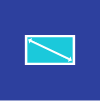
可以指定像是topRight、bottomLeft這類預設名稱。另外,Alignment使用的是座標系統,可以給定-1~1的浮點數數值。
下方範例示範將flutter logo設定為topRight,讓它對齊容器的右上角位置。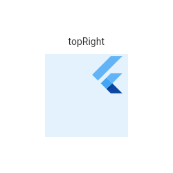
Center(
  child: Container(
    height: 120.0,
    width: 120.0,
    color: Colors.blue[50],
    child: Align(
      alignment: Alignment.topRight,
      child: FlutterLogo(
        size: 60,
      ),
    ),
  ),
)
第二個範例使用座標系統去計算出flutter logo相對於中心點的位置。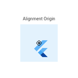
Center(
  child: Container(
    height: 120.0,
    width: 120.0,
    color: Colors.blue[50],
    child: Align(
      alignment: Alignment(0.2, 0.6),
      child: FlutterLogo(
        size: 60,
      ),
    ),
  ),
)
註:實際計算出位置的公式:
(0.2 * Logo寬/2 + Logo寬/2, 0.6 * Logo高/2 + Logo高/2) = (36.0, 48.0).
如果你期望你的組件呈現一定的比例,可以加入這個AspectRatio widget。
widget在初始化會先最大化其寬度,高度則是根據給定的aspect ratio決定。以16:9來說,如果寬度是無限寬,那麼初始化的時候,寬會根據aspect ratio優先被決定,然後高才會被畫出其最大高度。
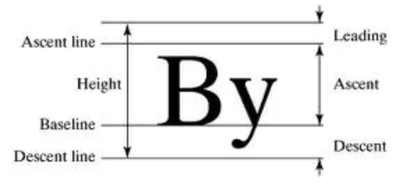
指定child對齊child自己的baseline。例如不同的文字,期望他們在同一個水平線上。
需要做垂直置中嗎?用它就對了!值得一提的是,Center繼承自Align,跟Alignment.center效果一樣。
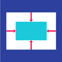
如果需要對child多一些額外的限制可以用這個widget。
下面範例示範將一個有文字的Card,填滿其parent,使用BoxConstraints.expand這個方法:
ConstrainedBox(
  constraints: const BoxConstraints.expand(),
  child: const Card(child: Text('Hello World!')),
)
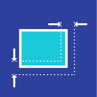
這應該是flutter內最常見的widget之一,可以控制繪製(painting)、定位(positioning)和大小(sizing)。
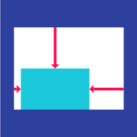
Container的組成:
Container繪製的過程:
Container算是由好幾種單一widget組合成的複合式widget,整體設計上較為複雜,一般情況下會依據下列順序去呈現其布局:
下面範例是一個正方形帶有margin屬性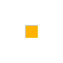
Center(
  child: Container(
    margin: const EdgeInsets.all(10.0),
    color: Colors.amber[600],
    width: 48.0,
    height: 48.0,
  ),
)
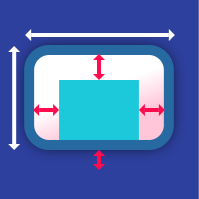
下面範例是套用了constraints、padding、alignment和transform的複合式效果。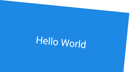
Container(
  constraints: BoxConstraints.expand(
    height: Theme.of(context).textTheme.display1.fontSize * 1.1 + 200.0,
  ),
  padding: const EdgeInsets.all(8.0),
  color: Colors.blue[600],
  alignment: Alignment.center,
  child: Text('Hello World',
    style: Theme.of(context)
        .textTheme
        .display1
        .copyWith(color: Colors.white)),
  transform: Matrix4.rotationZ(0.1),
)
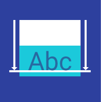
用來產生內距的widget。
Padding與Container.padding沒有什麼不同,只是差在Container沒有自己的屬性,其屬性來自於被打包進去的其他widget。
下面是一個padding的例子:
Padding(
  padding: EdgeInsets.all(8.0),
  child: const Card(child: Text('Hello World!')),
)
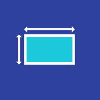
一個具有指定寬高的Box。
在沒有任何child的情況下,SizedBox會嘗試符合parent限制的寬高,如果本身的寬高是null或未指定,則值會是0。
下面範例是一個200x300受限大小的SizedBox
SizedBox(
  width: 200.0,
  height: 300.0,
  child: const Card(child: Text('Hello World!')),
)
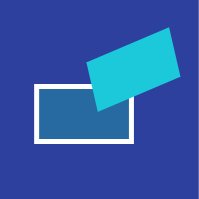
Transform的效果會在繪製出child之前就會先被套用效果。你可以嘗試變形任何widget,包括整個app。
下面範例示範rotate和skew一個橘色方塊。
Container(
  color: Colors.black,
  child: Transform(
    alignment: Alignment.topRight,
    transform: Matrix4.skewY(0.3)..rotateZ(-math.pi / 12.0),
    child: Container(
      padding: const EdgeInsets.all(8.0),
      color: const Color(0xFFE8581C),
      child: const Text('Apartment for rent!'),
    ),
  ),
)
Flutter對layout還滿有彈性的,如果以上還不能滿足需求,明天會來繼續介紹多組件布局(Multi-child layout widgets)。
前面的文章,幾乎都在趕12點前發文,其實今天也是,所以有些遺漏。我也會著手陸續修改,會補上一些之前遺漏的,順便修改語句表達。
感謝各位包涵我偷懶的部分
https://flutter.dev/docs/development/ui/widgets/layout
https://juejin.im/post/5b13c3e1f265da6e3d666d80

 iThome鐵人賽
 看影片追技術