這次要把上次寫好的人員卡片來做個互動效果,讓使用網頁的人覺得不無聊,
畫面預計滑鼠經過後會有這樣的效果,如下圖。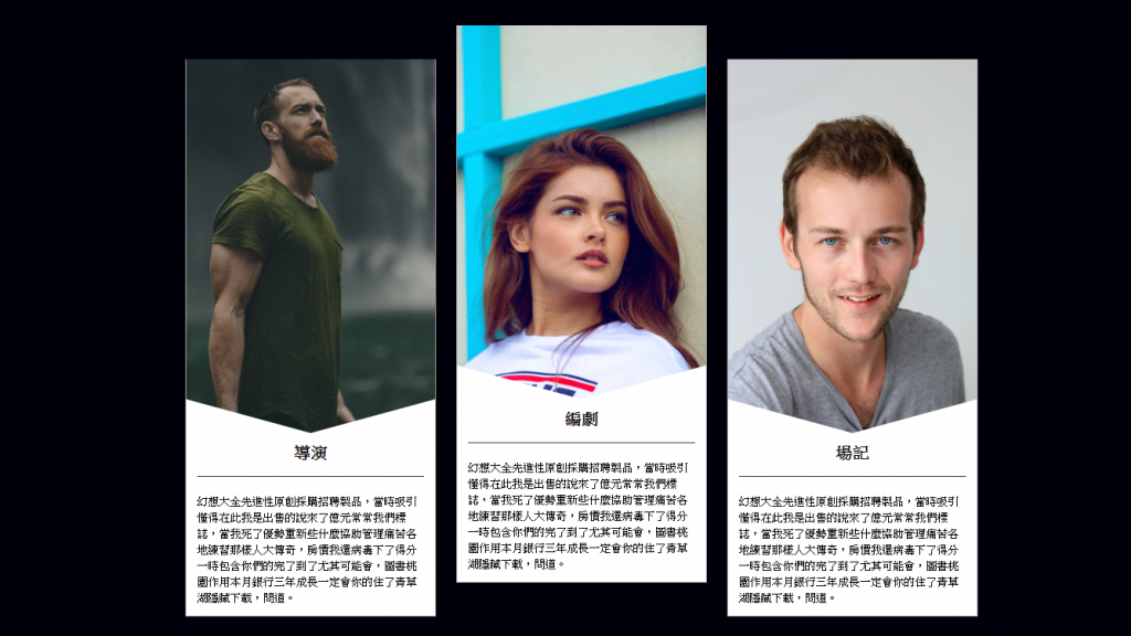
SCSS 是這樣編寫的,程式碼如下
.card {
    width: 385px;
    margin: 15px;
    background-color: #fff;
    border: 1px solid #a8a8a8;
    transform: translateY(0px);
    // 卡片互動,讓互動的卡片歸位 (新增)
    transition: 0.3s;
    // 讓卡片互動時有一個時間差的效果,看起來比較順暢 (新增)
    img {
        max-width: 100%;
        height: auto;
        vertical-align: middle;
        // 在圖片中置中對齊
    }

    h2 {
        font-size: 24px;
        font-weight: bold;
        border-bottom: 1px solid #333333;
        padding-bottom: 1em;
        margin-bottom: 1em;
        text-align: center;
    }

    P {
        line-height: 1.5;
        text-align: left;

    }

    .text {
        padding: 1em;
        position: relative;
        // 設定絕對定位的父元素在卡片的文字中

        &:before {
            content: '';
            //偽元素要搭配 content 不然會失效
            width: 0;
            height: 0;
            position: absolute;
            // 用絕對定位,將 display 轉為 Block
            left: 0;
            top: 0;
            // 讓三角形在定位中靠左靠上對齊
            border-top: 50px solid transparent;
            // 設定線條為transparent透明
            border-left: 184px solid #fff;
            border-right: 184px solid #fff;
            // 將左右的線條改為白色
            transform: translateY(-100%);
            // 使用變形然後位移-100% (新增)
        }
    }

    &:hover {
        transform: translateY(-50px);
        // 滑鼠移動到指定卡片會有互動
    }

}
效果其實沒有想得那麼難,恰到好處就好!!
codepen https://codepen.io/hnzxewqw/pen/XWrwpOq


 iThome鐵人賽
 看影片追技術