倘若不斷向深處扎根,就能茁壯成長 - RM
平時我們在使用 position 時可能是在使用 position: absolute ,需要對某個元素去做出特別的定位時、或是只需要讓元素稍作偏移但不脫離流而使用 position: relative 時,今天我們要談到 position 的四種屬性值:static、relative、absolute、fixed,還記得我們昨天提到的在 CSS 中的三種定位方式嗎?CSS 中主要存在三種定位方式,以 position 來說不同的屬性值主要分成了 Normal flow 狀態下的 static、relative 以及屬於絕對定位類別的 absolute、fixed 兩種。
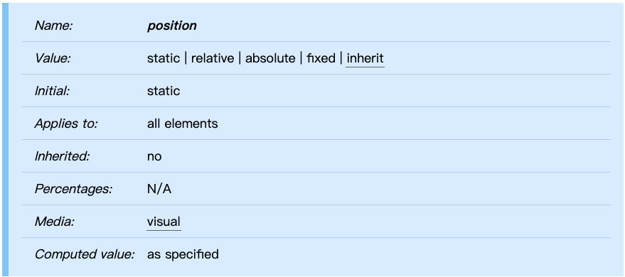
position
規範直通車:
Visual formatting model
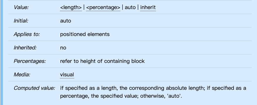
top、left、right、bottom
上面是規範中的 position 我們可以看見一般元素的初始值都是 static,也就是未脫離 Normal flow,屬於 Normal flow 狀態,好比我們今天直接設置了一個 <div>、<nav> 在預設情況下都是 static,由於兩個元素都是 display: block 所以會按照 Normal flow 中的 BFC 去進行定位佈局。
position: static:預設狀態,位於 Normal flow 中,例如說我們一般在設置 <a>、<div>、<p> 等元素都是屬於 position: static,會按照 Normal flow 方式去定位佈局。規範定義:
Once a box has been laid out according to the normal flow or floated, it may be shifted relative to this position. This is called relative positioning.
position: relative:box 會相對於它本來位於 Normal Flow 的位置去移動,並且不會影響其他元素,相當於實體位置沒有偏移一樣,不過當設置 position: relative 時,此時可能涉及到堆疊。
overflow: auto | scroll 狀態會形成滾動條去處理。以上的規則拿例子來說,我們可以看下列三種規則等效。
div.a8 { position: relative; direction: ltr; left: -1em; right: auto }
div.a8 { position: relative; direction: ltr; left: auto; right: 1em }
div.a8 { position: relative; direction: ltr; left: -1em; right: 5em } /*這三條規則等效*/
左右設置相牴觸時,左大於右。
.container{
  width: 270px;
  height: 270px;
  background-color: #cfcfcf;
  overflow: scroll;
  padding: 10px;
}
.item{
  text-align: center;
  width: 100px;
  height: 100px;
  background-color: #dfdfdf;
  outline: 2px dashed ;
  margin-bottom: 10px;
  color: #4e4e4e;
}
.item::before{
  content:'';
  display: inline-block;
  height: 100%;
  vertical-align: middle;
}
.item:nth-of-type(3){
  position: relative;
  top: 400px;
}

我們可以看見在上下左右都設置 10px 的狀態下,實際上是 10px 狀態的只有上、左,這是因為在同時設置衝突時,left > right;top > bottom 的緣故。
.container{
  width: 300px;
  height: 300px;
  background-color: #cfcfcf;
/*   overflow: auto; */
  overflow: scroll;
}
.item{
  width: 100px;
  height: 100px;
  background-color: #4e4e4e;
}
.item:first-of-type{
  position: relative;
  top: 400px;
}
此時假如對包含塊設定 overflow: scroll、auto 的話,超出的元素會以滾動條處理(如下),在這個時候 container 因為 overflow 不是 overflow: visible 所以對內新生成了一個 BFC ,此時的 container 與內部 div 不會產生所謂的 margin-collpase,除此之外一般的狀態下預設值為 overflow: visible 所以元素會直接超出包含塊區域,不會受到剪裁或遮罩、滑動處理。

規範定義:
In the absolute positioning model, a box is explicitly offset with respect to its containing block. It is removed from the normal flow entirely (it has no impact on later siblings).
position: absolute:相對於屬性值 position: static以外的最近祖先 containing block 去進行偏移,對於之後的元素定位沒有影響,本身新建了 BFC,因此不會產生 margin collapse。
position: absolute 本身有自己的 box 大小算法,寬要再進行設定不會自動佔滿包含塊(position: absolute 寬高 box 算法之後會提及)。position: absolute 包含塊為最近祖先非 position: static 元素。規範定義:
Fixed positioning is a subcategory of absolute positioning. The only difference is that for a fixed positioned box, the containing block is established by the viewport.
position: fixed 本身的定位跟 position: absolute 很相似,明顯不同地方是包含塊是 viewport ,設置了 position: fixed 定位偏移基準都是 viewport。對於各種 media type ,諸如列印、螢幕等等,
position: fixed會相對於某個視口去做移動,若是希望在列印和螢幕時有不同的效果,可以透過 media rule 去設定。
position: sticky 支援度不高,在此暫時不討論,規範寫到它較為接近於 position: relative 的定位方式,詳情見 CSS position level 3。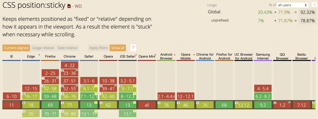
Cascading Style Sheets Level 2 Revision 2 (CSS 2.2) Specification
CSS Positioned Layout Module Level 3
CSS Display Module Level 3
以上的部分有任何錯誤的地方,歡迎指正呦~非常感謝~~XD

 iThome鐵人賽
 看影片追技術