要先確認http://localhost:8080/api 是否有連線成功
這裡是要用spring boot 先run成功
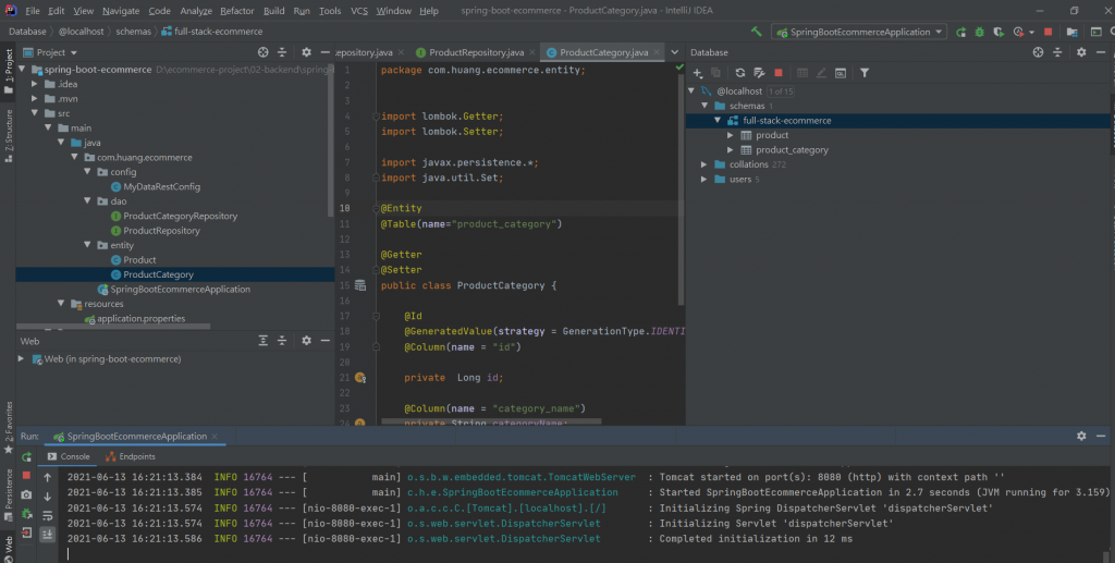
才會顯示
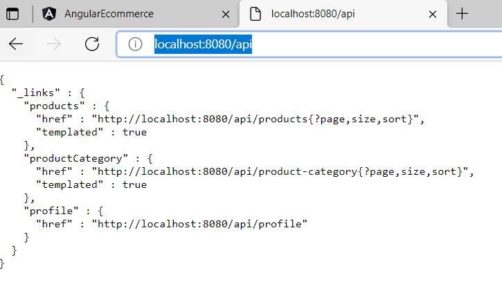
開始加入照片放入VS CODE 的ANGULAR裡的assets下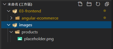
在原本的程式碼中
新增有關照片的
目前的程式碼:
<table class="table">

  <thead class="thead-dark">
      <tr>
        <th></th>
          <th>Name</th>
          <th>Price</th>
          <th>Units in Stock</th>
      </tr>
  </thead>

  <tbody>
      <tr *ngFor="let tempProduct of products">

        <td>
          <img src="{{ tempProduct.imageUrl }}"/>
        </td>
          <td>{{ tempProduct.name}}</td>
          <td>{{ tempProduct.unitPrice | currency:'USD'}}</td>
          <td>{{ tempProduct.unitsInStock}}</td>
      </tr>

  </tbody>
</table>
因為只有新增底的照片,所以目前http://localhost:4200/ 只有長這樣
有時會有點卡要等一下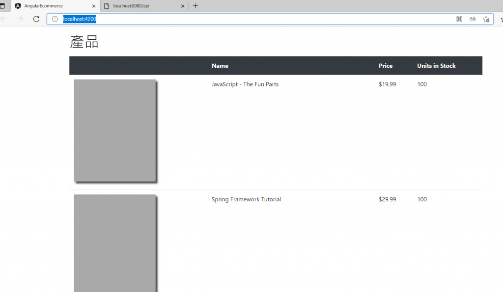
把高改成50,就是height="50"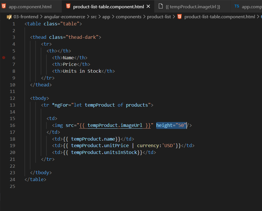
看起來才不會太突兀0.0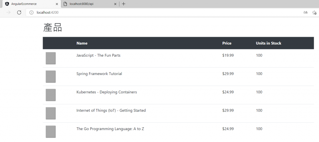
加入CSS語法 class="align-middle"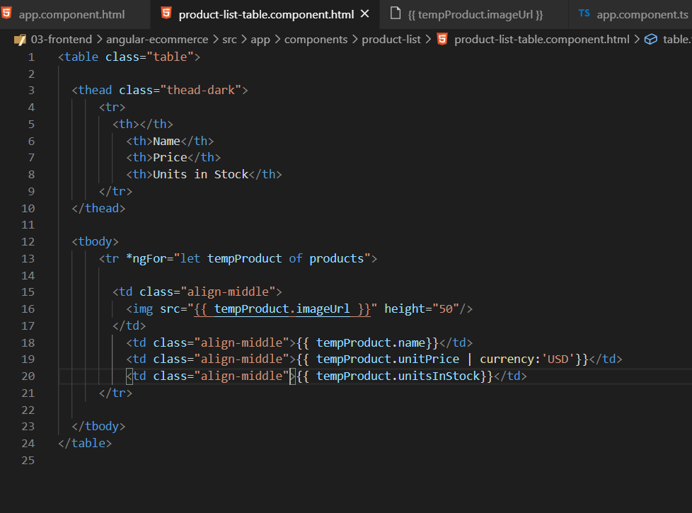
多了線條------------變得更美
後面將介紹如何把網站變成像這樣的排版
再加入可以搜尋書的功能.使用html+css
想要長成這樣的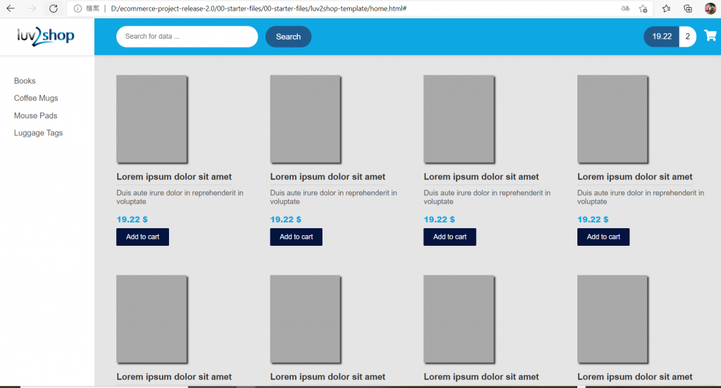
程式碼是這樣:
<!doctype html>
<html lang="en">

<head>
	<meta charset="utf-8">
	<meta name="viewport" content="width=device-width, initial-scale=1, shrink-to-fit=no">

	<title>luv2shop - Full Stack eCommerce: Angular and Spring Boot</title>

	<!-- Bootstrap CSS and Font Awesome -->
	<link rel="stylesheet" href="https://stackpath.bootstrapcdn.com/bootstrap/4.4.1/css/bootstrap.min.css"
		integrity="sha384-Vkoo8x4CGsO3+Hhxv8T/Q5PaXtkKtu6ug5TOeNV6gBiFeWPGFN9MuhOf23Q9Ifjh" crossorigin="anonymous">

	<link rel="stylesheet" href="https://cdnjs.cloudflare.com/ajax/libs/font-awesome/5.11.2/css/all.css" media="all">

	<!-- Main CSS-->
	<link href="styles.css" rel="stylesheet" media="all">

	<link rel="icon" href="assets/images/fav-icon.png">
</head>

<body>
	<div class="page-wrapper">

		<!-- MENU SIDEBAR-->
		<aside class="menu-sidebar d-none d-lg-block">
			<div class="logo">
				<a href="home.html">
					<img src="assets/images/logo.png" alt="luv2shop" class="img-responsive">
				</a>
			</div>
			<div class="menu-sidebar-content js-scrollbar1">
				<nav class="navbar-sidebar">
					<ul class="list-unstyled navbar-list">
						<li>
							<a href="#">Books</a>
						</li>
						<li>
							<a href="#">Coffee Mugs</a>
						</li>
						<li>
							<a href="#">Mouse Pads</a>
						</li>
						<li>
							<a href="#">Luggage Tags</a>
						</li>
					</ul>
				</nav>
			</div>
		</aside>
		<!-- END MENU SIDEBAR-->

		<!-- PAGE CONTAINER-->
		<div class="page-container">
			<!-- HEADER DESKTOP-->
			<header class="header-desktop">
				<div class="section-content section-content-p30">
					<div class="container-fluid">
						<div class="header-wrap">
							<form class="form-header" onsubmit="return false;" method="GET">
								<input class="au-input au-input-xl" type="text" name="search"
									placeholder="Search for data ..." />
								<button class="au-btn-submit" type="submit">
									Search
								</button>
							</form>
							<div class="cart-area d-n">
								<a href="shopping-detail.html">
									<div class="total">19.22 <span> 2</span> </div> <i class="fa fa-shopping-cart"
										aria-hidden="true"></i>
								</a>
							</div>
						</div>
						<div class="account-wrap"></div>
					</div>
				</div>
			</header>
			<!-- END HEADER DESKTOP-->

			<!-- MAIN CONTENT-->
			<div class="main-content">
				<div class="section-content section-content-p30">
					<div class="container-fluid">
						<div class="row">

							<div class="col-md-3">
								<div class="product-box">
									<a href="product-detail.html">
										<img src="assets/images/products/placeholder.png" class="img-responsive">
									</a>
									<a href="product-detail.html">
										<h1>Lorem ipsum dolor sit amet</h1>
									</a>
									<h2>Duis aute irure dolor in reprehenderit in voluptate </h2>
									<div class="price">19.22 $</div>
									<a href="#" class="primary-btn">Add to cart</a>
								</div>
							</div>
							<div class="clearfix"></div>
							<div class="col-md-3">
								<div class="product-box">
									<a href="product-detail.html">
										<img src="assets/images/products/placeholder.png" class="img-responsive">
									</a>
									<a href="product-detail.html">
										<h1>Lorem ipsum dolor sit amet</h1>
									</a>
									<h2>Duis aute irure dolor in reprehenderit in voluptate </h2>
									<div class="price">19.22 $</div>
									<a href="#" class="primary-btn">Add to cart</a>
								</div>
							</div>
							<div class="col-md-3">
								<div class="product-box">
									<img src="assets/images/products/placeholder.png" class="img-responsive">
									<h1>Lorem ipsum dolor sit amet</h1>
									<h2>Duis aute irure dolor in reprehenderit in voluptate </h2>
									<div class="price">19.22 $</div>
									<a href="#" class="primary-btn">Add to cart</a>
								</div>
							</div>

						</div>

						<div class="footer-pagination">
							<div class="row">
								<div class="col-md-6"></div>
								<div class="col-md-3">
									<div class="items">
										<label>Item per page</label> <select>
											<option>10</option>
											<option>20</option>
											<option>30</option>
											<option>40</option>
										</select>
									</div>
								</div>
								<div class="col-md-2">
									<div class="number">1 - 10 of 100</div>
								</div>
								<div class="col-md-1">
									<div class="arrows">
										<a href="#"><i class="fa fa-angle-left" aria-hidden="true"></i></a>
										<a href="#"><i class="fa fa-angle-right" aria-hidden="true"></i></a>
									</div>
								</div>
							</div>
						</div>
					</div>
				</div>
			</div>

		    <!-- END MAIN CONTENT-->

		</div>
	</div>

	<!-- END PAGE CONTAINER-->


	<footer>
		<ul>
			<li><a href="#">About Us</a></li>
			<li><a href="#">Contact Us</a></li>
			<li><a href="#">Help</a></li>
		</ul>
	</footer>

</body>

</html>
<!-- end document-->
聽前輩說現在的電商都是製造商直接面對客人~
比較不是中間還過手一段
所以也有相對的不好做
不過我做的是購物商城~不管是從哪一段出貨應該都沒差吧?
#台灣便利配
星期五就要把#育苗 成功的南瓜 搬到 田田
想要種100種蔬菜水果 0
購物網站難產中~
還好有學JAVA不然不知道怎麼串接~
雖然...QQ
https://www.ezship.com.tw/....../service_home_w18v1......#
DEAR ALL 我們明天見~

 看影片追技術