
一、q-toolbar、q-list、q-menu的相關應用
二、前台的導覽列練習
三、後台的導覽列練習
四、第四部分總結
經常作為q-header和q-footer裡面的容器
Toolbar is a component usually part of Layout Header and Footer, but it can be used anywhere on the page.
https://quasar.dev/vue-components/toolbar
例如:劃分出「左邊」與「右邊」兩個區域
<q-toolbar>
    <q-toolbar-title class="flex no-wrap items-center">
        <div>左邊</div>
        <div>左邊</div>
        <div>左邊</div>
    </q-toolbar-title>
    <div>
        <div>右邊</div>
        <div>右邊</div>
        <div>右邊</div>
    </div>
例如:搭配 q-space,劃分出「左邊」、「中間」與「右邊」三個區域
<q-toolbar>
    <q-toolbar-title class="flex no-wrap items-center">
        <div>左邊</div>
        <div>左邊</div>
        <div>左邊</div>
    </q-toolbar-title>
    <q-space/>
        <div>
          <q-input class="full-width" standout="bg-grey-2 text-white"/>
        </div>
     <q-space/>
    <div>
        <div>右邊</div>
        <div>右邊</div>
        <div>右邊</div>
    </div>
紅色分別是左邊和右邊的區塊,黃色則是中間兩旁的間距(q-space)
q-space的原理是使用flex的flex-grow,將剩下的空間平均分配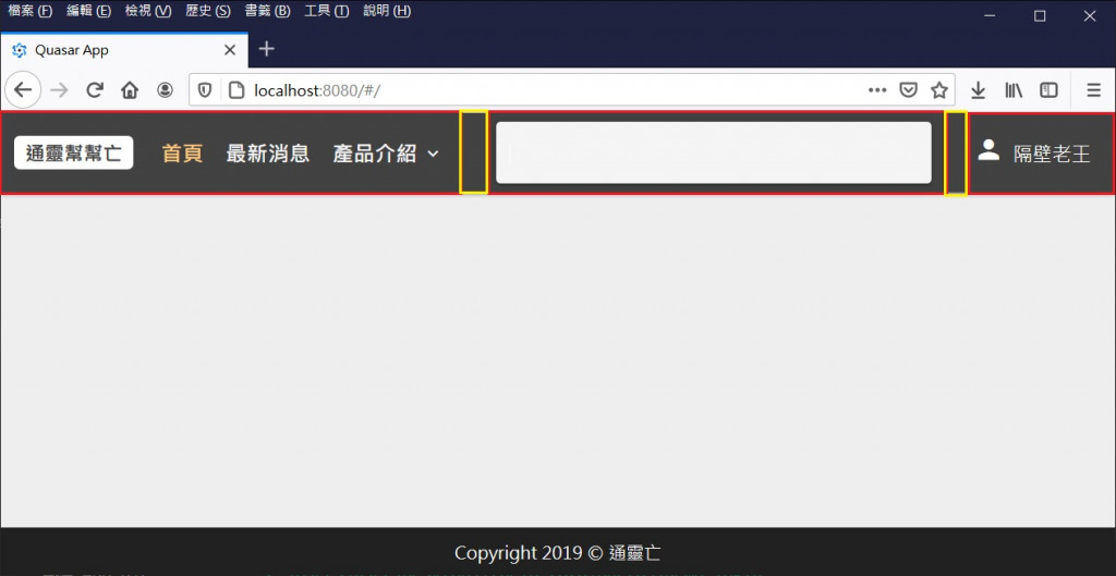
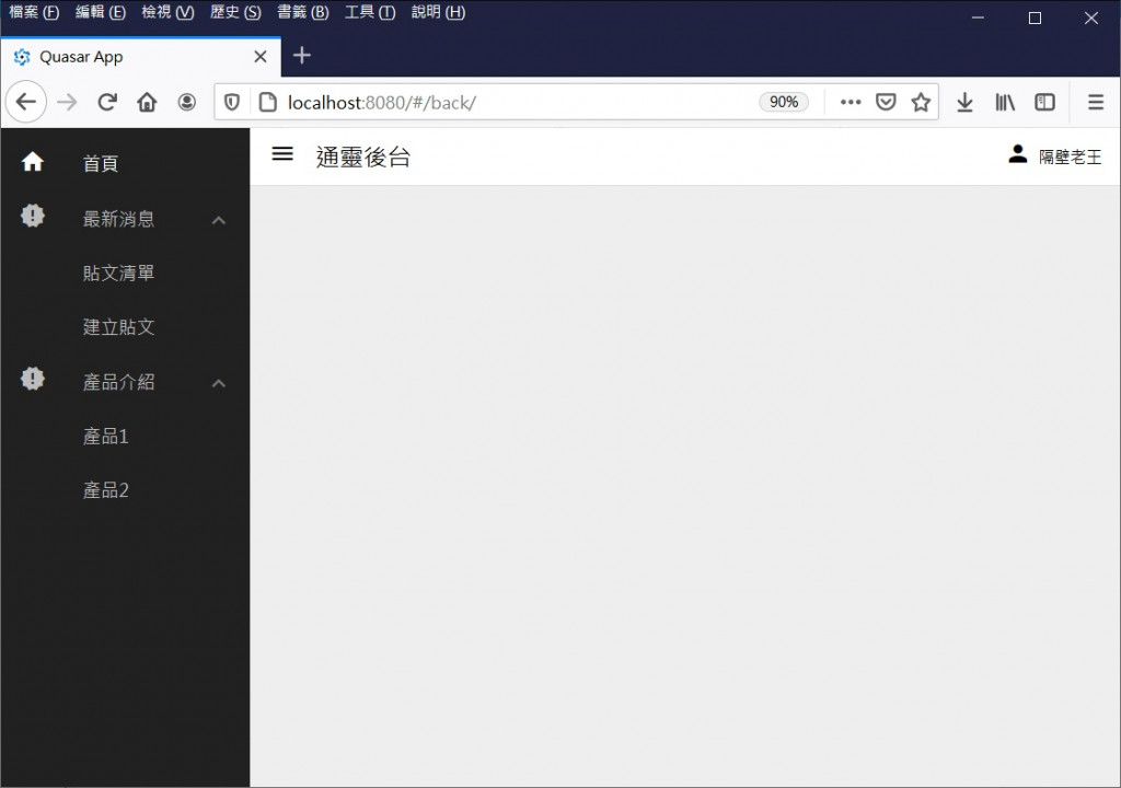
q-expansion-item:q-list當中展開收合的元件
q-item:q-list當中單一的項目元件,藉由inset-level調整選項的層級縮排
搭配v-router,用來實現Sidebar的下拉選單
也可以應用在q-menu裡面
The QList and QItem are a group of components which can work together to present multiple line items vertically as a single continuous element.
https://quasar.dev/vue-components/list-and-list-items#QItem-API
The QExpansionItem component allows the hiding of content that is not immediately relevant to the user. Think of them as accordion elements that expand when clicked on. It’s also known as a collapsible.
https://quasar.dev/vue-components/expansion-item
例如:簡易的二階選單程式碼
<q-list>
    <!-- q-item -->
    <q-item clickable  tag="a" exact :to="{name: 'xxx'}" active-class="text-white">
      <q-item-section avatar>
        <q-icon name="xxx" />
      </q-item-section>

      <q-item-section>
        <q-item-label>xx</q-item-label>
      </q-item-section>
    </q-item>

    <!-- q-expansion-item -->
    <q-expansion-item
      icon="xxx"
      label="xxx"
    >
        <q-item clickable  tag="a" :inset-level="1" exact active-class="text-white" :to="{ name: 'xxx' }">
            <q-item-section>
            <q-item-label>xxx</q-item-label>
            </q-item-section>
        </q-item>
    </q-expansion-item>
</q-list>
用來實現滑鼠點擊或聚焦時,顯示一個下拉式選單
常常配合q-list+q-item、q-date
也可以放自訂的內容
The QMenu component is a convenient way to show menus. Goes very well with QList as dropdown content, but it’s by no means limited to it.
https://quasar.dev/vue-components/menu#QMenu-API
例如:按下超連結時顯示
<a>
    <q-menu>
        <q-list>
            <q-item clickable v-close-popup>
                <q-item-section avatar><q-icon name="account_box" /></q-item-section>
                <q-item-section><q-item-label>通靈後台</q-item-label></q-item-section>
            </q-item>
            <q-item clickable v-close-popup>
                <q-item-section avatar><q-icon name="meeting_room" /></q-item-section>
                <q-item-section><q-item-label>登出</q-item-label></q-item-section>
            </q-item>
        <q-list>
    </q-menu>
</a>
例如:聚焦於欄位時顯示
<q-input standout="bg-grey-2 text-white">
    <q-menu>
      <q-date />
    </q-menu>
 </q-input>

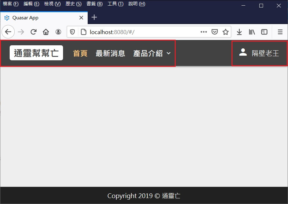
很多網站的導覽列都有「二階選單」
小通被主管賦予一個任務,要完成前後台的二階選單功能

功能示意如下:
希望透過第四部份的介紹
一方面讓大家了解網站版型的重要性
另一方面也讓大家體會Quasar Layout系統的方便性
接下來將進入第五部分,介紹比較細微的議題:切版與元件

 iThome鐵人賽
 看影片追技術