表單在網頁上有不同呈現的功能,像是網路投票、註冊、購物、問券、搜尋等,用來收集瀏覽者的資訊,增加與使用者的互動。
<form>包含表單元素的區域(input、textarea、select...),用來讓使用者輸入資料
<form action="送出目的地" method="資料傳送方式">
	<!-表單元素->
</form>
表單資料傳遞方式:
填好表單按送出按鈕後,透過get或post方傳送到伺服器(Web Server)
放在 HTTP 傳輸封包 body 中送出,安全性較高,因為已封包方式傳送,所以傳送資料大小沒有檔案限制。像是寫完信件,會將信件放到信封裡面,不會有人知道裡面寫什麼內容,安全性較高。
會將表單內的資料放在action請求的URL上面送出,安全性較差,且只有255個字元限制,適合用在搜尋等資料量少的表單。get傳送方式就像是明信片,容易被其他人看到內容,安全性較低。
製作表單,會有輸入框、下拉選單、按鈕等元件組成。下面就會一一介紹每個元件功能
<input>是讓使用者輸入的資料的元件,常用在搜尋(text)、密碼(password)、信箱(email)等。
通用屬性:
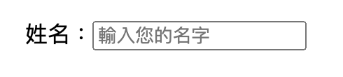
姓名:<input type="text" name="username" placeholder="輸入您的名字">
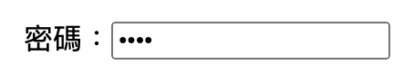
不會被明碼顯示在螢幕畫面中
<input type="password">
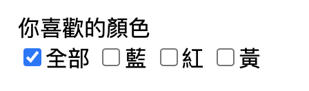
name需要都是一樣,一個群組內,可以複選,預設選取可以使用checked
你喜歡的顏色<br>
<input type="checkbox" name="color" id="all" checked>全部
<input type="checkbox" name="color" id="blue">藍
<input type="checkbox" name="color" id="red">紅
<input type="checkbox" name="color" id="yellow">黃
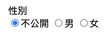
name需要都是一樣,一個群組內,只能單選,預設選取可以使用checked
性別<br>
<input type="radio" name="gender" id="noopen" checked>不公開
<input type="radio" name="gender" id="man">男
<input type="radio" name="gender" id="woman">女
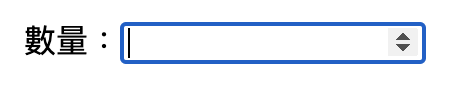
只能輸入數字,選取input輸入框右邊可以點選上下箭頭符號,增減數字
<input type="number">
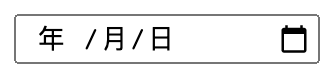
<input type="date">
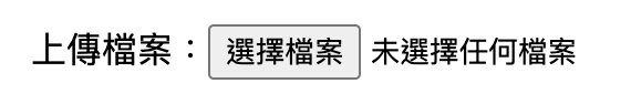
<input type="file">
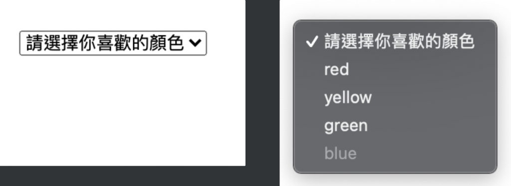
<select>用來建立下拉式選單 (dropdown menu),讓使用者可以從一堆選項中選擇出一個或多個選項
<option>
<option>
<select>
    <option>請選擇你喜歡的顏色</option>
    <option value="red">red</option>
    <option selected>yellow</option>
    <option>green</option>
		<option disabled>blue</option>
</select>
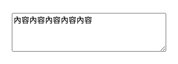
<textarea>多行文字輸入欄位
<textarea name="mytext" rows="4" cols="30">內容內容內容內容內容</textarea>
<label>label可以將欄位名稱及表單元件做關聯。用for屬性值設定與表單元件id做關聯。或是直接把表單元件包在label裡面。
<div>
	方法一:
	<label for="emailAddress">Email address: </label>
	<input type="email" name="emailAddress" id="emailAddress">
</div>
<div>
	方法二:
	<label>
		Email address:
		<input type="email" name="emailAddress">
	</label>
</div>
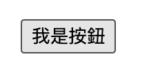
<button><button type="button">我是按鈕</button>
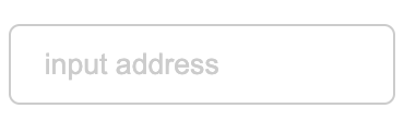
表單元件像是輸入框、下拉選單...的樣式預設都醜醜的,透過css可以隨心所欲的將元件變得美美的,以下是我比較常用的表單樣式
<select class="form-control">
		<option>choose area</option>
		<option>Taichung</option>
		<option>Taipei</option>
	</select>
	<input type="text" class="form-control" placeholder="input address">
.form-control{
	color:#333;
	border:1px solid #ccc;
	padding:10px 15px;
	margin-bottom:10px;
	border-radius:5px;
}
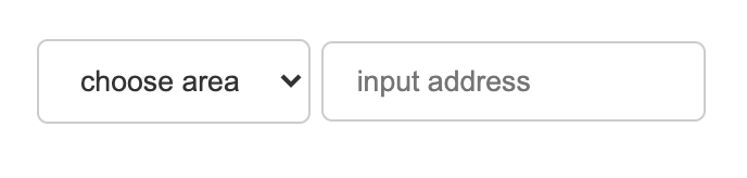
.form-control::placeholder {
  color: #ccc;
}
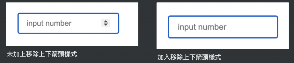
/*chrome瀏覽器移除*/
input::-webkit-outer-spin-button,
input::-webkit-inner-spin-button {
  -webkit-appearance: none;
}
/*firefox瀏覽器移除*/
input[type="number"]{
  -moz-appearance: textfield;
}
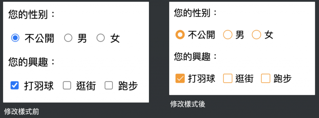
<p>您的性别:</p>
<div class="select-item radio-item">
  <input type="radio" id="noopen" name="sex" checked>
  <label for="noopen"></label>不公開
</div>
<div class="select-item radio-item">
  <input type="radio" id="man" name="sex">
  <label for="man"></label>男
</div>
<div class="select-item radio-item">
  <input type="radio" id="woman" name="sex">
  <label for="woman"></label>女
</div>

<p>您的興趣:</p>
<div class="select-item checkbox-item">
  <input type="checkbox" id="noopen" name="sex" checked>
  <label for="noopen"></label>打羽球
</div>
<div class="select-item checkbox-item">
  <input type="checkbox" id="man" name="sex">
  <label for="man"></label>逛街
</div>
<div class="select-item checkbox-item">
  <input type="checkbox" id="woman" name="sex">
  <label for="woman"></label>跑步
</div>
.select-item {
  position: relative;
  display: inline-block;
  margin-right: 5px;
}
.select-item input {
  vertical-align: middle;
  width: 14px;
  height: 14px;
  appearance: none;
  -webkit-appearance: none;
  opacity: 0;
  outline: none;
  margin: 0 5px 0 0 ;
}
.select-item label {
  position: absolute;
  left: 3px;
  top: 3px;
  z-index: -1;
  width: 14px;
  height: 14px;
  border: 1px solid #409eff;
  border-radius: 50%;
}
.select-item input:checked + label {
  background-color: #409eff;
}
/*radio style*/
.radio-item input[type="radio"]:checked + label::after {
  content: "";
  position: absolute;
  left: calc(50% - 4px);
  top: calc(50% - 4px);
  width: 8px;
  height: 8px;
  background-color: #fff;
  border-radius: 50%;
}
/*checkbox style*/
.checkbox-item label{
  border-radius: 2px;
}
.checkbox-item input[type="checkbox"]:checked + label::after {
  content: "";
  position: absolute;
  left: 5px;
  top: 0px;
  width: 4px;
  height: 10px;
  border-right: 1px solid #fff;
  border-bottom: 1px solid #fff;
  transform: rotate(45deg);
}
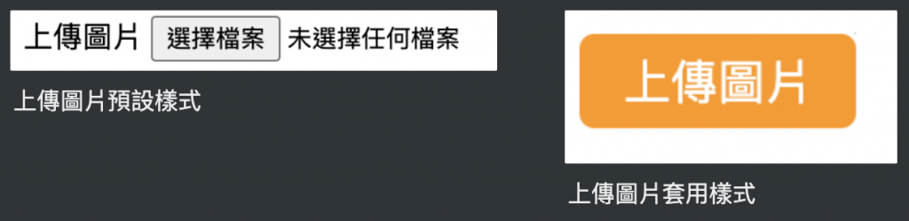
<div class="upload-box">
  <label for="file-upload" class="customer-upload">
    上傳圖片
  </label>
  <input id="file-upload" type="file"/>
</div>
.upload-box input[type="file"] {
  position: absolute;
  width: 1px;
  height: 1px;
  padding: 0;
  margin: -1px;
  overflow: hidden;
  border: 0;
}
.upload-box .customer-upload {
  background-color:#ff9800;
  display: inline-block;
  padding: 5px 15px;
  cursor: pointer;
  color:#fff;
  border-radius:5px;
}
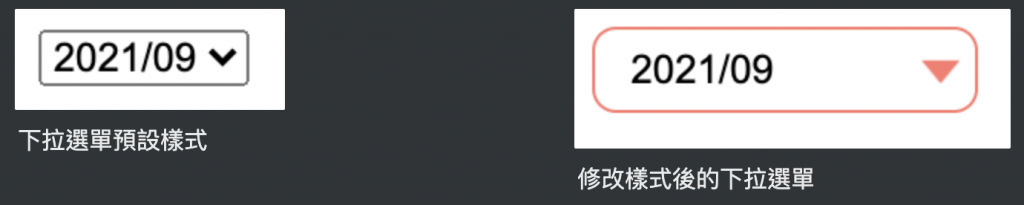
<select class="form-control">
  <option>2021/09</option>
  <option>2021/10</option>
</select>
select {
  width: 130px;
  padding:5px 25px 5px 8px;
  background-color: #fff;
  background-clip: padding-box;
  border-radius: 0.25rem;
  border-radius: 8px;
  border: 1px solid #ff786e;
	line-height: 1;
	/*將預設的select選擇框樣式清除*/
  appearance: none;
  -moz-appearance: none;
  -webkit-appearance: none;
	/*箭頭樣式及箭頭位置*/
  background: url(img/arr.png) no-repeat scroll 96% center #fff;
  background-size: 13px 8px;
  outline: 0;
}
參考資料:
https://medium.com/ui-ux練功坊/form表單中的get與post有什麼差別-d2a04845769a
https://medium.com/@small2883/表單結構-表單中的get-與-post區別-685b0bfe15ea
https://developer.mozilla.org/en-US/docs/Web/CSS/::placeholder
https://www.itread01.com/p/632603.html


 iThome鐵人賽
 看影片追技術