前面完成了「Carousel」區塊,今天來完成「Reviews」的區塊。
card 標題的樣式
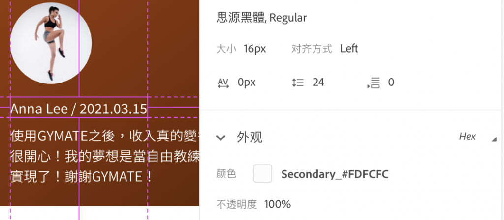
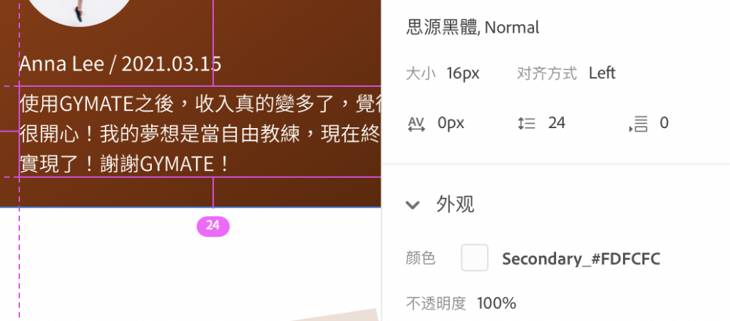
card 內文的樣式
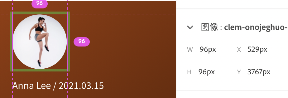
card img的大小:96px*96px
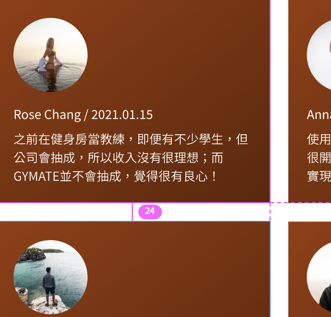
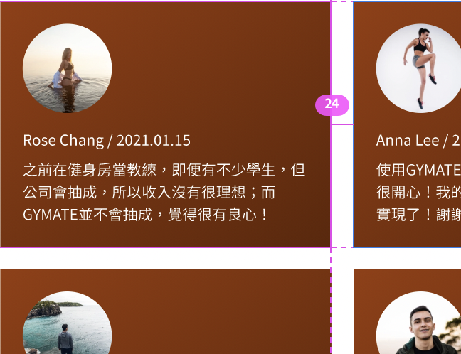
卡片之間的margin : 24px
card的padding : 24px 24px
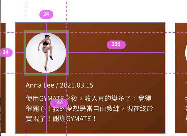
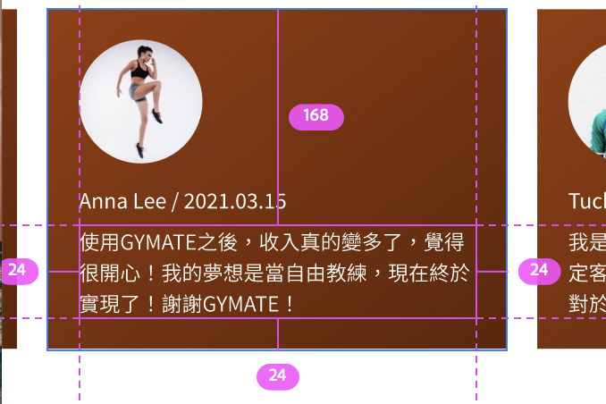
card img的margin-bottom : 16px
card 標題的margin-bottom : 8px
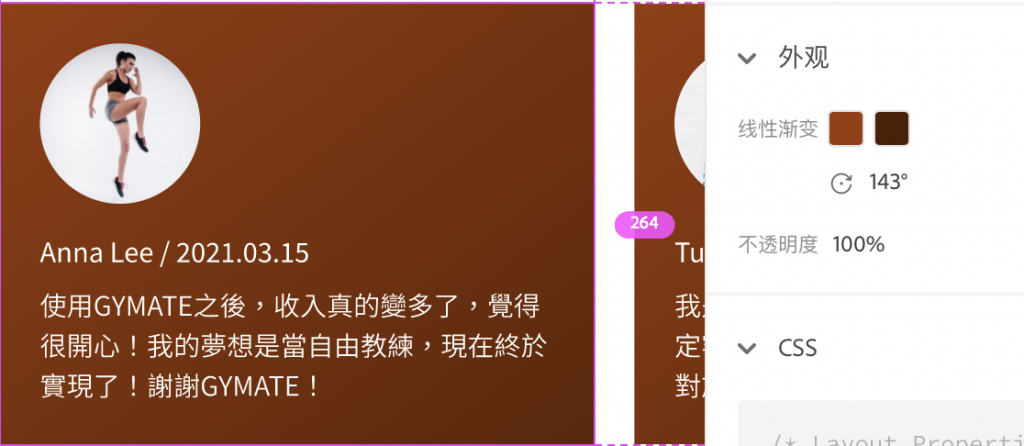
card 的background-color(漸層) :
linear-gradient(deg143,#9B3C05,#4E1E03)
先開一個新區塊 ,加入container、row以及col
section
container
col-4
col-4
mt-10
<section class="mt-10">
		<div class="container">
	    <div class="row">
		      <div class="col-4"></div>
		      <div class="col-4"></div>
		      <div class="col-4"></div>
		      <div class="col-4"></div>
		      <div class="col-4"></div>
		      <div class="col-4"></div>
	    </div>
	  </div>
</section>
去Bootstrap官網複製卡片的code
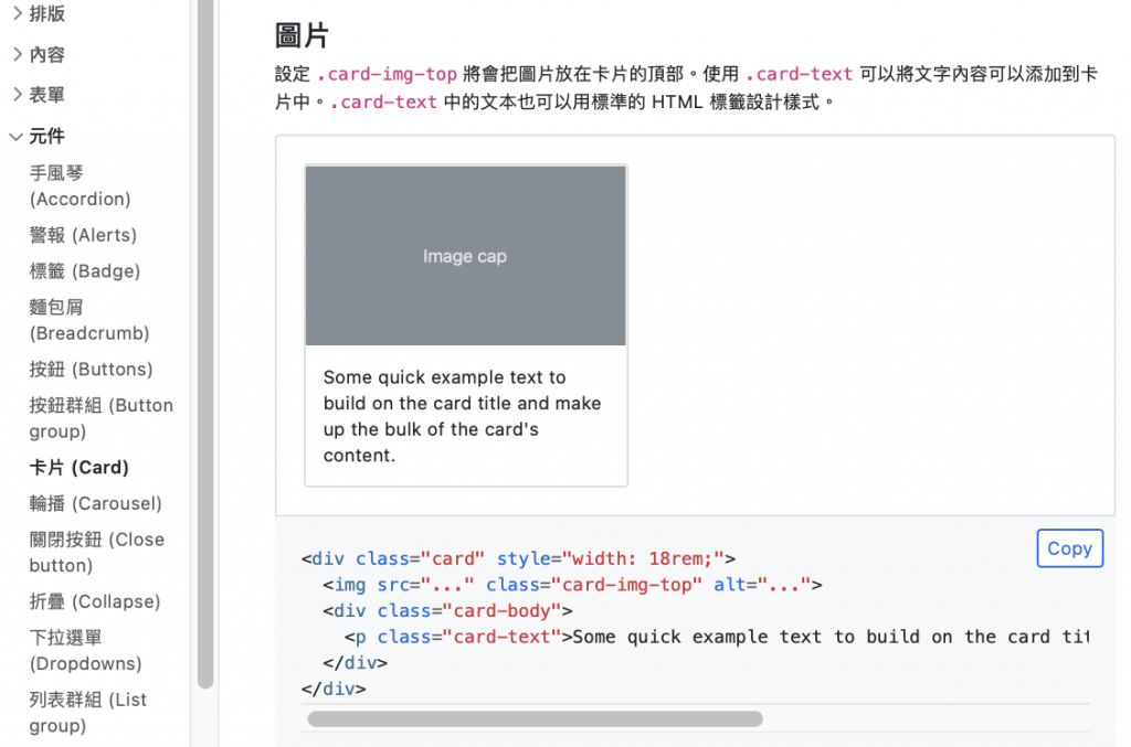
<div class="card" style="width: 18rem;">
	  <img src="..." class="card-img-top" alt="...">
	  <div class="card-body">
	    <p class="card-text">Some quick example text to build on the card title and make up the bulk of the card's content.</p>
	  </div>
</div>
(* 這邊可以刪掉card的style="width: 18rem;",因為會這樣設定寬度,只是因為它要在bootstrap官網上呈現上圖18rem的寬度XDD)
修改卡片的內容
<section class="mt-10">
<div class="container">
<div class="row">
<div class="col-4">
<div class="card">
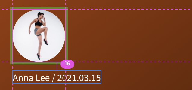
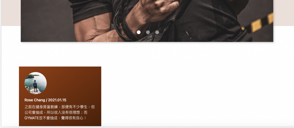
<img src="style/PHOTO/review-1.png" class="card-img-top" alt="...">
<div class="card-body">
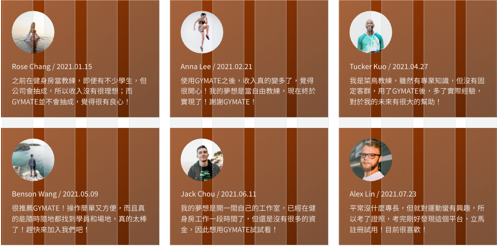
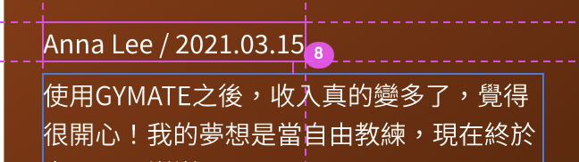
<h6>Rose Chang / 2021.01.15</h6>
<p>之前在健身房當教練,即便有不少學生,但公司會抽成,所以收入沒有很理想;而GYMATE並不會抽成,覺得很有良心!</p>
</div>
</div>
</div>
</div>
</div>
</section>
客製化的部分
p-6
border-0
bg-gradient
text-secondary
p-0
<div class="card p-6 border-0 bg-gradient text-secondary">
  <img src="style/PHOTO/review-1.png" class="card-img-top mb-5" style="width: 96px;" alt="...">
  <div class="card-body p-0">
      <h6 class="mb-2">Rose Chang / 2021.01.15</h6>
      <p class="card-text fw-light">之前在健身房當教練,即便有不少學生,但公司會抽成,所以收入沒有很理想;而GYMATE並不會抽成,覺得很有良心!</p>
  </div>
</div>
把剩下5個卡片內容也新增上去後,就會發現「咦!忘了加margin-bottom!」XDXD
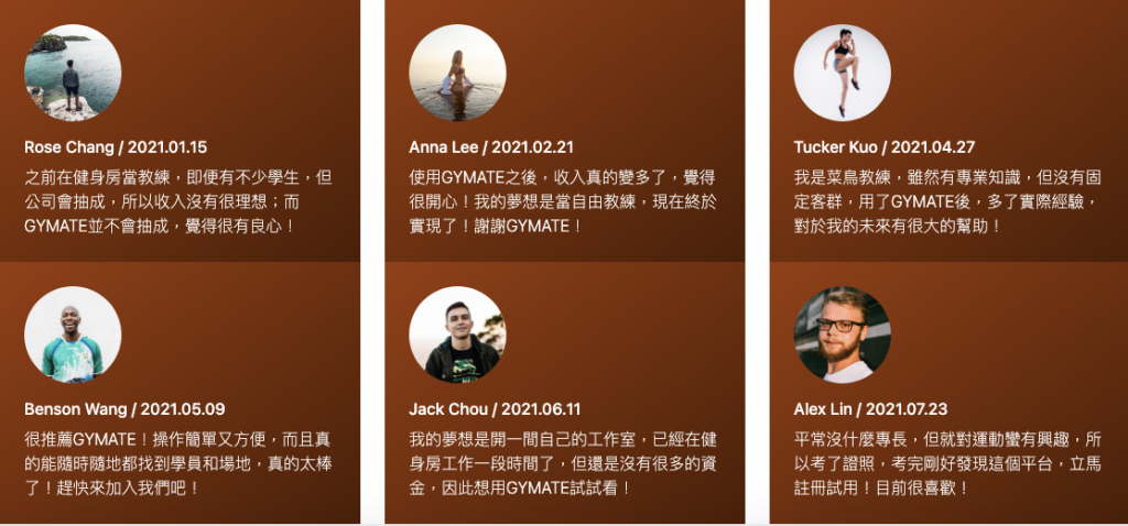
加上後就完成啦XD
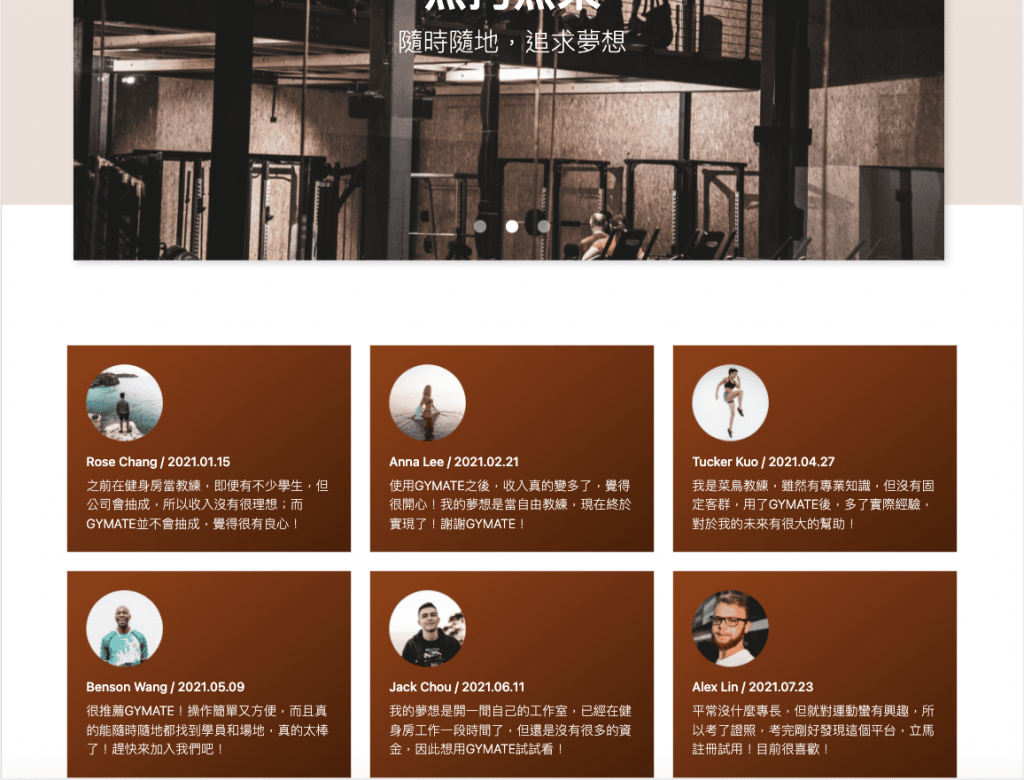
登登登登,Revews的區塊就完成啦!明天繼續來切下一個區塊吧 (๑´ㅂ`๑)


 iThome鐵人賽
 看影片追技術