#Jetpack Compose 基本概念:
通常在專案開始,大部份pm都會給一份 ui/ux 的圖,工程師再開始寫code,那看到figma的圖時,就會把一些color、文字style 和theme 寫到 /res/values/ 下 colors.xml、style.xml和themes.xml, 那compose 的專案會在專案下的 ui.theme 資料夾內產生使用的檔案例:theme.kt
那我們就來用Color、Typography 和 Shape 三大元素,來試試看畫面變化吧!
override fun onCreate(savedInstanceState: Bundle?) {
        super.onCreate(savedInstanceState)
setContent {
            MyCompose1Theme {
                // A surface container using the 'background' color from the theme
                Surface(modifier = Modifier.fillMaxSize(), color = MaterialTheme.colors.background) {
                    Greeting("Android Kevin")
                }
            }
        }
}
...

@Preview(showBackground = true)
@Composable
fun DefaultPreview() {
    MyCompose1Theme {
        Surface {
            Greeting("Android Kevin")
        }
    }
}
androidx.compose.foundation.border
import androidx.compose.material.MaterialTheme
 ...

//新增 Image 圖片
        Image(
            painter = painterResource(R.drawable.compose_logo),
            contentDescription = "Contact profile picture",
            modifier = Modifier
                // Set image size to 40 dp
                .size(40.dp)
                // Clip image to be shaped as a circle
                .clip(CircleShape)
                // 加上邊框顏色
                .border(1.5.dp, MaterialTheme.colors.secondary, CircleShape)
        )
...

Column {

            Text(
                text = "Hello $name!",
                // 加上文字顏色
                color = MaterialTheme.colors.secondaryVariant
            )
結果顯示-只修改圖片框和第一行的文字顏色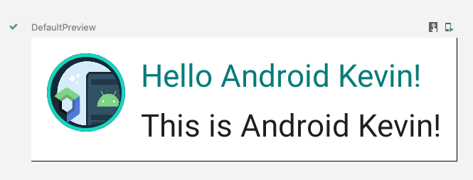
Column {
           Text(
               text = msg.author,
               color = MaterialTheme.colors.secondaryVariant,
			    //字體排版樣式
               style = MaterialTheme.typography.subtitle2
           )

           Spacer(modifier = Modifier.height(4.dp))

           Text(
               text = msg.body,
				//字體排版樣式
               style = MaterialTheme.typography.body2
           )
       }
結果顯示出來,是不是排版看起比較整齊了。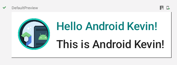
//新增加的 shape形狀, 包住文字
Surface(shape = MaterialTheme.shapes.medium, elevation = 1.dp) {
	//新增加的文字
	Text(
     	text = "This is $name!",
     	modifier = Modifier.padding(all = 4.dp),
     	style = MaterialTheme.typography.subtitle2
     )
}
結果顯示出來,第二行文字用形狀包起,再加上一點padding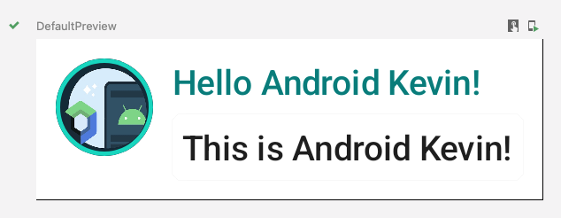
這張比較明顯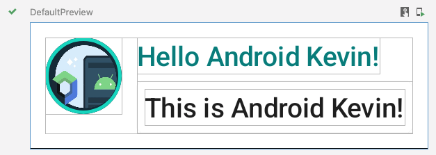
import android.content.res.Configuration

//新增日夜間模式函式
@Preview(name = "Light Mode")
@Preview(
    uiMode = Configuration.UI_MODE_NIGHT_YES,
    showBackground = true,
    name = "Dark Mode"
)
結果顯示出來,直接看到日夜間的 UI,不用切換,一次滿足是不是很讚!!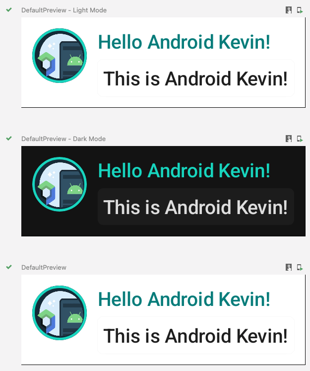
心得:
通常app都有自己的主題色和拿到UI設計師的出圖與顏色,很少會直接用原生的Material Design,所以不管是用xml 還是 Compose UI , 最好還是要了解一下如何使用和修改 colors 、style和theme的檔案,不然都寫好了,才要定義colors 、style和theme,就要把code全掃一次,很辛苦的呀。
https://developer.android.com/jetpack/compose/tutorial


 看影片追技術