Hello, Gang! It's Thibe! 雖然今天天氣很好,但在寂寞雨夜的時候,還是有Thibe的文章陪著你的,我們就來實作Day #9吧~
CodePen: https://codepen.io/stevetanus/pen/OJZpOWj
.frame
.moon
- for i in (1..11)
div class="crater-#{ i }"
.hill-bg-1
.hill-bg-2
.hill-fg-1
.hill-fg-2
.hill-fg-3
.front
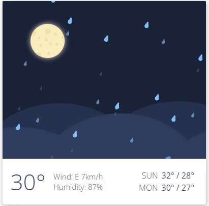
.temperature 30°
.info Wind: E 7km/h <br/> Humidity: 87%
table.preview
tr
td Sun
td 32° / 28°
tr
td Mon
td 30° / 27°
- for i in (1..10)
div class="drop-big-#{ i }"
- for i in (1..10)
div class="drop-medium-#{ i }"
- for i in (1..10)
div class="drop-small-#{ i }"
.moon裡面有11個.crater形成月亮,hill為五個山丘,front是前面的資訊欄,顯示了.temperature(溫度)、.info(天氣資訊)、table顯示後兩天的預測,tr代表table row,td代表table data,最後有10個.drop-big、10個.drop-medium、10個.drop-small的大中小雨點。
What's
tablehttps://www.w3schools.com/html/html_tables.asp
.frame {
  position: absolute;
  .moon {
  position: absolute;
  ...
  background: #F6EDBD;
  overflow: hidden;
  .crater-1 {
    position: absolute;
    width: 11px;
    height: 11px;
    top: 9px;
    left: 28px;
    border-radius: 10px;
    background: #ECE1A8;
  }
  .crater-4 {
    @extend .crater-1;
    width: 6px;
    height: 6px;
  }
  .crater-10 {
    @extend .crater-1;
    width: 4px;
    height: 4px;
    top: 25px;
    left: 15px;
  }
.moon設定為overflow: hidden讓上面的隕石坑不會超出月亮,.crater分成三種,分別是11px、6px、4px的隕石坑,都是用絕對定位來形成坑坑巴巴的月亮。
.moon {
    ...
    animation: rise 1s ease-out;
}
@keyframes rise {
	from {
		transform: translate(-20px,200px);
	}
	to {
		transform: translate(0,0px);
	}
}
月亮會往右往上移動,ease-out讓月亮由快至緩的上升。
.hill-bg-1 {
  position: absolute;
  z-index: 2;
  width: 337px;
  height: 281px;
  top: 201px;
  left: -57px;
  background: #26314F;
  border-radius: 50%;
}
.hill-fg-1 {
  @extend .hill-bg-1;
  background: #303C5D;
  top: 248px;
  left: -137px;
}
.hill有兩個在後方(bg),有三個在前方(fg),他們都是寬度較高度多的橢圓形,透過背景色和位置的不同,形成五個山巒。
.front {
    z-index: 10;
    display:flex
    align-items: center
    .preview {
        display: flex;
        justify-content: flex-end;
    }
}
display: flex使用flexbox去排版,align-items: center使得子元素們的交錯軸置中,justify-content: flex-end,使得子元素的主軸靠右。
css-flex圖解: https://www.casper.tw/css/2017/07/21/css-flex/
@for $i from 1 through 10 {
  .drop-big-#{$i} {
    position: absolute;
    z-index: 20;
    left: (-20 + 38 * $i)+ px;
    bottom: 90px;
    width: 8px;
    height: 8px;
    border-radius: 50%;
    background: $drop-color;
    animation: drop (0.7 + random(2) / 10) + s linear (random(50) /25) + s infinite;
    animation-fill-mode: both;
    transform-origin: 50% 100%;
    &:before {
      position: absolute;
      content: '';
      display: block;
      top: -2px;
      left: 1px;
      width: 6px;
      height: 6px;
      background: $drop-color;
      border-radius: 3px;
    }
    &:after {
        position: absolute;
        content:'';
        display: block;
        top: -5px;
        left: 2px;
        width: 4px;
        height: 10px;
        background: $drop-color;
        border-radius: 50%;
      }
  }
.drop-big第一個的位置在18px,到第十個間每個相差38px,&:before是6px的圓角長方形在原本的雨滴上方,&;after是個橢圓形拉長雨滴的頂點。.drop-medium跟.drop-small則是較小的雨滴。
.drop-big {
    animation: drop (0.7 + random(2) / 10) + s linear (random(50)/25) + s infinite;
    }
.drop-medium {
    animation: drop (1.3 + random(2) / 10) + s linear (random(50)/25) + s infinite;
    }
.drop-small {
    animation: drop (1.9 + random(2) / 10) + s linear (random(50)/ 25) + s infinite;
    }
}
@keyframes drop {
	0% {
		transform: translate3d(40px,-320px,0) scaleX(1) scaleY(1) rotate(17deg);
	}
	85% {
		transform: translate3d(0,0,0) scaleX(1) scaleY(1) rotate(17deg);
	}
	100% {
		transform: translate3d(0,0,0) scaleX(3) scaleY(0) rotate(0deg);
	}
}
@keyframes drop動畫中,一開始會往右往上移以及傾斜17度,在85%的時候雨滴會掉到地面,100%時會X軸放大3倍,Y軸變為0倍,達到水滴散開的效果。動畫開始時間從大雨滴到小雨滴,動畫delay的時間會在0到2秒之間。如此一來,達到雨滴分三層隨機傾斜落下的的動畫。
HTML
| 目標 | 工具 |
|---|---|
| 表格 | table |
| CSS | |
| 目標 | 工具 |
| ------------- | ------------- |
| 月亮 | 圓形 + 多個坑洞,設定overflow: hidden |
| 雨滴 | 圓形 + 小一點的圓形 + 橢圓形,使用:before、:after |
| 下落擴散動畫 | transform: translate3d、scale(1,1)到scale(3,0) |
不知道大家有多少個印象深刻的雨夜呢? 情緒有時候會隨著天氣而放大,有些人喜歡下雨時的寂靜,有些人則討厭著下雨時的孤獨,滴滴答答的雨點觸動著我們的神經,靜靜地思考著不同的回憶。


 看影片追技術