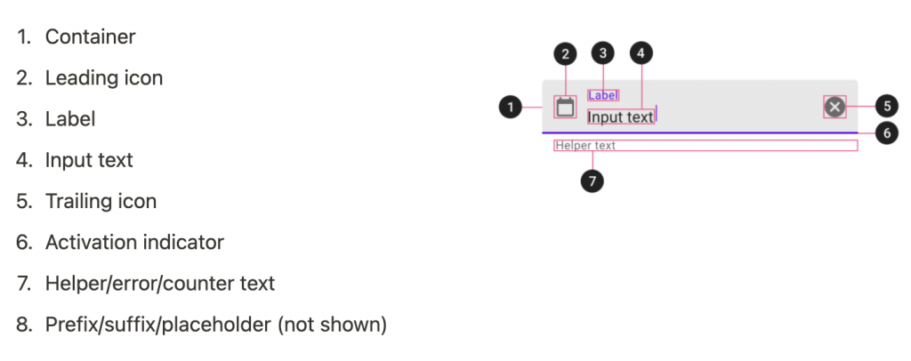
Text fields 是讓可輸入欄位,並且提示容易讓使用者理解的資訊,同時可以有顯示輸入的錯誤訊息。
有兩種Text fields,都提供相同的功能與互動的訊息提示,差別只有在style不同,但Outlined text fields與Filled text fields 欄位相比,Outlined text fields欄位的視覺強調較小。
Filled text field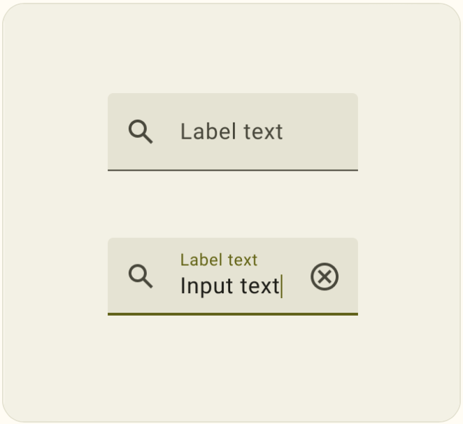
Outlined text fields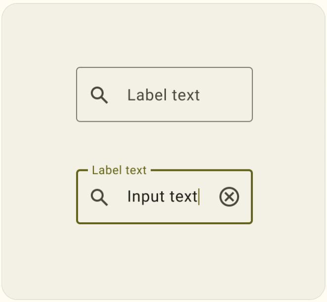
官方不建議同時使用 Filed Text fields 、Outlined Text Field,所以要同時使用希望是用在不同的部分最為恰當。
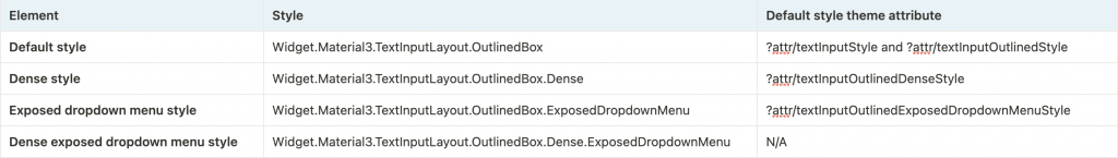
layout的部分使用TextInputLayout 內層TextInputEditText,可更好地控制輸入的動態的視覺方面,TextInputLayout預設style是Outlined Text Field。
API and source code:
<com.google.android.material.textfield.TextInputLayout
    style="?attr/textInputFilledStyle"
    android:id="@+id/filledTextField"
    android:layout_width="match_parent"
    android:layout_height="wrap_content"
    android:hint="@string/label">

    <com.google.android.material.textfield.TextInputEditText
        android:layout_width="match_parent"
        android:layout_height="wrap_content"
    />

</com.google.android.material.textfield.TextInputLayout>
// Get input text
val inputText = filledTextField.editText?.text.toString()

filledTextField.editText?.doOnTextChanged { inputText, _, _, _ ->
    // Respond to input text change
}
<com.google.android.material.textfield.TextInputLayout
    android:id="@+id/outlinedTextField"
    android:layout_width="match_parent"
    android:layout_height="wrap_content"
    android:hint="@string/label">

    <com.google.android.material.textfield.TextInputEditText
        android:layout_width="match_parent"
        android:layout_height="wrap_content"/>

</com.google.android.material.textfield.TextInputLayout>
// Get input text
val inputText = outlinedTextField.editText?.text.toString()

outlinedTextField.editText?.doOnTextChanged { inputText, _, _, _ ->
    // Respond to input text change
}
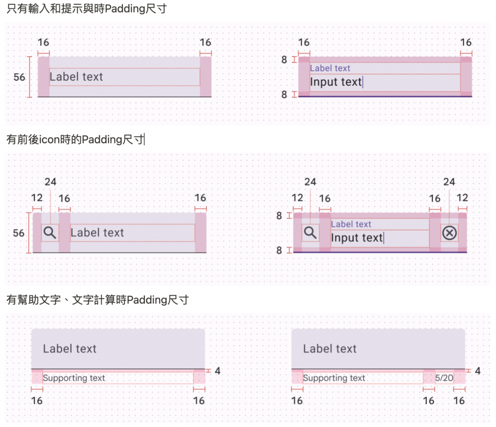
當android:layout_width:wrap_content時使用最小寬度為 56dp和最大寬度為488dp,當然也可以自定義覆蓋原本的最大和最小寬度設定。
<com.google.android.material.textfield.TextInputLayout
    android:id="@+id/textField"
    android:layout_width="wrap_content"
    android:layout_height="wrap_content"
    android:minWidth="@dimen/custom_min_width"
    android:maxWidth="@dimen/custom_max_width"
    android:hint="@string/label">

    <com.google.android.material.textfield.TextInputEditText
        android:layout_width="match_parent"
        android:layout_height="wrap_content"/>

</com.google.android.material.textfield.TextInputLayout>
<com.google.android.material.textfield.TextInputLayout
android:id="@+id/textField"
android:layout_width="match_parent"
android:layout_height="wrap_content"
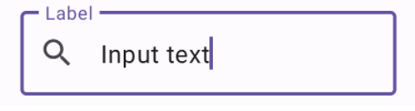
app:startIconDrawable="@drawable/ic_search_24dp"
android:hint="Label">
<com.google.android.material.textfield.TextInputEditText
android:layout_width="match_parent"
android:layout_height="wrap_content"/>
</com.google.android.material.textfield.TextInputLayout>
當TextInputEditText設置為顯示密碼時,可以添加一個icon在屏蔽密碼或將密碼顯示為純文本之間切換。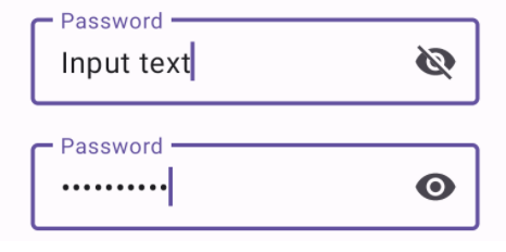
<com.google.android.material.textfield.TextInputLayout
    ...
    app:endIconMode="password_toggle">

    <com.google.android.material.textfield.TextInputEditText
        ...
        android:inputType="textPassword"/>

</com.google.android.material.textfield.TextInputLayout>
按下該icon來清除輸入文字,或使用自定義的icon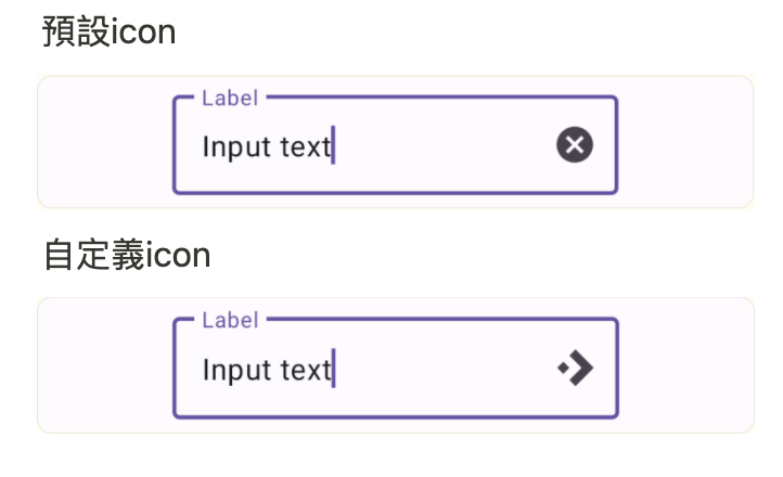
預設icon
<com.google.android.material.textfield.TextInputLayout
    ...
    app:endIconMode="clear_text">
    ...

</com.google.android.material.textfield.TextInputLayout>


自定義icon
<com.google.android.material.textfield.TextInputLayout
    ...
    app:endIconMode="custom"
    app:endIconDrawable="@drawable/ic_accelerator_24dp">

    ...

</com.google.android.material.textfield.TextInputLayout>
<com.google.android.material.textfield.TextInputLayout
...
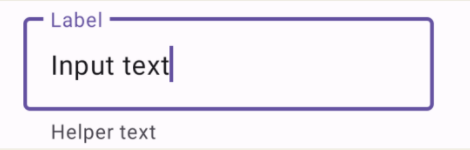
app:helperTextEnabled="true"
app:helperText="@string/helper_text">
...
</com.google.android.material.textfield.TextInputLayout>
<com.google.android.material.textfield.TextInputLayout
...
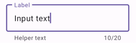
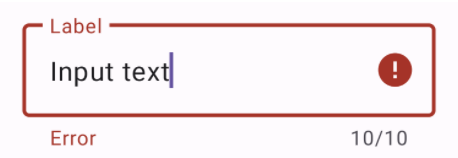
app:counterEnabled="true"
app:counterMaxLength="20">
...
</com.google.android.material.textfield.TextInputLayout>
<com.google.android.material.textfield.TextInputLayout
    ...
    app:errorEnabled="true">
    ...
</com.google.android.material.textfield.TextInputLayout>
// Set error text
passwordLayout.error = getString(R.string.error)

// Clear error text
passwordLayout.error = null
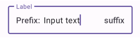
<com.google.android.material.textfield.TextInputLayout
    ...
    app:prefixText="@string/prefix"
    app:suffixText="@string/suffix">
    ...

</com.google.android.material.textfield.TextInputLayout>
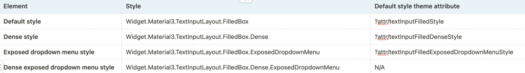
<com.google.android.material.textfield.TextInputLayout
    ...
    style="@style/Widget.Material3.TextInputLayout.*.ExposedDropdownMenu">

    <AutoCompleteTextView
        android:layout_width="match_parent"
        android:layout_height="wrap_content"
        android:inputType="none"
        app:simpleItems="@array/simple_items"/>

</com.google.android.material.textfield.TextInputLayout>
val items = arrayOf("Item 1", "Item 2", "Item 3", "Item 4")
(textField.editText as? MaterialAutoCompleteTextView)?.setSimpleItems(items)
custom item adapter
val items = listOf("Item 1", "Item 2", "Item 3", "Item 4")
val adapter = ArrayAdapter(requireContext(), R.layout.list_item, items)
(textField.editText as? AutoCompleteTextView)?.setAdapter(adapter)
custom item layout
<TextView
    xmlns:android="http://schemas.android.com/apk/res/android"
    android:layout_width="match_parent"
    android:layout_height="wrap_content"
    android:padding="16dp"
    android:ellipsize="end"
    android:maxLines="1"
    android:textAppearance="?attr/textAppearanceTitleMedium"/>


感謝您耐心看到這邊。
明天會將使用所學到Button、Text Fields實作一個小專案。
提前預告畫面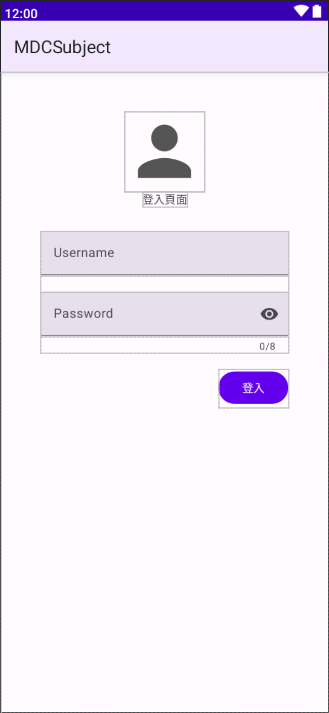


 看影片追技術