Watch me whip(whip), watch me Nae Nae ~ 早上起來洗臉刷牙,戴上手錶錢包鑰匙手機,出門去玩囉~
今天我們來實作Day #10!

手錶有兩個重點,一個是時間刻度,一個是進度條動畫。
CodePen: https://codepen.io/stevetanus/pen/OJZpeEO
.frame
  .center
    - (1..15).each do |i|
      %div{:class => "point-set-#{i}"}
        - (1..4).each do |j|
          %div{:class => "point-#{j}"}
    %svg.spinner{:viewbox => "0 0 202 202", :xlmns => "https://www.w3.org/2000/svg"}
      %circle{:cx => "101", :cy => "101", :r => "99.5"}
    .date Sun 18 Sep 2022
    .time 11:30
    .beat <span class="fa fa-heart"></span>120
    .energy 878 kcal
Haml是一種乾淨美觀的HTML的簡略語言,語法%div為<div></div>,後面的{}包住屬性,縮排則為下一層。
在.center之下有用迴圈創造出15個class = point-set-數字的div,15個div中又包了4個class = point-數字的div,這邊會透過CSS讓這60個div變成白色的時間刻度。
在svg的tag中(%svg),給予circle的tag(%circle),並給定中心為101(centerX),101(centerY)的半徑99.5px(radius)的圓圈。
Haml官方文件: https://haml.info/docs/yardoc/file.REFERENCE.html
SVG oxxo教學: https://ithelp.ithome.com.tw/articles/10156672
.frame {
  position: absolute;
  width: 400px;
  height: 400px;
  .center {
  position: absolute;
  width: 212px;
  height: 212px;
  top: 87px;
  left: 87px;
  border: 7px solid #3A3A3A;
將.center的寬除以2是106px,加上left: 87px,再加上7px的border,讓圓圈的中心固定在(200,200)。
有15個.point-set裡面有4個.point,總共有60個刻度點。
我們先從第一個.point-set開始,我用灰色的背景讓它更為清楚: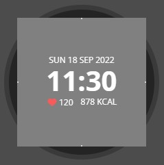
@for $i from 1 through 1 {
  .point-set-#{$i}{
    position: absolute;
    height: 188px;
    width: 188px;
    top: 12px;
    left: 12px;
    background: grey;
    transform: rotate( (($i - 1)*6) + deg);
//     右上角0~90°的刻度
    .point-1 {
      position: absolute;
      width: 2px;
      height: 2px;
      top: 0;
      left: 93px;
      background: #D3D3D3;
    }
//     右下角91~180°的刻度
    .point-2 {
			@extend .point-1;
			top: 93px;
			left: auto;
			right: 0;
		}
//     左下角181~270°的刻度
    .point-3 {
			@extend .point-1;
			top: auto;
			bottom: 0;
		}
//     左上角271~360°的刻度
    .point-4 {
			@extend .point-1;
			top: 93px;
			left: 0;
		}
  }
}
.point-set-1寬長為188px,左側跟上側推了12px(188+24=212=.center寬長)的正方形,我們在上面繪製了四個點,剛好在0,90,180,270度的位置,然後用迴圈在之後每個正方形都旋轉6度(transform: rotate( (($i - 1)*6) + deg);),就可以繪製成60個時間刻度。
//這邊可調整成你想要的秒數
$speed: 60s
.spinner {
  position: absolute;
  width: 202px;
  height: 202px;
  border-radius: 50%;
  top: 5px;
  left: 5px;
  circle {
    stroke: #F85B5B;
    stroke-width: 3;
    fill: none;
    stroke-dasharray: 625;
    animation: spinner $speed linear infinite;
    transform-origin: center center;
    transform: rotate(-90deg);
  }
}
.spiner為寬長202px的圓形,circle加上了邊框線並設定不填滿顏色,再加上spinner均速無限的動畫,transform: rotate(-90deg)是為了讓svg圓形的起點從90度變為0度,滿足動畫需求。
@keyframes spinner {
	from {
		stroke-dashoffset: 625;
		transform: rotate(-90deg) scaleY(1);
	}
	50% {
		stroke-dashoffset: 0;
		transform: rotate(-90deg) scaleY(1);
	}
	50.001% {
		transform: rotate(-90deg) scaleY(-1);
	}
	to {
		stroke-dashoffset: 625;
		transform: rotate(-90deg) scaleY(-1);
	}
}
0%(from)時,stroke-dasharray跟stroke-dashoffset都設為625,整個圓形的框線都會被虛線蓋住,50%時,stroke-dashoffset設為0,讓整條框線顯現;50.001%設定scaleY(-1)讓整個圓反轉,到100%(to)之間,stroke-dashoffset設定為625,整條框線會慢慢縮小到不見。
stroke-animation: https://www.casper.tw/svg/2014/06/15/svg-css-stroke-animation/
HTML
| 目標 | 屬性 |
|---|---|
| 圓圈SVG | <circle cx="" cy="" r=""/> |
| 乾淨版HTML | Haml |
| CSS | |
| 目標 | 屬性 |
| ------------- | ------------- |
| 時間刻度 | 15個旋轉6度的正方形,裡面的4邊中點 |
| SVG描繪動畫 | stroke-dasharray與stroke-dashoffset搭配 |
時光匆匆,不為任何人停留 ~ 很快地這個周末又過了,然後是2022年,看看手錶把握當下的時間吧!


 看影片追技術