
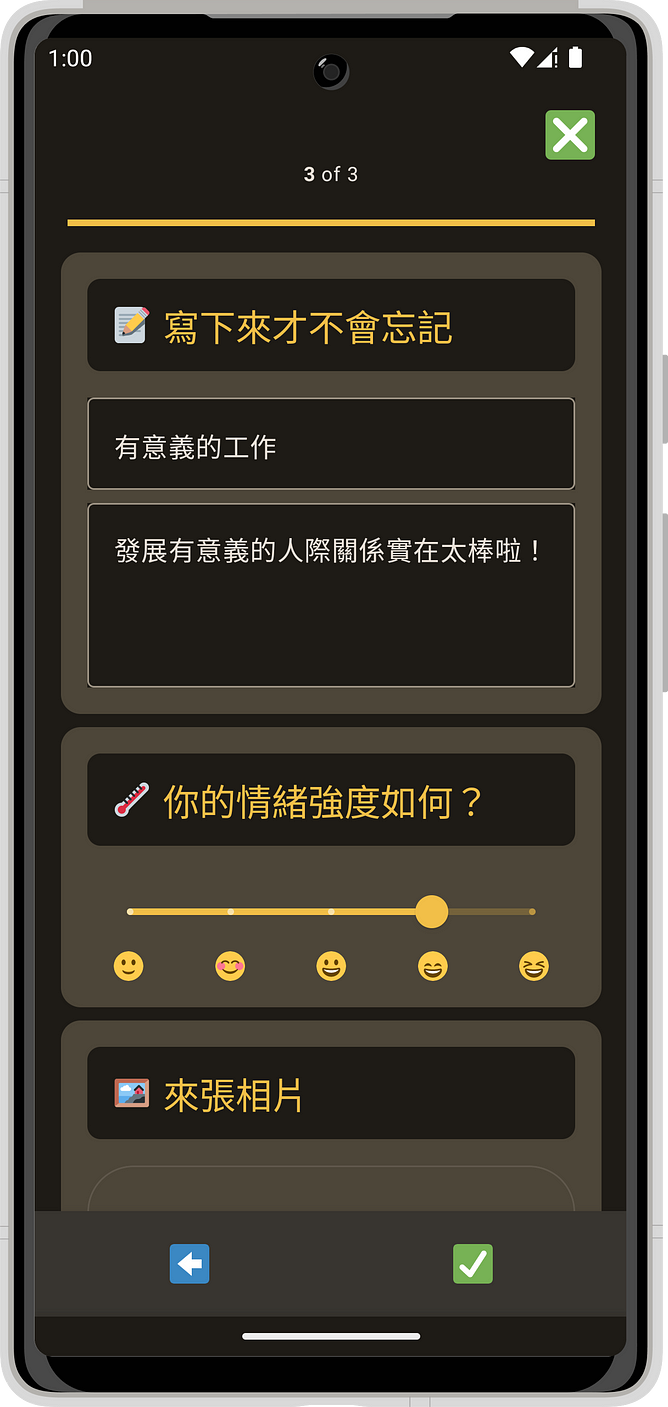
此系列文章是以我的業餘專案: Kimoji 作為範例。
這款以純 Jetpack Compose 撰寫的 side project,已經在 Google Play 上架。 歡迎試玩!
立馬下載
限免兌換碼
我們可以在 ui 資料夾下的檔案裡找到所有和目前主題相關的資訊。比方說,我們目前使用的預設色彩定義就位於 Color.kt 裡面。
我們來定義新的顏色。把這些內容加入 Color.kt:
val md_theme_light_primary = Color(0xFF785900)
val md_theme_light_onPrimary = Color(0xFFFFFFFF)
val md_theme_light_primaryContainer = Color(0xFFFFDF9D)
val md_theme_light_onPrimaryContainer = Color(0xFF251A00)
// ...
現在我們把這些內容填到 Theme.kt 裡的 MaterialTheme color scheme:
private val LightColors = lightColorScheme(
    primary = md_theme_light_primary,
    onPrimary = md_theme_light_onPrimary,
    primaryContainer = md_theme_light_primaryContainer,
    onPrimaryContainer = md_theme_light_onPrimaryContainer,
    // ...
)
如果我們重新整理預覽畫面,就可以看到新色彩了: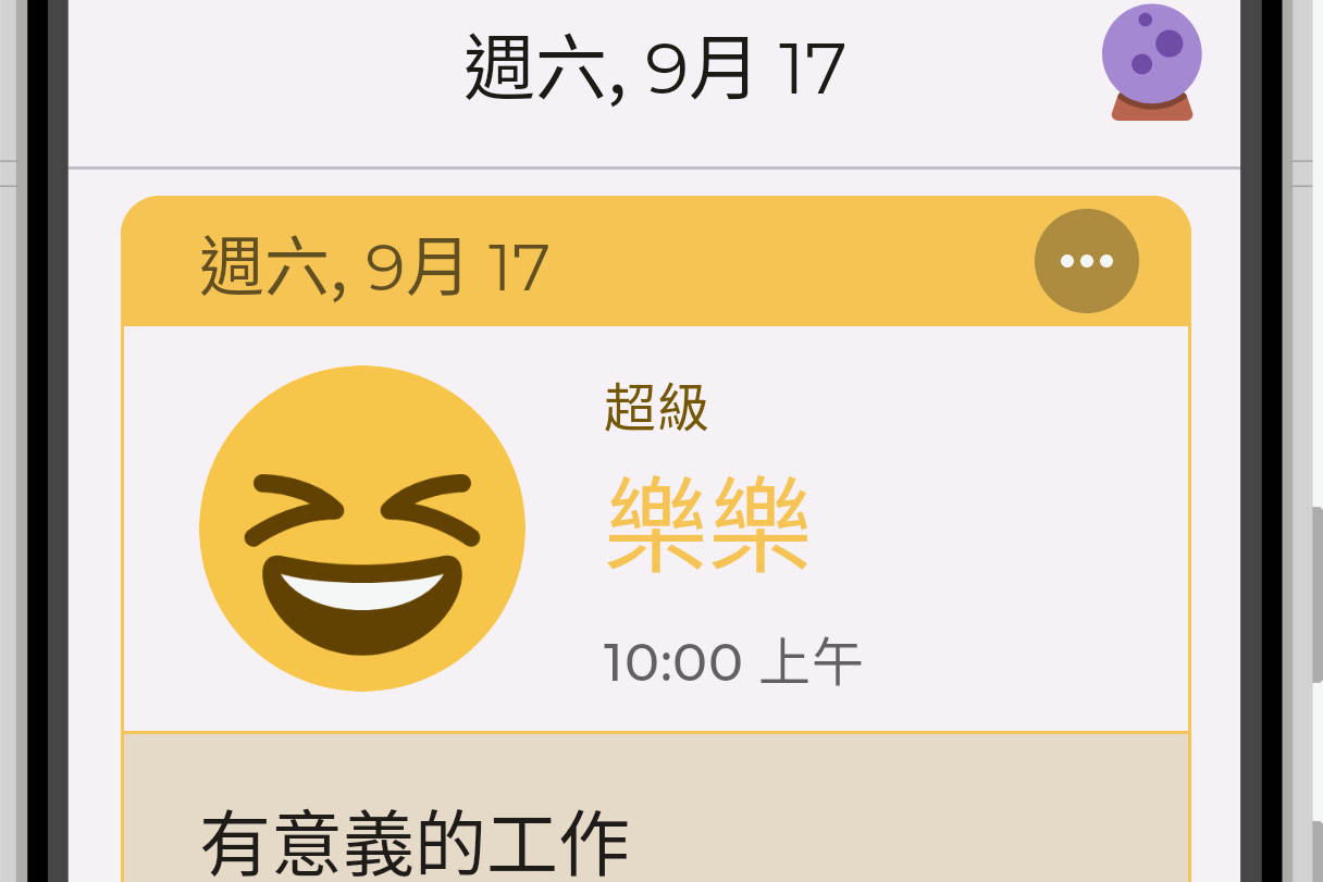
不過,我們還沒有修改深色模式。我們可以先設定預覽畫面,再進行後續步驟。使用 UI_MODE_NIGHT_YES,為 ComponentPreview 新增 @Preview 註解:
@Preview("default")
@Preview("dark theme", uiMode = UI_MODE_NIGHT_YES)
@Preview("large font", fontScale = 2f)
@Composable
fun ComponentPreview() {
    KimojiTheme {
        EmotionAgents(
            emotions = EmotionRepository.getEmotions(),
            onEmotionClick = { },
            selectedOption = 1L
        )
    }
}
這樣就能新增一個深色模式的預覽畫面。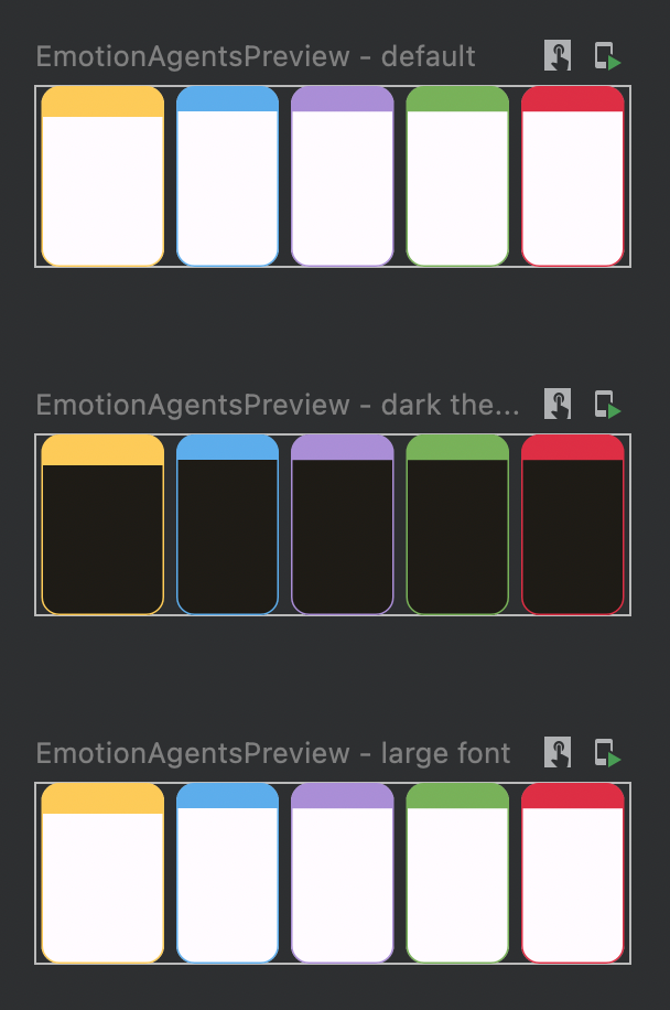
在 Theme.kt 中的 color scheme 定義 DarkColors:
private val DarkColors = darkColorScheme(
    primary = md_theme_dark_primary,
    onPrimary = md_theme_dark_onPrimary,
    primaryContainer = md_theme_dark_primaryContainer,
    onPrimaryContainer = md_theme_dark_onPrimaryContainer,
    // ...
)
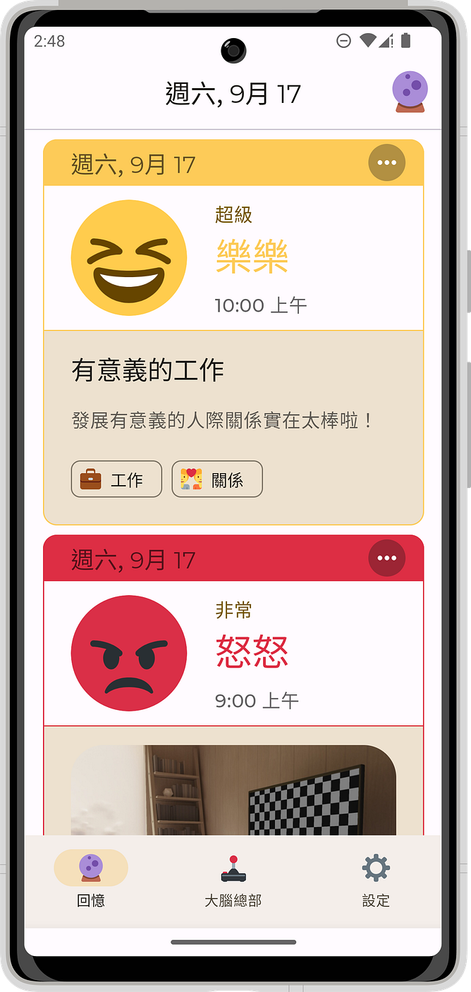
現在我們的 app 已經設定好主題跟樣式了!
 |
 |
 |
|---|---|---|
Theme.kt 最終的程式碼 |
import androidx.compose.foundation.isSystemInDarkTheme
import androidx.compose.material.MaterialTheme
import androidx.compose.material.darkColors
import androidx.compose.material.lightColors
import androidx.compose.runtime.Composable
import androidx.compose.foundation.isSystemInDarkTheme
import androidx.compose.material.MaterialTheme
import androidx.compose.material.darkColors
import androidx.compose.material.lightColors
import androidx.compose.runtime.Composable

private val DarkColors = darkColorScheme(
    primary = md_theme_dark_primary,
    onPrimary = md_theme_dark_onPrimary,
    primaryContainer = md_theme_dark_primaryContainer,
    onPrimaryContainer = md_theme_dark_onPrimaryContainer,
    // ...
)

private val LightColors = lightColorScheme(
    primary = md_theme_light_primary,
    onPrimary = md_theme_light_onPrimary,
    primaryContainer = md_theme_light_primaryContainer,
    onPrimaryContainer = md_theme_light_onPrimaryContainer,
    // ...
)

@Composable
fun KimojiTheme(
    darkTheme: Boolean = isSystemInDarkTheme(),
    content: @Composable () -> Unit
) {
    val colors = if (darkTheme) {
        DarkColors
    } else {
        LightColors
    }

    MaterialTheme(
        colorScheme = colors,
        typography = TypographyM3,
        content = content
    )
}
此系列文章是以我的業餘專案:Kimoji 為範例。
Kimoji 是一款心情日記 App,讓你用可愛的 emoji 來撰寫你的心情日記。現在就來試試這款設計精美的微日記吧!
 |
 |
 |
|---|---|---|
 |
 |
 |
Reference: https://developer.android.com/codelabs/jetpack-compose-basics


 Medium 好讀版
 iThome鐵人賽
 看影片追技術