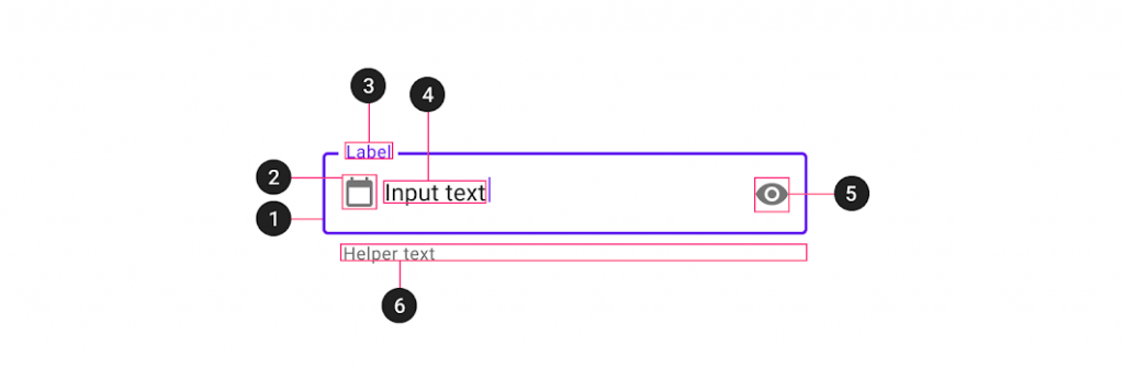
作為 Text fields 最核心的元件,Material Design 將它拆分為 TextInputlayout 與 TextInputEditText。而 TextInputLayout 是 LinearLayout 的子類,作為一個 ViewGroup,它的角色是用來裝飾 Text fields 的 Hint、icon、background 等等,任何想要對 Text fields 的設計與修改,都會在 TextInputLayout 上去設置
那最簡單的設置,就是將 TextInputLayout 裡面包裹一個 TextInputEditText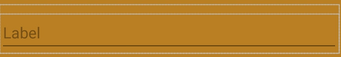
<com.google.android.material.textfield.TextInputLayout
    android:id="@+id/textField"
    android:layout_width="match_parent"
    android:layout_height="wrap_content"
    android:hint="@string/label">

    <com.google.android.material.textfield.TextInputEditText
        android:layout_width="match_parent"
        android:layout_height="wrap_content"
    />

</com.google.android.material.textfield.TextInputLayout>
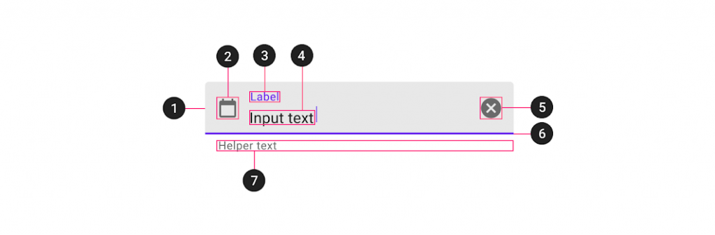
若想要在 start 位置放置 icon 就只要添加下面程式碼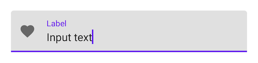
<com.google.android.material.textfield.TextInputLayout
    ...
    app:startIconDrawable="@drawable/ic_favorite_24dp"
    ...
</com.google.android.material.textfield.TextInputLayout>
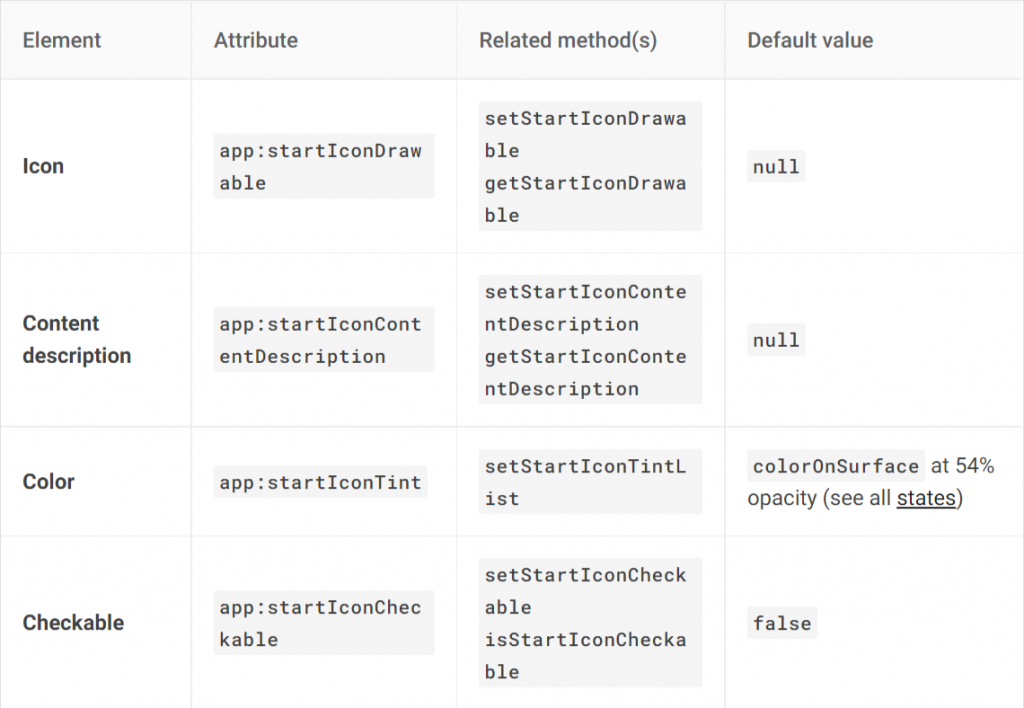
若想要在 start 位置放置 icon 就只要添加下面程式碼,而 Material Design 已經提供幾個 mode 使用
在登入或輸入比較敏感性資料的畫面,通常都會希望隱藏輸入的資料,就能使用 password toggle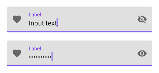
<com.google.android.material.textfield.TextInputLayout
    ...
    app:endIconMode="password_toggle">
    ...
</com.google.android.material.textfield.TextInputLayout>
在輸入的狀態下,點擊 clear text icon 能一次清除所有的資料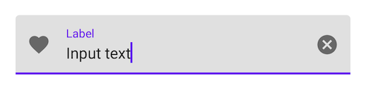
<com.google.android.material.textfield.TextInputLayout
    ...
    app:endIconMode="clear_text">
    ...
</com.google.android.material.textfield.TextInputLayout>
若上述的情況都不滿足,也有自定義的選項,但要先將 mode 設置為 custom,才能去設置 icon drawable,否則直接設置的話會失效
<com.google.android.material.textfield.TextInputLayout
    ...
    app:endIconMode="custom"
    app:endIconDrawable="@drawable/ic_check_circle_24dp"
    ...
</com.google.android.material.textfield.TextInputLayout>
textField.setEndIconOnClickListener {
  // Respond to end icon presses
}
<com.google.android.material.textfield.TextInputLayout
...
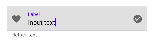
app:helperTextEnabled="true"
app:helperText="@string/helper_text">
...
</com.google.android.material.textfield.TextInputLayout>
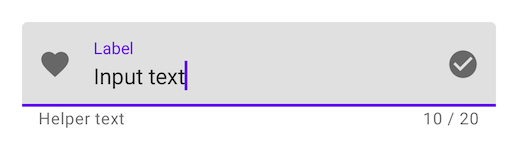
maxLength 這個屬性只是單純提示用戶應該輸入的字數,不會真的讓用戶只能輸入此上限。若是超過則會變為 error 的狀態提示用戶已經超出上限,若是真的想要在應用上去限制,應該在 TextInputEditText 設置 maxLength
<com.google.android.material.textfield.TextInputLayout
    ...
    app:counterEnabled="true"
    app:counterMaxLength="20">
    ...
</com.google.android.material.textfield.TextInputLayout>
errors 在官方的介紹上有點簡略,這邊我用自己的範例來跟大家解釋一下。假如今天我們有設置 counter、helper text、endIcon,那這些屬性會被影響嗎? 並不會,當超出限制到 errors 狀態時,雖然會更換 helper text 與 endIcon,但在限制內時又會變換回來。有興趣的可以試著 Demo 看看
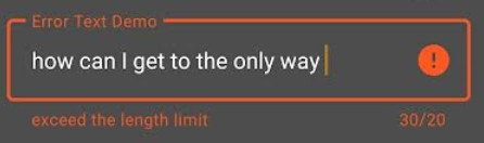
<com.google.android.material.textfield.TextInputLayout
                android:hint="Error Text Demo"
                app:helperText="Test error override"
                app:endIconMode="clear_text"
                app:counterEnabled="true"
                app:counterMaxLength="20"
                app:errorEnabled="true">
</com.google.android.material.textfield.TextInputLayout>
 binding.textErrorTextField.addTextChangedListener {
         if (binding.textErrorTextField.text.toString().length > 20)
             binding.textErrorTextFieldLayout.error = "exceed the length limit "
         else
             binding.textErrorTextFieldLayout.error = null
}
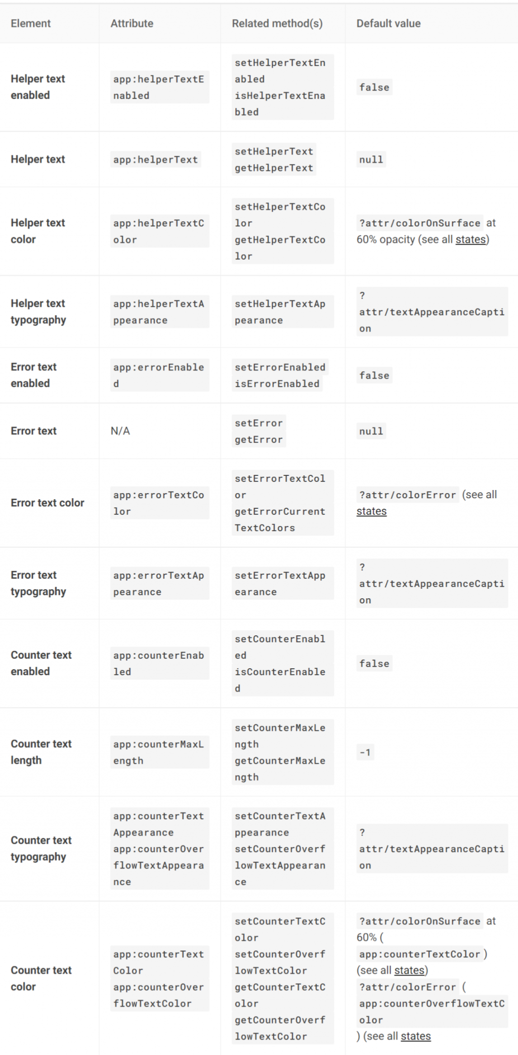
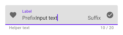
<com.google.android.material.textfield.TextInputLayout
    ...
    app:prefixText="@string/prefix"
    app:suffixText="@string/suffix">
    ...
</com.google.android.material.textfield.TextInputLayout>
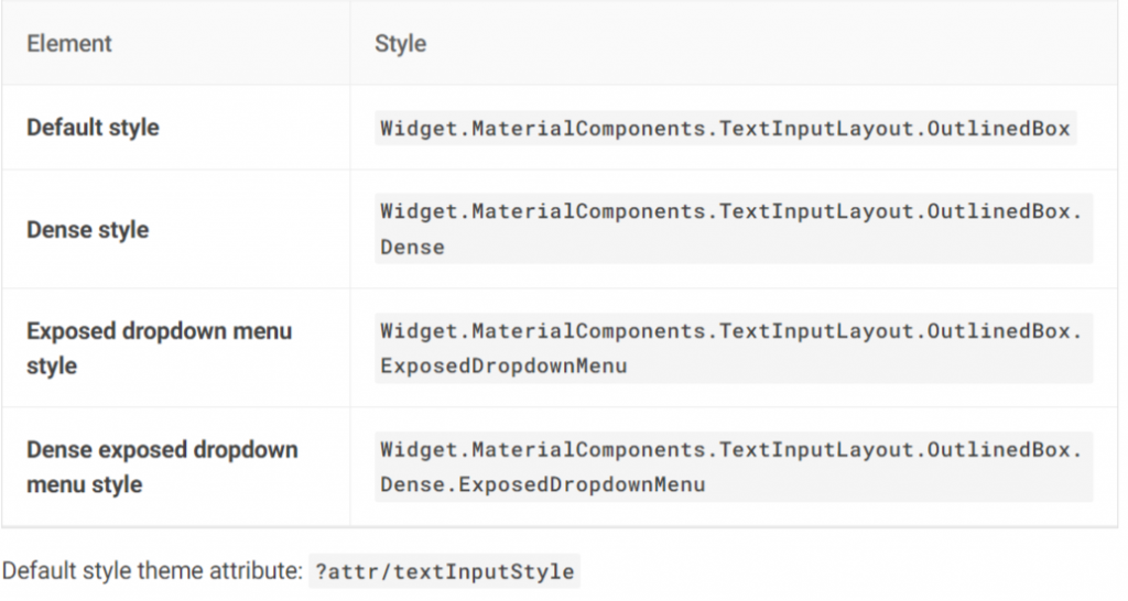
InputLayout 不僅僅是能改變上述的外觀屬性,還能變成類似 Spinner 的樣式。只不過在設置上,與一般的 Text fields 有點不同,裡面包裹的元件必須是 AutoCompleteTextView。因為功能上我們並不需要編輯與輸入,要的是展開選取的功能,所以在 InputType 的地方會改成 none 的形式,以免讓用戶能編輯修改
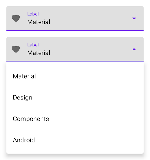
<com.google.android.material.textfield.TextInputLayout
...
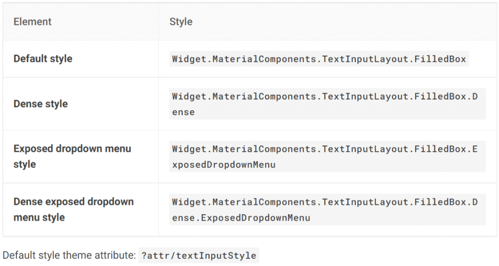
style="@style/Widget.MaterialComponents.TextInputLayout.*.ExposedDropdownMenu">
<AutoCompleteTextView
android:layout_width="match_parent"
android:layout_height="wrap_content"
android:inputType="none"
/>
</com.google.android.material.textfield.TextInputLayout>
val dropMenuList = listOf("Material", "Design", "Components", "Android")
val menuAdapter = ArrayAdapter(requireContext(), R.layout.itemview_dropmenu_item, dropMenuList)
    binding.dropDownAutoText.setAdapter(menuAdapter)
<TextView xmlns:android="http://schemas.android.com/apk/res/android"
    android:layout_width="match_parent"
    android:layout_height="wrap_content"
    android:ellipsize="end"
    android:maxLines="1"
    android:padding="16dp"
    android:textAppearance="?attr/textAppearanceSubtitle1"
    android:textColor="@color/white" />
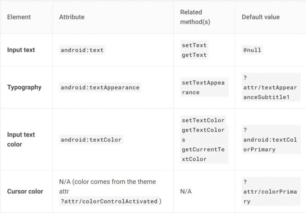
上面已經提到 Material Design 把 text fields 分為兩個部分,TextInputEditText 就是作為讓用戶輸入編輯的角色。但要注意的是,使用上與 EditText 是相同的,因為已經把外觀的部分都交給 TextInputLayout 了,所以在設置 hint 的時候,必須在 Inputlayout 而不是 InputEditText
而作為輸入的元件,Material Design 已經貼心的提供多種輸入型態給我們使用。例如,上面提到過的 InputType none 就能讓用戶無法進行輸入,或是限定只能輸入數字或文字等等
 <com.google.android.material.textfield.TextInputEditText
                    android:inputType="number"
                    android:layout_width="match_parent"
                    android:layout_height="wrap_content" />
在預設情況下,text field 就會是 Filled,不需要在額外設置 Style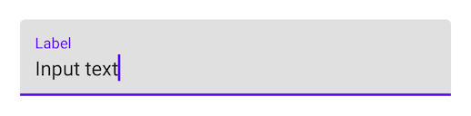
<com.google.android.material.textfield.TextInputLayout
    android:id="@+id/filledTextField"
    android:layout_width="match_parent"
    android:layout_height="wrap_content"
    android:hint="@string/label">

    <com.google.android.material.textfield.TextInputEditText
        android:layout_width="match_parent"
        android:layout_height="wrap_content"
    />

</com.google.android.material.textfield.TextInputLayout>
位於 Filled text baseline 的位置,會在 Focused 的時候變色顯示,讓用戶知道目前正在此輸入框進行操作。所以在屬性上,分別有 Focused Width、Width 兩種寬度屬性可設置,是為了透過之間的變化產生動畫效果。如果想要自定義修改這些屬性,記得 Focused Width 要大於 Width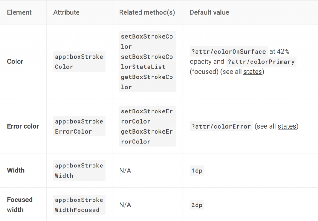
透過設置 Style 就能更換
<com.google.android.material.textfield.TextInputLayout
    android:id="@+id/outlinedTextField"
    android:layout_width="match_parent"
    android:layout_height="wrap_content"
    android:hint="@string/label"
    style="@style/Widget.MaterialComponents.TextInputLayout.OutlinedBox">

    <com.google.android.material.textfield.TextInputEditText
        android:layout_width="match_parent"
        android:layout_height="wrap_content"
    />

</com.google.android.material.textfield.TextInputLayout>
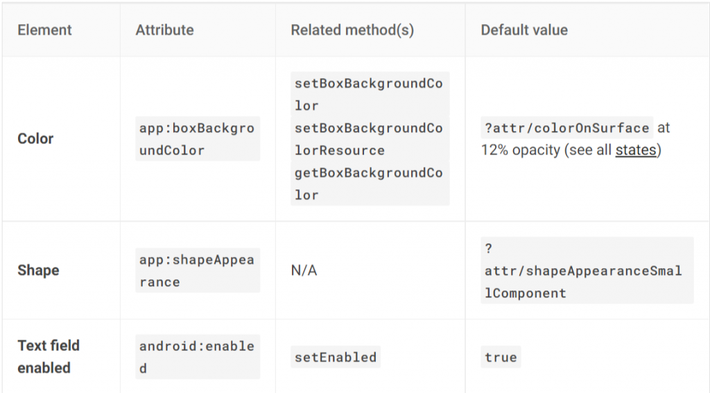
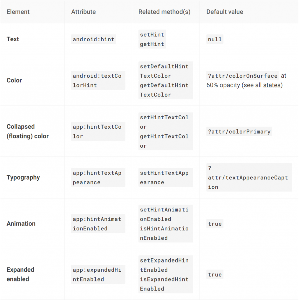
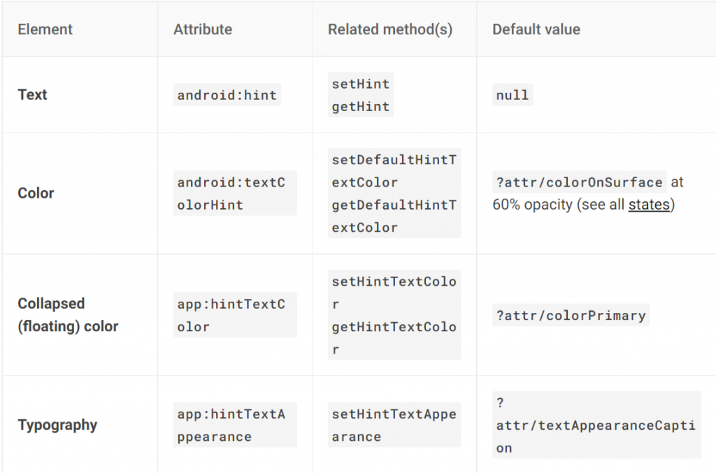
Outlined text 在 Container 的屬性相對 Filled text 較多了一些,大多是關於 Stroke (框線),也是它最大的特色,是將 indicator 交給 Stroke 的變化去提示用戶目前正在 Focused。而它也有FocusedWidth 與 Width,與剛剛提到的 Activation indicator 是相同概念,在自定義數值時,一樣要讓 Focused 大於 Not Focused
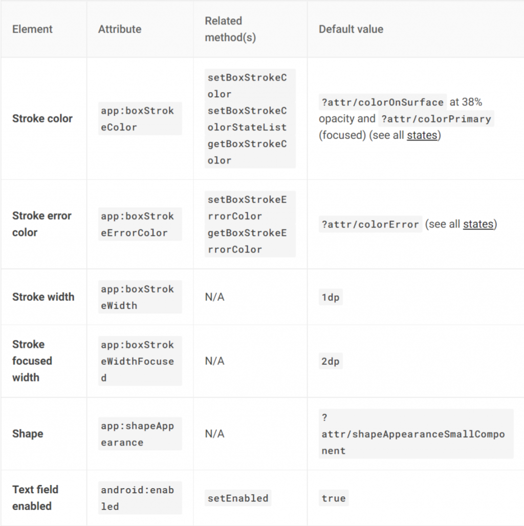
下圖,官方的屬性列表沒有提到 Filled Text 關於 Hint 動畫的設置,不代表真的沒有。因為我們切換這兩種型態的 text fields 只是改變 style,並不是真的換了一個元件。所以還是可以去設置的,只不過官方這樣的列表,應該是不希望我們在 Outlined text 中去改動 Hint 的動畫與設置
如果上述這幾個種類的 Text fields 在 Material Design 上的設置剛好不符合我們要的,就可以依照剛剛所介紹的過 attributes 去做修改。這邊就用我自己魔改的範例,當中我自定義了 Outlined text、dropdownMenu 的配色與字型大小等等。Text fields 組成顏色都是對應 ColorSurface、ColorOnSurface 與 ColorPrimary,想魔改的各位可以從這幾個屬性下手
<style name="Widget.App.OutlinedBox.DropDownMenu" parent="Widget.MaterialComponents.TextInputLayout.OutlinedBox.Dense.ExposedDropdownMenu">
        <item name="materialThemeOverlay">@style/ThemeOverlay.App.ToggleButton</item>
    </style>

    <style name="ThemeOverlay.App.OutlinedBox.DropDownMenu" parent="">
        <item name="colorOnSurface">@color/white</item>
        <item name="colorSurface">@color/lightYellow</item>
    </style>

    <style name="Widget.App.TextInputLayout.OutlinedBox" parent="Widget.MaterialComponents.TextInputLayout.OutlinedBox">
        <item name="materialThemeOverlay">@style/ThemeOverlay.App.TextInputLayout.OutlinedBox</item>
        <item name="shapeAppearance">@style/ShapeAppearance.App.SmallComponent</item>
        <item name="hintTextColor">@color/white</item>
    </style>

    <style name="ThemeOverlay.App.TextInputLayout.OutlinedBox" parent="">
        <item name="colorPrimary">@color/lightYellow</item>
        <item name="colorOnSurface">@android:color/holo_green_light</item>
        <item name="colorError">@color/red</item>
        <item name="textAppearanceSubtitle1">@style/TextAppearance.App.Subtitle1</item>
        <item name="textAppearanceCaption">@style/TextAppearance.App.Caption</item>
        <item name="editTextStyle">@style/Widget.MaterialComponents.TextInputLayout.OutlinedBox
        </item>
    </style>
Text fields 在實作上不會特別困難,很多小東西 Material Design 已經幫我們做好,若是你還在用最原始的 EditText 想設計出好看好用的 InputText 畫面,建議可以直接使用 Text fields,絕對能滿足在 UI 設計上大部分的需求。若是因為版本問題無法引進也沒關係,至少要效仿將其分為 InputLayout 與 InputEditText 的概念,切分元件之間的層級與職責,才是 Material Design 最值得我們學習的地方 
若是對實作還是有點不懂的,這邊提供我的 Github 方便大家參考

 iThome鐵人賽
 看影片追技術