iT邦幫忙

2022 iThome 鐵人賽

DAY 6
0

前言

App bar:Top ( toolbar ),官方之所以這樣區分,是因為在 Material Design 分為 Top 與 Bottom,只不過在常見的設計當中,Top 是比較常見的設計

App bar : Top - Design 分為下面幾個段落來介紹

  • Usage
  • Anatomy
  • Behavior
  • Contextual action bar

Usage

Top bar 可提供與當前畫面相關的內容和操作。像是用於品牌 logo、title 的顯示,還有 navigation、action 等等操作。是一個頂層應用的組合 bar

原則

  • 固定的 : Top bar 會一直位在應用程式每個畫面的最上方,可以透過往下滑動而收起
  • 導覽性 : 提供相關 icon 告知並帶領用戶前往其它應用畫面
  • 連貫性 : Top bar 的位置與呈現會一直保持與內容相關

種類

Regular bar

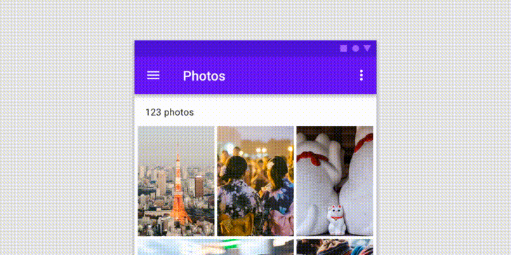
基本設置的 bar,通常會帶有 menu、navigation icon、title 等應用元件
https://ithelp.ithome.com.tw/upload/images/20220921/20151680jCNvpGrqMz.png

Prominent bar

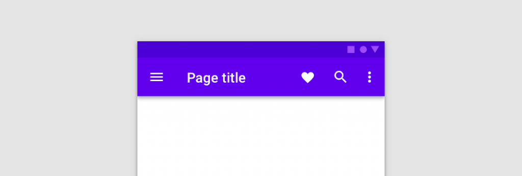
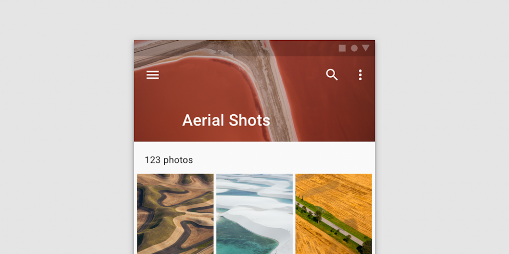
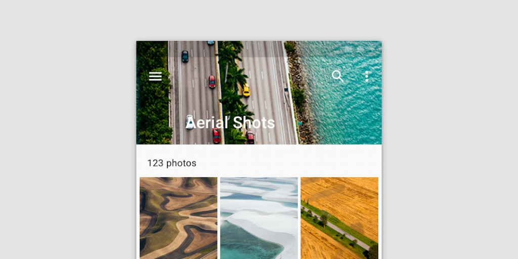
用於更長的 title 與容納大型圖像或為 top bar 提供更強的存在感
https://ithelp.ithome.com.tw/upload/images/20220921/20151680ws3w0jrJhQ.png

Contextual action bar

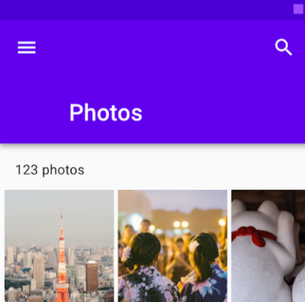
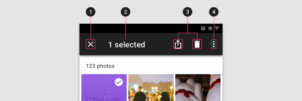
可為所選項目提供操作,例如我們在多選取相簿圖片進行刪除與保存等等。top bar 可以轉換為 contextual action bar ,在執行或關閉之前會一直保持狀態
https://ithelp.ithome.com.tw/upload/images/20220921/20151680wIEaCWXbMB.png


Anatomy

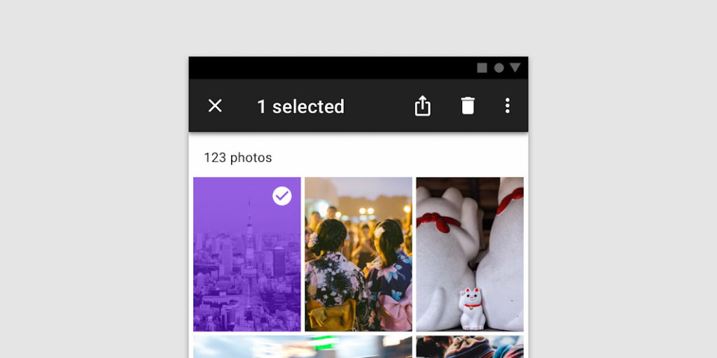
由於 top bar 本身就是一種容器,所以在組成上,可自行選擇要設置哪種組件
https://ithelp.ithome.com.tw/upload/images/20220921/20151680Rchi55DJia.png

  1. Container
  2. Navigation icon (optional)
  3. Title (optional)
  4. Action items (optional)
  5. Overflow menu (optional)

Images in bars

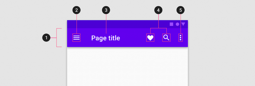
若想要在 top bar 放入圖像,使用 Prominent top bar 的方式呈現,因為這個狀態能提供更多的空間,而注意不要使用難以辨識的圖片或是 icon,甚至在顏色上與 top bar 的 title 有衝突

good

https://ithelp.ithome.com.tw/upload/images/20220921/20151680QQWMt4dt7o.png

bad

https://ithelp.ithome.com.tw/upload/images/20220921/20151680aTa2JCIS1A.png

Navigation icon (optional)

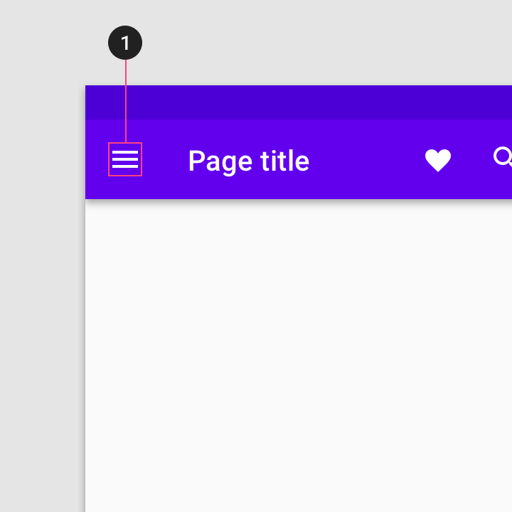
導航 icon 不是必要的設置,當出現在 top bar 的時候,會位在最左方,而它可以是

  • menu icon : 用來開啟 navigation drawer
  • up arrow : 用來往上一個層級的畫面
  • back arrow : 用來回到前一個畫面
    https://ithelp.ithome.com.tw/upload/images/20220921/201516800qlZNF943C.png

Title (optional)

用來告知用戶當前所在的畫面、場景或是功能,而在設計上避免出現下列幾個情況

  • title 應該避免在 Regular bar 出現多行
    https://ithelp.ithome.com.tw/upload/images/20220921/20151680Y9OnnQQKs9.png

  • title 應該避免為了配合單行的設置,而去截斷 title 所傳達的訊息
    https://ithelp.ithome.com.tw/upload/images/20220921/20151680SaVOkdaIhf.png

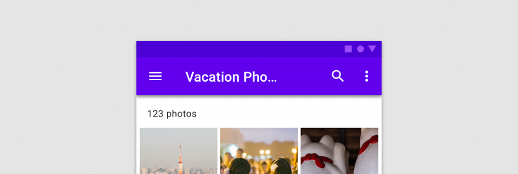
  • title 應該避免為了配合單行的設置,而去縮小文字
    https://ithelp.ithome.com.tw/upload/images/20220921/20151680YDE6LRhqDl.png

Icon placement

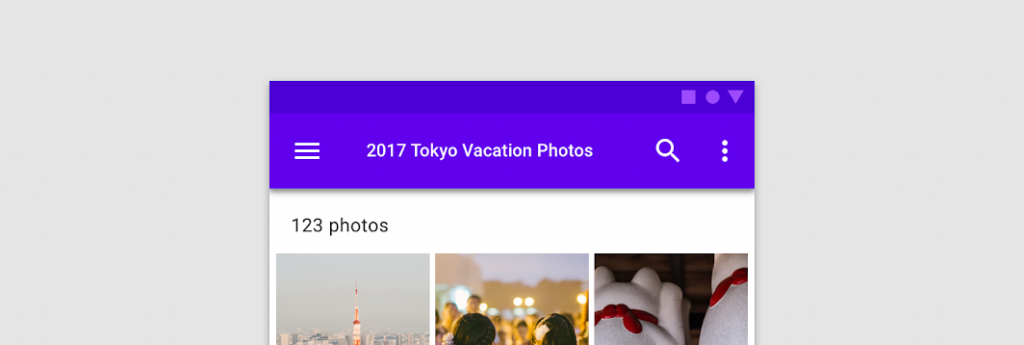
在 icon 配置上,應該依照 action 的重要性與常用性,由左至右放置。例如在最左方的是 navigation icon 負責導航頁面的工作,剩餘右邊的 icon,可照使用情境去設計排列,而最右方應該放置一個 menu icon,任何不適合在 top bar 出現的 action 都可以放入當中,讓用戶在有需要的時候再去開啟點選
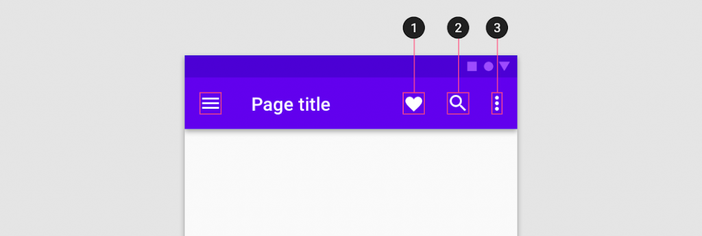
https://ithelp.ithome.com.tw/upload/images/20220921/20151680UvxO9pMhgZ.png


Behavior

Scrolling

當用戶在操作滑動的時候,我們可以選擇將 top bar 隱藏並在回到上方時出現或是一直讓 top bar 保持在上方不會變動,端看當前畫面的使用情境如何。對於 top bar 的隱藏或顯示,取決於用戶在體驗上是否常常需要 top bar 與當前畫面有相互功能

若是應用在 Prominent bar 的話,會在下滑時去縮小變成 Regular bar,讓用戶有更大的空間去操作畫面


Contextual action bar

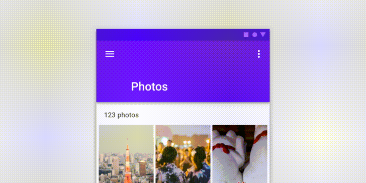
top bar 可以轉換為 Contextual action bar,以向所選項目提供操作。例如,當用戶從圖庫中選擇照片時,top bar 會轉換為 contextual action bar,其中包含與所選照片相關的操作

為了讓用戶知道現在已經切換為 Contextual action bar,所以我們必須從外觀上去做改變

  • Top bar 顏色改變
  • navigation icon 更換為 close icon
  • title 更改為 contextual title
  • 所有的 action icon 都更換為 contextual action icon

Anatomy

https://ithelp.ithome.com.tw/upload/images/20220921/20151680nU3BvdWB5H.png

  1. Close button (instead of a navigation icon)
  2. Contextual title
  3. Contextual actions
  4. Overflow menu (optional)

小結

Top bar 是一群小型元件的組合,通常會一直停佇在主畫面上方。所提供的操作與提示,也應該是要針對較為重要與優先的事件。Material Design 在 Top bar 設計上所關注的重點在於,提供一個醒目與簡潔的應用組件,並告知用戶當前所在的畫面與狀態,讓用戶知道目前在那個情況和能做那些操作


上一篇
Day 5 - Text fields ( Implementation )
下一篇
Day 7 - App bar : Top ( Implementation )
系列文
從 Google Material Design Components 來了解與實作 Android 的 UI/UX 元件設計30
圖片
  直播研討會
圖片
{{ item.channelVendor }} {{ item.webinarstarted }} |
{{ formatDate(item.duration) }}
直播中

尚未有邦友留言

立即登入留言