在開發時,"容器"不可或缺且面對響應式設計 (RWD) 更需要有容器的概念才適合做出自適應的網頁,現在就讓我們來看看容器與 RWD 是如何在 tailwind 中實作的吧!
首先介紹 tailwind 獨樹一格的 RWD 吧!在 tailwind 中預設的 RWD 斷點 (breakpoint) 數值如下: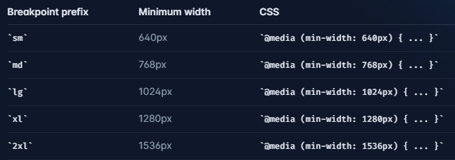
若需要客製化,可到 tailwind.config.js 檔案中,不僅可以更換斷點寬度數值,也可更換斷點名稱,以下實作: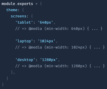
在 RWD 的應用上,僅需將斷點名稱後面加上冒號 (":") 再輸入想要的樣式,例如稍後要示範的 h2:
<h2 class="h-screen text-4xl bg-green-400 sm:hidden">
  手機背景顏色:綠色
</h2>
以上程式碼是以預設的 RWD 數值做示範,平時為 display: block; 但會在 sm (min-width: 640px) 時隱藏 (hidden = display: none;);也就是說裝置的螢幕大小小於 640px 會顯示,若大於 640px 則隱藏。
*在此,讀者可以先記好在 tailwind 來說,RWD 為 min-width 的設計,稍後會再說到。
container 的斷點設計與數值如下: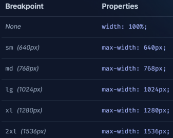
使用上經常搭配 mx-auto,達到容器置中的效果,再經由本身 container 的斷點即可做出隨裝置螢幕大小變化的容器。
<div class="container mx-auto px-3 h-screen py-6"></div>
但其實可以再簡化,我們能夠透過 tailwind.config.js 的檔案編輯,使得 container 本身具有置中的能力而不仰賴 mx-auto 這個 class。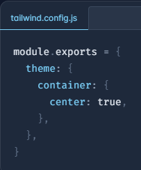
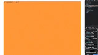
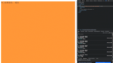
在 chrome 開發人員工具顯示樣式為: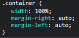
這個方式會將 mx-auto 的 CSS 樣式加進 container 裡,非常方便!
另外,我們在做 RWD 時,除了將容器置中還不夠,通常還會在兩側 padding,我們以 padding: 0 32px; 為例:
<div class="container px-4 h-screen py-6"></div>
一般來說要達成 padding: 0 32px; 必須加上 px-8,而這個做法也可透過 config 檔案編輯。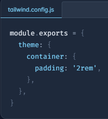
編輯後也跟剛才 mx-auto 的方式一樣,會將 padding-left: 32px; 與 padding-right: 32px; 加入 container 的樣式,此外也可透過 default 的概念,讓 container 建立 RWD 的 padding 樣式。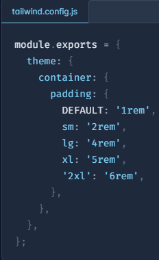
同時,在開發人員工具的顯示如下,sm => min-width: 640px;、lg => min-width: 1024px;: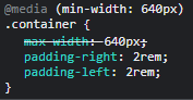
所以 padding 會在 640px 的寬度下應用 2rem、在 1024px 的寬度下應用 4rem。
將上述方法介紹到的方法集合起來,範例程式碼如下:
    <div class="container h-screen py-6">
      <div>
        <h2 class="h-screen text-4xl bg-green-400 sm:hidden">
          手機背景顏色:綠色
        </h2>
        <h2
          class="hidden h-screen text-4xl text-white bg-gray-500 sm:block lg:hidden"
        >
          iPad 背景顏色:灰色
        </h2>
        <h2 class="hidden h-screen text-4xl bg-orange-400 lg:block">
          PC 背景顏色:橘色
        </h2>
      </div>
    </div>
大家還記得剛剛說的 RWD 斷點數值是以 min-width 起手嗎?但在 container 的斷點數值卻是 max-width 起手,這種巧妙的搭配可以讓元素套用 RWD 時為填滿父層元素,而外圍的 container 又能藉由 max-width 限制寬度在一定數值之下,起初看到 tailwind 的搭配就認為非常有趣。 (官方文件)
最後補充,container 本身還可以搭配 RWD 語法,範例如下:
    <div class="lg:container h-screen py-6">
      <div>
        <h2 class="h-screen text-4xl bg-green-400 sm:hidden">
          手機背景顏色:綠色
        </h2>
        <h2
          class="hidden h-screen text-4xl text-white bg-gray-500 sm:block lg:hidden"
        >
          iPad 背景顏色:灰色
        </h2>
        <h2 class="hidden h-screen text-4xl bg-orange-400 lg:block">
          PC 背景顏色:橘色
        </h2>
      </div>
    </div>
在 lg (min-width: 1024px;) 寬度之前 container 會處於滿版狀態,>lg 之後的裝置螢幕大小才套用 container 數值;也就是說 lg 以前 container 這個樣式不會出現,除非 >lg。
tailwind 的容器方法有讓各位為之驚艷嗎?下一篇 flex box 敬請期待


 看影片追技術