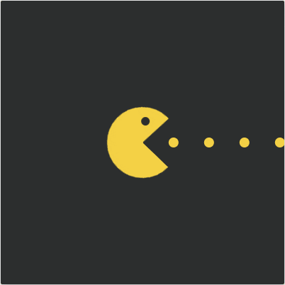
相信大家在小時候,應該多少玩過小精靈(Pac-Man)的遊戲,就是走在迷宮中吃豆子逃避幽靈,努力存活下去的遊戲。
今天我們就來實作Day #21
CodePen: https://codepen.io/stevetanus/pen/yLjvqBw
<div class="frame">
  <svg class="pacman">
    <circle cx="50" cy="50" r="25" />
  </svg>
  <svg class="eye">
    <circle cx="6" cy="6" r="6" />
  </svg>
  <svg class="dots">
    <polyline points="0,7 240,7" class="line"/>
  </svg>
</div>
三個SVG分別是.pacman大圓形、.eye小圓形、.dots長度240單位的線。
$radius: 50; // 大圓半徑
$speed: 0.7s; // 動畫速度
.pacman {
  position: absolute;
  width: ($radius * 2) + px; // 100px
  height: ($radius * 2) + px; // 100px
  top: ((400 - ($radius * 2))/2) + px; // 150px
  left: ((400 - ($radius * 2))/2) + px; // 150px
  fill: none;
  stroke: #f4d146;
  stroke-width: $radius + px; // 50px
  stroke-dasharray: ($radius * 3.14); // 157 等於半徑25的圓的圓周長
  animation: mouth $speed ease-in-out infinite;
}
fill: none+stroke: #f4d146的半徑25px的圓:
透過stroke-width: $radius + px,變成半徑50px的圓:
加上stroke-dasharray: ($radius * 3.14),線段為157單位,剛好跟SVG設定<circle r="25" />半徑25單位的圓形周長一樣(25 * 2 * 3.14),所以依舊為滿圓:
而再加上動畫mouth
@keyframes mouth {
  0%,
  100% {
    translate: -10px;
    stroke-dashoffset: 0;
    rotate: 0deg;
  }
  50% {
    translate: 5px;
    stroke-dashoffset: ($radius * 3.14/4); // 1/4的半徑25的圓的圓周長
    rotate: 45deg;
  }
}
stroke-dashoffset的值加上後,會往回推1/4圓,所以會有1/4的缺口,rotate: 45deg使圓形缺口來到右側,形成小精靈嘴巴
.eye {
  position: absolute;
  ...
  animation: eye $speed ease-in-out infinite;
}
@keyframes eye {
  0%,
  100% {
    translate: 0px;
  }
  50% {
    translate: -6px -3px;
  }
}
.eye在動畫50%時,會向左上方移動,配合嘴巴張開的樣子。
.dots {
  position: absolute;
  height: 14px;
  width: 240px;
  top: 193px; // 193 + 7 = 200 中心點
  left: 180px; // 中心點偏左
  stroke: #f4d146;
  stroke-width: 14px;
  stroke-dasharray: 0px 50px;
  stroke-linecap: round;
  animation: points $speed linear infinite;
  stroke-dashoffset: 14;
}
stroke-width: 14px產生14px的邊框線,stroke-dasharray: 0px 50px,表示為持續的實線,但有50px的間段(stroke-dasharray的參數第一個為分段長度,第二個之後為間距長度,在第一個長度填入0px為實線無分段,若是填入奇數數組,則會複製成為雙數數組),stroke-dashoffset: 14往左推移14單元。
@keyframes points {
  0% {
    stroke-dashoffset: 14;
  }
  100% {
    stroke-dashoffset: 64;
  }
}
動畫開始時,推移14px,結束時會往左50px,在無限的動畫中,下次開始又會回到推移14px,因為其推移的50px跟stroke-dasharray設定的間距50px一樣,所以產生很順暢地吃豆子的動畫。
stroke-dasharray: https://developer.mozilla.org/en-US/docs/Web/SVG/Attribute/stroke-dasharray
CSS
| 目標 | 屬性 |
|---|---|
| 小精靈嘴巴 | stroke-width為兩倍的SVG圓半徑,stroke-dasharray為SVG圓周長,stroke-dashoffset為1/4的SVG圓周長,rotate: 45deg |
| 無限豆子 | stroke-dasharray: 0px 間距、stroke-dashoffset: 間距的動畫 |
這篇在寫的時候看著原作者的code,思考了小精靈嘴巴開闔的動畫好久,一開始原本想說就當作不知道,然後寫進文章希望有人可以幫忙,但多多思考後才理解其中的原理,如果我有寫錯的地方再請麻煩糾正~
話說,小精靈動畫是蠻吸引人的,你們也這麼覺得嗎


 看影片追技術