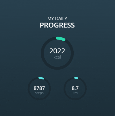
現在科技產品日新月異,許多人都會戴上智慧手錶、手環來追蹤運動情況,各運動品牌也有屬於會員的數據紀錄網頁,我們常會在上面看到當日運動數據的圖表。
今天我們就來實作Day #24
CodePen: https://codepen.io/stevetanus/pen/BaxrNLQ
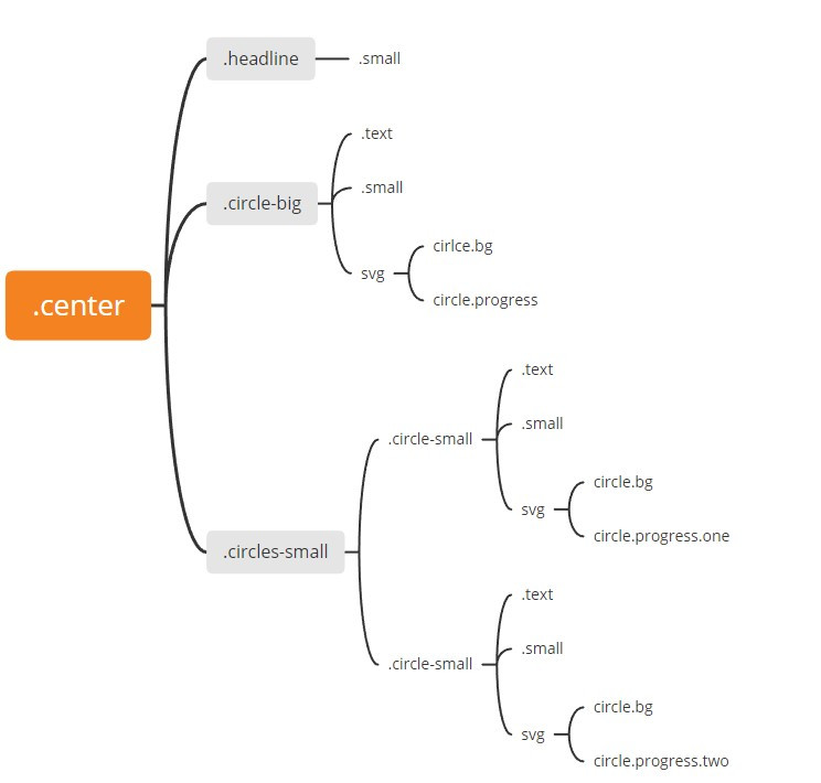
.center分成三部分,.headline、.circle-big大圓圈、.circles-small小圓圈們,每個圓圈中都有.text一般大小文字、.small小文字、SVG圓形,SVG圓形可以透過CSS的屬性stroke-dasharray跟stroke-dashoffset來達到進度條的效果,是個必學的動畫。
.circle-big {
  position: relative;
  width: 114px;
  height: 114px;
  margin: 30px auto 25px auto; // m30-a-15-a 上右下左

  svg {
    width: 114px;
    height: 114px;
  }
  ...
.circle-big設定為相對位置,有著上30px下25px的margin,SVG元素寬高皆為114px。
<circle class="bg" cx="57" cy="57" r="52" />
  .bg {
    fill: none;
    stroke-width: 10px;
    stroke: #1B2A33;
  }
<circle class="progress" cx="57" cy="57" r="52" />
.progress {
    fill: none;
    stroke-width: 10px;
    stroke: #27E1AE;
    stroke-linecap: round;
    stroke-dasharray: (52*2*3.14); // 圓周長 = 半徑*2*圓周率
    stroke-dashoffset: 60;
    transform-origin: 50% 50%;  // rotate的旋轉中心為圓形中心
    rotate: -90deg; // 往回90deg從圓形正上方開始畫stroke
    animation: big 1.5s ease-out;
  }
在SVG官方文件中,3.3 Rendering Order提到前面的元素會先被畫到畫布上,後面的元素會被畫在前面元素之上,因此才能有進度條重疊的效果。
動畫
@keyframes big {
  from {
    stroke-dashoffset: (52*2*3.14)
  }
  to {
    stroke-dashoffset: 60;
  }
}
.bg為背景進度條,我們在.progress加上big的動畫,從stroke-dashoffset: 圓周長,stroke會在1.5秒內成長到stroke-dashoffset: 60。
.circles-small {
  margin: 0 auto; // m0-a 上下0px 左右平均分配
  width: 400px;
  height: 80px;
  text-align: center;
}
.circle-small {
  display: inline-block;
  position: relative;
  width: 80px;
  height: 80px;
  margin: 0 20px;
display: inline-block使得兩個.circle-small都在同一條線上,margin: 0 20px使得他們左右兩側產生20px的margin。
<circle class="progress one" cx="40" cy="40" r="37" />
<circle class="progress two" cx="40" cy="40" r="37" />
.progress {
    fill: none;
    stroke-width: 6px;
    stroke: #5CE1EC;
    stroke-linecap: round;
    stroke-dasharray: (37*2*3.14); // 小圓周長
    rotate: -90deg;
    transform-origin: 50% 50%;

    &.one {
      stroke-dashoffset: 80;
      animation: one 1.5s ease-out;
    }

    &.two {
      stroke-dashoffset: 140;
      animation: two 1.5s ease-out;
    }

  }
動畫
@keyframes one {
  from {
    stroke-dashoffset: (37*2*3.14);
  }
  to {
    stroke-dashoffset: 80;
  }
}

@keyframes two {
  from {
    stroke-dashoffset: (37*2*3.14);
  }
  to {
    stroke-dashoffset: 140;
  }
}
stroke-dashoffset在動畫開始皆為小圓圓周長,使得stroke視覺長度為0,在動畫結束時,one的動畫中stroke-dashoffset比較短,two的動畫中stroke-dashoffset比較長,故在第二個小圓圈的進度條比較短(被推移的px較多)。
HTML
| 目標 | 屬性 |
|---|---|
| 重疊圓圈 | svg內兩個相同circle |
| CSS | |
| 目標 | 屬性 |
| ------------- | ------------- |
| 圓形外圍進度條 | stroke-dasharray: 圓周長 |
| 進度條從圓形上方開始 | transform-origin: 50% 50%、rotate: -90deg |
| 進度條動畫 | from stroke-dashoffset: 圓周長 to stroke-dashoffset:推移px |
感謝各位的收看~周末在家追劇打Game喝酒聚會的時候,別忘了還是找些時間去稍微運動一下吧~


 iThome鐵人賽
 看影片追技術