今天來介紹全台鄉鎮預報的資料,原本想說介紹一個區就好,但發現氣象局有提供全台各鄉鎮市區預報資料的壓縮檔。
處理這個的話,就一勞永逸啦。不然其實氣象局開放資料有一個城市一個城市提供的檔案形式。
先下載檔案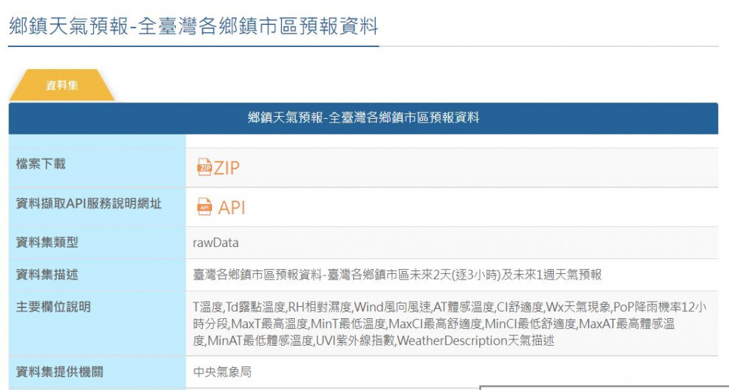
選擇ZIP檔,下載後會有F-D0047-093.zip檔案,解壓縮之後會有很多xml檔案,如下圖。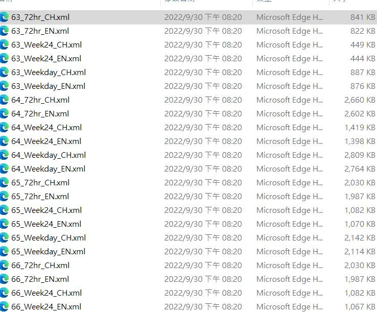
那有三份是非xml檔案格式的csv檔,其中file.csv的內容記錄xml檔案對應的實際內容。
用python執行上述的動作,解壓縮,然後開啟file.csv
import zipfile
import pandas as pd

extractdir = "F-D0047-093"
with zipfile.ZipFile("F-D0047-093.zip", 'r') as zip_ref:
    zip_ref.extractall("F-D0047-093")
df = pd.read_csv("F-D0047-093/file.csv")
print(df.head())

def getidx(cityname, duration, lang):
    '''
    cityname: 城市名稱(例:高雄市)
    duration: 想要的預報長度種類,有三種選擇,
              三天3小時,一週24小時,一週日夜
    lang: 語言,中文或英文
    '''
    wantfn = cityname + duration + \
             "天氣預報XML檔" + lang
    return wantfn
want = getidx("高雄市", "一週24小時", "中文")
fnxml = df.query("description == '{:s}'".format(want))["name"].values.astype(str)[0]
print(df.head())會如下圖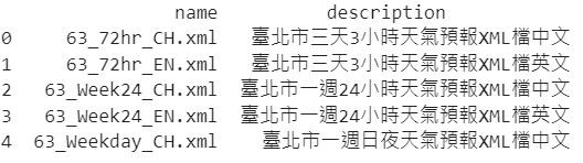
所以我就寫了一個funtion,可以依照想要的城市、預報資料種類及語言,回傳正確檔名。
而目前我選的是高雄市一週24小時中文的預報資料。
接下來就跟前幾天介紹的步驟一樣,用xmltodict解資料並搭配一些套件視覺化囉
import xmltodict as xdict
import numpy as np

with open("F-D0047-093/" +fnxml, "r", encoding="utf-8") as fn:
    satdict = xdict.parse(fn.read())

subdivs = [] #這邊故意先將高雄市所包含的區域彙整為list
subdivamount = len(satdict["cwbopendata"]["dataset"]["locations"]["location"])
for sub in range(subdivamount):
    eachsub = satdict["cwbopendata"]["dataset"]["locations"]["location"][sub]
    subdivs.append(eachsub["locationName"])

#寫抓取一個區或一個鄉鎮資料轉換為資料表的function
def subdivison(subsdf):
    hdlist = ["Date"]
    obs = []
    for hd in range(len(subsdf["weatherElement"])):
        headname = subsdf["weatherElement"][hd]['elementName']
        hdlist.append(headname)
        time_value = subsdf["weatherElement"][hd]["time"]
        if headname == "T":
            fchr = [ time_value[x]["startTime"] for x in range(len(time_value)) ]
        for tau in range(len(time_value)):
            if headname != "WS" and headname != "CI" and headname != "Wx" \
                and headname != "MaxCI" and headname != "MinCI" and headname != "UVI":
                obs.append(time_value[tau]["elementValue"]["value"])
            else:
                obs.append(time_value[tau]["elementValue"][0]["value"])
    fcst_length = len(fchr)
    npcb = np.concatenate((np.array(fchr), np.array(obs)))
    obsdf = pd.DataFrame(npcb.reshape(-1, fcst_length).T,columns = hdlist)
    return obsdf

#看一下會呈現的樣子
print(subdivison(satdict["cwbopendata"]["dataset"]["locations"]["location"][3]).head())

然後就視覺化囉,這邊我故意畫四張圖(即四個區),前面有製作了分區名稱的list(subdivs),
選擇第4個至第7個。
import matplotlib.pyplot as plt
from pathlib import Path

fpath = Path("font/msjh.ttf")
fig, axs = plt.subplots(2,2,figsize=(12,10))
plt.subplots_adjust(hspace=0.3)
for ax,subs in zip(axs.flatten(),subdivs[4:8]):
    subpos = subdivs.index(subs)
    dfsub = subdivison(satdict["cwbopendata"]["dataset"]["locations"]["location"][subpos])
    datestr = []
    for dt in dfsub["Date"]:
        dttime = datetime.strptime(dt,"%Y-%m-%dT%H:%M:%S+08:00")
        datestr.append(dttime.strftime("%m%d"))
    l1, = ax.plot(dfsub["T"].astype(float),"g-",label="平均溫度")
    l2, = ax.plot(dfsub["MaxT"].astype(float),"r-",label="最高溫")
    l3, = ax.plot(dfsub["MinT"].astype(float),"b-",label="最低溫")
    l4, = ax.plot(dfsub["MaxAT"].astype(float),"r--",label="最高體感溫度")
    l5, = ax.plot(dfsub["MinAT"].astype(float),"b--",label="最低體感溫度")
    yuper = max(dfsub["MaxT"].astype(float).max(),dfsub["MaxAT"].astype(float).max()) + 1
    ylower = min(dfsub["MinT"].astype(float).min(),dfsub["MinAT"].astype(float).min()) - 1
    ax.set_ylabel("溫度",font=fpath)
    ax.set_xlabel("月份日期",font=fpath)
    ax.set_ylim(ylower,yuper)
    ax.set_xticks(range(len(datestr)),datestr)
    ax.set_title(subs,font=fpath)
handles = [l1,l2,l3,l4,l5]
labels = ["平均溫度","最高溫","最低溫","最高體感溫度","最低體感溫度"]
fig.legend(handles = handles, labels =labels, ncol=6,bbox_to_anchor =(0.75, 0.05),prop=fpath)
視覺化圖如下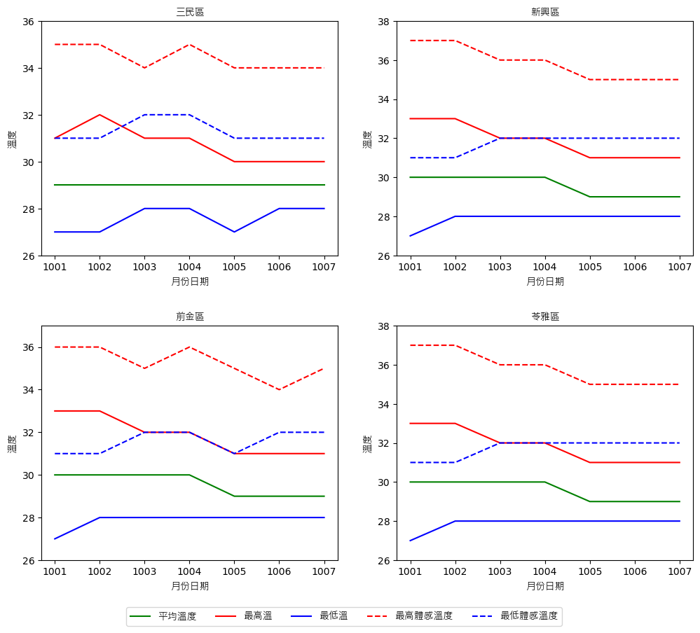
到目前為止,所有的介紹內容有寫成function的,只要再改一下(有可能要大改XD),應該就會很好用。