Stack 也是我很常用於排版的 UI component 。display 屬性是 Flex ,添加了方便排版的語法糖元件。
適合用於群組元件們來安排彼此間的距離。 在 figma 上,設計畫面有重複元素排列時,設計師也是會使用 Autolayout 功能去設定好間距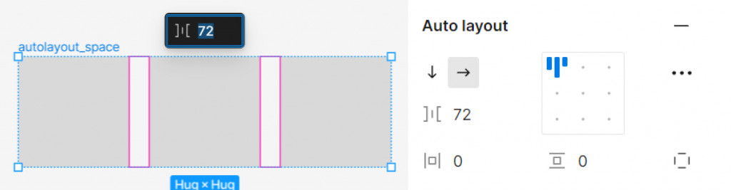
在 Stack 元件中用 spacing 屬性用來設置間距的數值
<Stack spacing='24px'>
 <Box w='40px' h='40px' bg='yellow.200'>
    1
  </Box>
  <Box w='40px' h='40px' bg='tomato'>
    2
  </Box>
  <Box w='40px' h='40px' bg='pink.100'>
    3
  </Box>
</Stack>
在 RWD 很常見寬螢幕是均分橫排,小螢幕是直排,在 Stack 中習慣藉由 direction 屬性來實作
direction={['column', 'row']}
<Flex  direction={['column', 'row']} spacing='24px'>
 <Box flex="1" h='40px' bg='yellow.200'>
    1
  </Box>
  <Box  flex="1" h='40px' bg='tomato'>
    2
  </Box>
  <Box  flex="1" h='40px' bg='pink.100'>
    3
  </Box>
</Flex>
當如果 Stack 方向都會維持同一個方向就可以使用 HStack 水平方向、 VStack 垂直方向
當如果排列的元素之間有分隔線,可以利用 props divider
<VStack
  divider={<StackDivider borderColor='gray.200' />}
  spacing={4}
  align='stretch'
>
  <Box h='40px' bg='yellow.200'>
    1
  </Box>
  <Box h='40px' bg='tomato'>
    2
  </Box>
  <Box h='40px' bg='pink.100'>
    3
  </Box>
</VStack>


 iThome鐵人賽
 看影片追技術