
Flutter中也提供不同的按鈕元件,這裡我們以EvaluatedButton為例。這是一個提供視覺層次感的按鈕元件,當按下按鈕時,Material.elevation 屬性會增加。label中的 Text 和 Icon 漸會以 ButtonStyle.foregroundColor 的樣式顯示,按鈕的填充背景顏色由 ButtonStyle.backgroundColor 決定。
若是要參考其他的Button元件也可以到FilledButton、OutlinedButton、TextButton等頁面查詢相關格式與使用方式!
style:代表樣式設定
ButtonStyle.foregroundColor(前景色):指定按鈕文本和圖示的顏色。
ButtonStyle.backgroundColor(背景顏色):定義按鈕的背景顏色。
ButtonStyle.elevation(陰影高度):設定按鈕的陰影高度。這會影響按鈕按下時的視覺效果,增加按鈕的立體感。
ButtonStyle.side(邊框):可以定義按鈕的邊框樣式,包括顏色、寬度等屬性。
ButtonStyle.padding(內邊距):指定按鈕的內邊距,即按鈕內容與按鈕邊界之間的距離。
ButtonStyle.shape(形狀):定義按鈕的形狀,例如圓角、矩形等。可以使用 RoundedRectangleBorder、CircleBorder 等形狀物件。
ButtonStyle.minimumSize(最小尺寸):設定按鈕的最小尺寸
ButtonStyle.maximumSize(最大尺寸):指定按鈕的最大尺寸
onPressed: 可以放入按下按鈕後的行為
child: 通常會放置按鈕內的元素,像是文字、Icon、圖片等
 ElevatedButton(
            style: ButtonStyle(
                      backgroundColor: MaterialStateProperty.all(Colors.blue), // 背景顏色
                      foregroundColor: MaterialStateProperty.all(Colors.black), // 文字顏色
                      elevation: MaterialStateProperty.all(6), // 按下按鈕的陰影高度
                      shape: MaterialStateProperty.all(RoundedRectangleBorder(
                        borderRadius: BorderRadius.circular(10.0), // 圓角設定
                      )),
                      padding: MaterialStateProperty.all(const EdgeInsets.all(16.0)), // 內邊距
                    ),
            onPressed: () {},//按下後的行為
            child: const Text('Enabled'),
          ),
EvaluatedButton用法
import 'package:flutter/material.dart';

/// Flutter code sample for [ElevatedButton].

void main() => runApp(const ElevatedButtonExampleApp());

class ElevatedButtonExampleApp extends StatelessWidget {
  const ElevatedButtonExampleApp({super.key});

  @override
  Widget build(BuildContext context) {
    return MaterialApp(
      home: Scaffold(
        appBar: AppBar(title: const Text('ElevatedButton Sample')),
        body: const ElevatedButtonExample(),
      ),
    );
  }
}

class ElevatedButtonExample extends StatefulWidget {
  const ElevatedButtonExample({super.key});

  @override
  State<ElevatedButtonExample> createState() => _ElevatedButtonExampleState();
}

class _ElevatedButtonExampleState extends State<ElevatedButtonExample> {
  @override
  Widget build(BuildContext context) {
    final ButtonStyle style =
        ElevatedButton.styleFrom(textStyle: const TextStyle(fontSize: 20));

    return Center(
      child: Column(
        mainAxisSize: MainAxisSize.min,
        children: <Widget>[
          ElevatedButton(
            style: style, //樣式,style為預設
            onPressed: null,//按下後的行為,null代表無法互動
            child: const Text('Disabled'),
          ),
          const SizedBox(height: 30),
          ElevatedButton(
            style: ButtonStyle(
                      backgroundColor: MaterialStateProperty.all(Colors.blue), // 背景顏色
                      foregroundColor: MaterialStateProperty.all(Colors.black), // 前景顏色
                      elevation: MaterialStateProperty.all(6), // 陰影高度
                      shape: MaterialStateProperty.all(RoundedRectangleBorder(
                        borderRadius: BorderRadius.circular(10.0), // 圓弧設定
                      )),
                      padding: MaterialStateProperty.all(const EdgeInsets.all(16.0)), // 內邊距
                    ),
            onPressed: () {},//按下後的行為
            child: const Text('Enabled'),
          ),
        ],
      ),
    );
  }
}
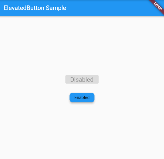
EvaluatedButton使用範例
Container是一個可以添加填充、邊框、裝飾等視覺效果的容器元件,可以根據需要自動調整大小,也可以使用指定的寬度、高度。
這個範例中,我們示範了兩個不同的Container,且可以從程式中看到各個屬性的調整用法!
import 'package:flutter/material.dart';

void main() {
  runApp(MyApp());
}

class MyApp extends StatelessWidget {
  @override
  Widget build(BuildContext context) {
    return MaterialApp(
      home: MyHomePage(),
    );
  }
}

class MyHomePage extends StatelessWidget {
  @override
  Widget build(BuildContext context) {
    return Scaffold(
      appBar: AppBar(
        title: const Text('Container Examples'),
      ),
      body: Center(
        child: Column(
          mainAxisAlignment: MainAxisAlignment.center,
          children: [
            Container(
              margin: const EdgeInsets.all(10.0),//外邊距為10像素
              color: Colors.amber[600],
              width: 48.0,
              height: 48.0,
            ),
            const SizedBox(height: 20.0), // 添加垂直間距
            Container(
              constraints: BoxConstraints.expand(//大小約束條件,使容器的高度根據條件值動態調整
                height: Theme.of(context).textTheme.headlineMedium!.fontSize! * 1.1 + 200.0,
              ),
              padding: const EdgeInsets.all(8.0),//內邊距8像素
              color: Colors.blue[600],
              alignment: Alignment.center,//置中對齊
              transform: Matrix4.rotationZ(0.1),//旋轉0.1弧度
              child: Text(
                'Hello World',
                style: Theme.of(context).textTheme.headlineMedium!.copyWith(color: Colors.white),
              ),
            ),
          ],
        ),
      ),
    );
  }
}
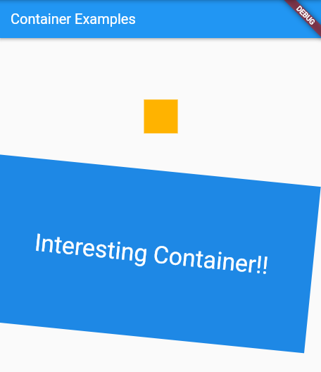
Container使用範例
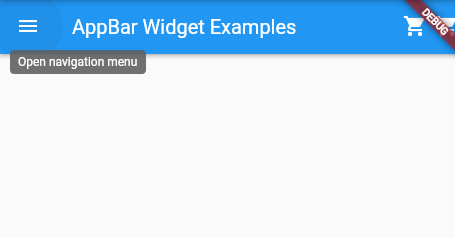
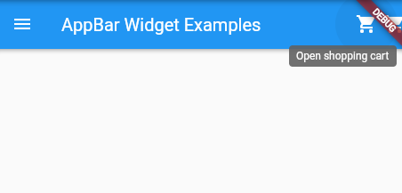
我們在Flutter程式中,都會看到上方有一個AppBar的項目,紀錄著應用欄元件,包含leading(左側圖標)、title(標題)和actions(操作按鈕),以及Bottom(底部)。
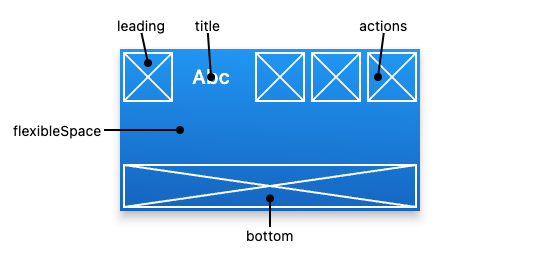
參見: AppBar class,位置相關項目說明圖示
AppBar通常被放置在Scaffold的appBar屬性中,將其作為一個固定高度的小部件置於屏幕頂部。對於可滾動的應用欄,可以查看SliverAppBar,它將AppBar嵌套在一個sliver中,方便我在CustomScrollView,滾動的案例中使用。
我們可以看到,在範例中程式碼依序寫入了leading, title與actions,並使用IconButton元件,進行點擊時的互動。其中,tooltip是代表當滑鼠移動到上方時,會採取的動作
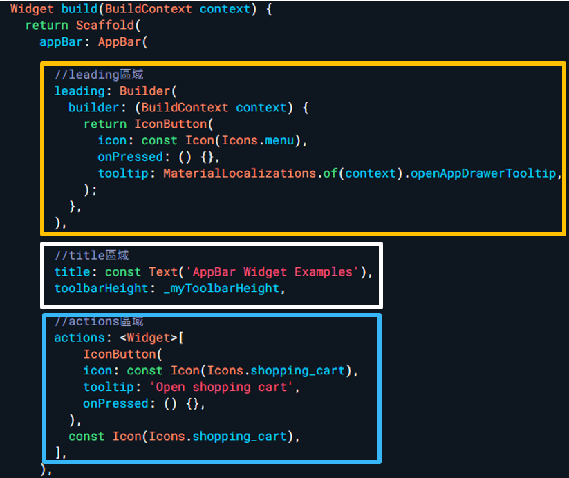
黃框、白框、藍框由上而下依序代表leading, title與actions的放置位置
import 'package:flutter/material.dart';

void main() => runApp(MyApp());

class MyApp extends StatelessWidget {
  @override
  Widget build(BuildContext context) {
    return MaterialApp(
      home: MyHomePage(),
    );
  }
}

class MyHomePage extends StatelessWidget {
  final double _myToolbarHeight = 56.0;

  @override
  Widget build(BuildContext context) {
    return Scaffold(
      appBar: AppBar(

        //leading區域
        leading: Builder(
          builder: (BuildContext context) {
            return IconButton(
              icon: const Icon(Icons.menu),
              onPressed: () {},
              tooltip: MaterialLocalizations.of(context).openAppDrawerTooltip,
            );
          },
        ),

        //title區域
        title: const Text('AppBar Widget Examples'),
        toolbarHeight: _myToolbarHeight,

        //actions區域
        actions: <Widget>[
            IconButton(
            icon: const Icon(Icons.shopping_cart),
            tooltip: 'Open shopping cart',
            onPressed: () {},
          ),
          const Icon(Icons.shopping_cart),
        ],
      ),

    );
  }
}
AppBar使用範例
Scaffold元件提供了頁面建構的基礎,提供了一個簡單的框架讓我們實行AppBar、Drawer(側邊欄)、Bottom Sheet(底部表單)等元件功能
基本上,一個簡單的Scaffold架構如下方顯示,會依序放置appBar、body(頁面主體)、與bottomNavigationBar(下方導覽欄)或是其他所需區塊,其中,這些區塊會以冒號:作為開頭,並在裡面放置需要用到的元件,層遞疊加
Scaffold(
  appBar: //AppBar放置位置

  body: //頁面主體內容

  bottomNavigationBar: //下方欄

  //可疊加其他需要功能

),
簡易Scaffold架構
以下程式將Flutter demo code的計數器增添下方欄與浮動按鈕的設計,達成了一個簡易的Scaffold計數器頁面展示,其中,BottomAppBar與FloatingActionButton的使用方式有興趣的朋友可以參見官網提供的範例,在此不加贅述
import 'package:flutter/material.dart';

/// Flutter code sample for [Scaffold].

void main() => runApp(const ScaffoldExampleApp());

class ScaffoldExampleApp extends StatelessWidget {
  const ScaffoldExampleApp({super.key});

  @override
  Widget build(BuildContext context) {
    return const MaterialApp(
      home: ScaffoldExample(),
    );
  }
}

class ScaffoldExample extends StatefulWidget {
  const ScaffoldExample({super.key});

  @override
  State<ScaffoldExample> createState() => _ScaffoldExampleState();
}

class _ScaffoldExampleState extends State<ScaffoldExample> {
  int _count = 0;

  @override
  Widget build(BuildContext context) {
    return Scaffold(
      appBar: AppBar(
        title: const Text('Sample Counting Code'),
      ),
      body: Center( //頁面主體
        child: Text('You have pressed the button $_count times.'),
      ),
      bottomNavigationBar: BottomAppBar(
        shape: const CircularNotchedRectangle(), //圓角矩形,用於放置浮動按鈕
        child: Container(height: 50.0),
      ),
      floatingActionButton: FloatingActionButton(//FloatingActionButton(FAB),浮動按鈕
        onPressed: () => setState(() {
          _count++;
        }),
        tooltip: 'Increment Counter',
        child: const Icon(Icons.add),
      ),
      floatingActionButtonLocation: FloatingActionButtonLocation.centerDocked,
    );
  }
}
當游標到懸浮按鈕時會顯示字樣,並且點擊會觸發計數器的功能,並在頁面呈現更新後的次數

 看影片追技術