
當我們有使用float來做排版時,為了避免外容器沒被撐開的問題,我們可以在外容器添加.clearfix。
而它的手法可以從mixin程式碼中知道:
@mixin clearfix() {
  &::after {
    display: block;
    clear: both;
    content: "";
  }
}
從上可知.clearfix也是使用僞元素來做clear:both;。
範例程式碼:
<div class="bg-info clearfix">
  <button type="button" class="btn btn-secondary float-start">Example Button floated left</button>
  <button type="button" class="btn btn-secondary float-end">Example Button floated right</button>
</div>
效果:
使用Color and background屬性可以讓我們在填上背景色時,也自動幫我們決定好相應的文字顏色(淺色背景黑字,深背景是白字),可以用在很多元件上例如卡片、標籤等。
寫法是:.text-bg-情境色,例如:.text-bg-primary,這會有primary顏色(預設是#0D6EFD的藍色)配白字。
範例程式碼:
<div class="text-bg-primary p-3">Primary with contrasting color</div>
<div class="text-bg-secondary p-3">Secondary with contrasting color</div>
<div class="text-bg-success p-3">Success with contrasting color</div>
<div class="text-bg-danger p-3">Danger with contrasting color</div>
<div class="text-bg-warning p-3">Warning with contrasting color</div>
<div class="text-bg-info p-3">Info with contrasting color</div>
<div class="text-bg-light p-3">Light with contrasting color</div>
<div class="text-bg-dark p-3">Dark with contrasting color</div>
效果如下: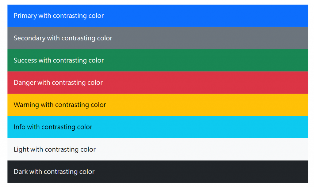
bootstrap在helpers中也有固定寫好的Position class可以使用,適合用在像是網頁上方的選單等元件。
屬性有fixed與sticky可以選,位置有top與bottom可以選,例如想要使某元件固定在瀏覽器最上方可以用:.fixed-top,相反的使固定在瀏覽器底部就用.fixed-bottom。
P.S.想複習position可以參考這篇文章position - 金魚都能懂的CSS必學屬性。
而此CodePen可以操作查看sticky屬性與fixed不同之處。
另外bootstrap Position屬性支持響應式,寫法是:.定位方法-中斷點-位置,例如.sticky-sm-top就是在瀏覽器寬度sm以上時此物件呈現.sticky-top的效果。
範例程式碼如下:
<div class="sticky-sm-top">Stick to the top on viewports sized SM (small) or wider</div>
<div class="sticky-md-top">Stick to the top on viewports sized MD (medium) or wider</div>
<div class="sticky-lg-top">Stick to the top on viewports sized LG (large) or wider</div>
<div class="sticky-xl-top">Stick to the top on viewports sized XL (extra-large) or wider</div>
<div class="sticky-xxl-top">Stick to the top on viewports sized XXL (extra-extra-large) or wider</div>
Ratio屬性可以用在外部嵌入的物件,例如 <iframe>, <embed>, <video>, 與 <object>,當然也可以用在HTML 子元素(例如:<div> 或 <img>)。
使用方式是:在包在外層的父元素上.ratio.ratio-寬x長(預設有1x1, 4x3, 16x9, 21x9的比例)
範例:
<div class="ratio ratio-16x9">
  <iframe src="https://www.youtube.com/embed/zpOULjyy-n8?rel=0" title="YouTube video" allowfullscreen></iframe>
</div>
效果: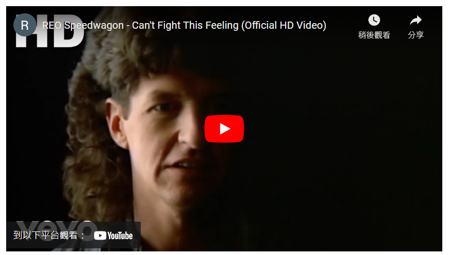
此寬高為616x346.5(px)
如果改成
<div class="ratio ratio-1x1">
  <iframe src="https://www.youtube.com/embed/zpOULjyy-n8?rel=0" title="YouTube video" allowfullscreen></iframe>
</div>
會變成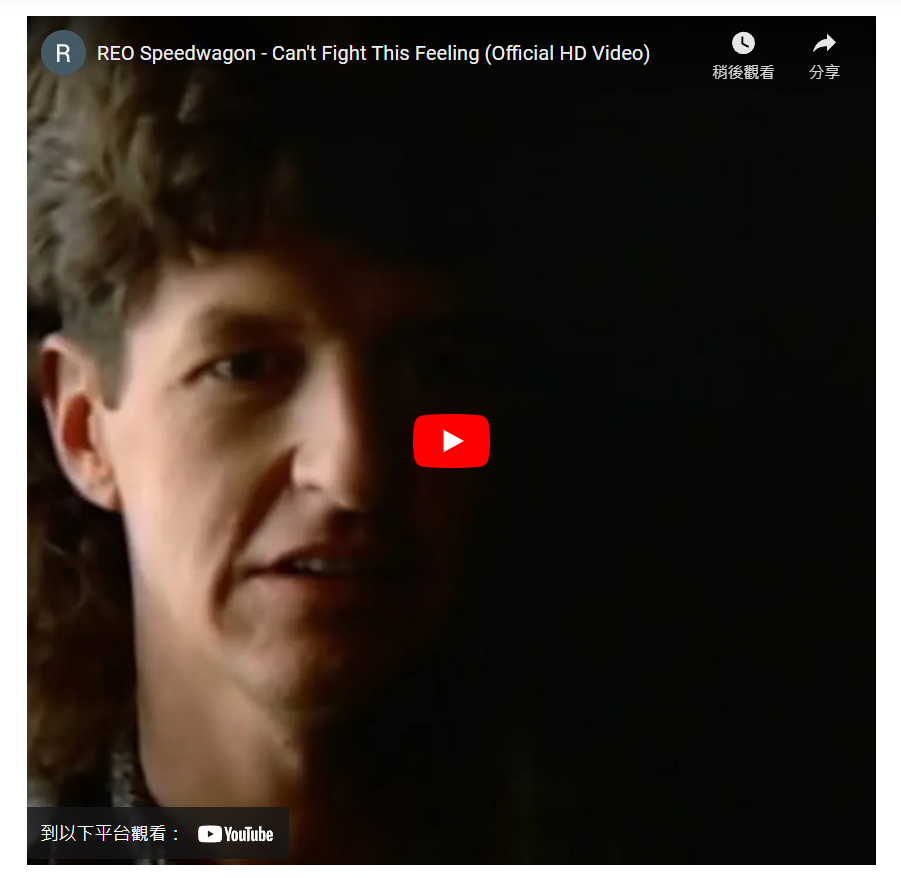
後來變成616x616(px)
--aspect-ratio:高寬比,例如要創建 2x1 的寬高比,請在 .ratio 上設置 --aspect-ratio: 50%。範例程式碼:
<div class="ratio" style="--bs-aspect-ratio: 50%;">
  <div>2x1</div>
</div>
效果: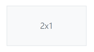

 iThome鐵人賽
 看影片追技術