如果想要使label浮動在input之內而不占額外空間的話,我們可以在外層加入.form-floating,包覆一對 <input class="form-control"> 和 <label>,注意 <input class="form-control">要放前面。
範例程式碼:
<div class="form-floating mb-3">
  <input type="email" class="form-control" id="floatingInput" placeholder="name@example.com">
  <label for="floatingInput">Email address</label>
</div>
<div class="form-floating">
  <input type="password" class="form-control" id="floatingPassword" placeholder="Password">
  <label for="floatingPassword">Password</label>
</div>
效果: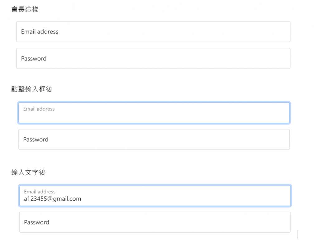
如果已經定義 value,或是輸入框有打字 ,則 <label> 會自動調整為其浮動位置。
如圖: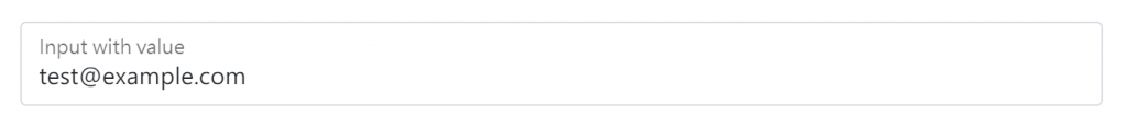
此外,帶有.form-control 的 <textarea> 會跟 <input> 有相同的高度,如果要調整它的高度請不要用rows="..."的方式,請用css設定height。
範例程式碼:
<div class="form-floating">
  <textarea class="form-control" placeholder="Leave a comment here" id="floatingTextarea2" style="height: 100px"></textarea>
  <label for="floatingTextarea2">Comments</label>
</div>
效果: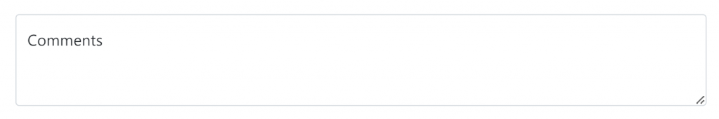
.form-floating也可以用在 <select class="form-select">上,不過就不能用size(一次呈現的選項數)跟multiple(多選)效果了。
範例程式碼:
<div class="form-floating">
  <select class="form-select" id="floatingSelect" aria-label="Floating label select example">
    <option selected>Open this select menu</option>
    <option value="1">One</option>
    <option value="2">Two</option>
    <option value="3">Three</option>
  </select>
  <label for="floatingSelect">Works with selects</label>
</div>
效果: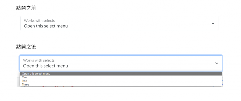
通用類別排版法:
建議使用 .margin-bottom 通用類別來推擠垂直間距,讓整個表單使用單一方向推擠以符合一致性。
使用範例:
<div class="mb-3">
  <label for="formGroupExampleInput" class="form-label">Example label</label>
  <input type="text" class="form-control" id="formGroupExampleInput" placeholder="Example input placeholder">
</div>
<div class="mb-3">
  <label for="formGroupExampleInput2" class="form-label">Another label</label>
  <input type="text" class="form-control" id="formGroupExampleInput2" placeholder="Another input placeholder">
</div>
效果: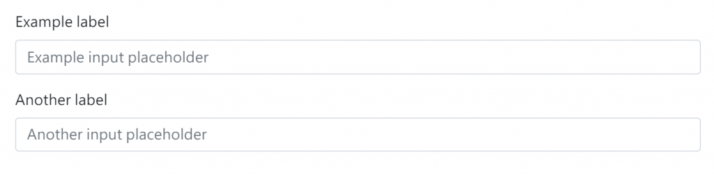
如果要套用格線系統做排版的話請務必把表單元素放在 .column類別裡面。
例如:
<div class="row g-2">
  <div class="col-md">
    <div class="form-floating">
      <input type="email" class="form-control" id="floatingInputGrid" placeholder="name@example.com" value="mdo@example.com">
      <label for="floatingInputGrid">Email address</label>
    </div>
  </div>
  <div class="col-md">
    <div class="form-floating">
      <select class="form-select" id="floatingSelectGrid" aria-label="Floating label select example">
        <option selected>Open this select menu</option>
        <option value="1">One</option>
        <option value="2">Two</option>
        <option value="3">Three</option>
      </select>
      <label for="floatingSelectGrid">Works with selects</label>
    </div>
  </div>
</div>
效果: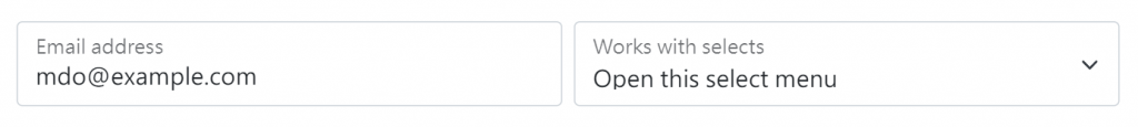
使用Gutters(寫法:g-*)可以在.row上定義裡面的column之間的間距。
我們可以使用格線系統建立像下圖或是更複雜的排版都沒問題
如果要使每個項目的input與lable呈現水平排版的話(預設是垂直的,因為Bootstrap 在幾乎所有表單控制 (form control) 應用了 display: block 和 width: 100%,表單預設會垂直堆疊),我們可以把.row包在input與label的外面,並在input與label中個別加入.col類別。
範例程式碼:
<form>
  <div class="row mb-3">
    <label for="inputEmail3" class="col-sm-2 col-form-label">Email</label>
    <div class="col-sm-10">
      <input type="email" class="form-control" id="inputEmail3">
    </div>
  </div>
  <div class="row mb-3">
    <label for="inputPassword3" class="col-sm-2 col-form-label">Password</label>
    <div class="col-sm-10">
      <input type="password" class="form-control" id="inputPassword3">
    </div>
  </div>
</form>
效果: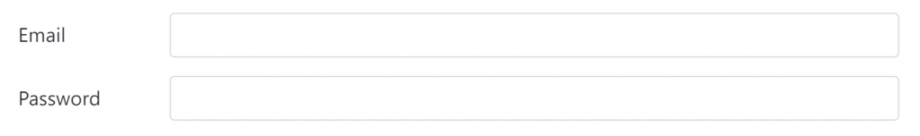
此外可以在<label> 或是 <legend> 使用 .col-form-label-sm 或 .col-form-label-lg,以正確的對應 .form-control-lg 以及.form-control-sm 的尺寸。
然後在排版的時候我們可以使用.col-*(有指定欄數)以及多個.col並用,.col會自動分配剩下的寬度。
也可以使用.col-auto,它只會佔內容所需的空間。


 看影片追技術